Visor Review 2026: Pros, Cons, Features, and Pricing


Visor is a Gantt chart maker designed to help project managers visualize, update, and share project timelines with minimal friction. If you’re tired of clunky interfaces, rigid layouts, or tools that don’t play nicely with other platforms, this tool stands out with its blend of real-time collaboration and flexible charts.
In this Visor review, I’ll walk through features, use cases, pros and cons, and pricing to help you decide if it’s the right timeline solution for your team.
Visor Evaluation Summary
- From $18/user/month
- Free plan available
Why You Can Trust Us
We’ve been testing and reviewing project management software since 2012. As project managers ourselves, we know how critical and difficult it is to make the right decision when selecting software.
We invest in deep research to help our audience make better software purchasing decisions. We’ve tested more than 2,000 tools for different project management use cases and written over 1,000 comprehensive software reviews. Learn how we stay transparent & our software review methodology.
Visor Overview
When I compare Visor to other options, its real-time collaboration, friendly onboarding, and flexible integrations make it easier to adopt and share project updates. The interface feels intuitive, and pricing is clear—though advanced customization options and automation don't go as deep as some alternatives.
If you’re choosing a Gantt chart maker for cross-functional tech teams needing fast setup and Airtable or Jira syncing, Visor’s strengths stand out.
pros
-
Real-time updates sync instantly across shared timelines
-
Grid and Gantt views show data in multiple ways
-
Collaboration features support interactive stakeholder feedback
cons
-
Mobile experience is limited compared to desktop
-
No built-in resource management tools
-
Complex projects can feel cluttered in large timelines
-

Accelo
Visit WebsiteThis is an aggregated rating for this tool including ratings from Crozdesk users and ratings from other sites.4.4 -
Celoxis
Visit WebsiteThis is an aggregated rating for this tool including ratings from Crozdesk users and ratings from other sites.4.4 -
Wrike
Visit WebsiteThis is an aggregated rating for this tool including ratings from Crozdesk users and ratings from other sites.4.3


Our Review Methodology
How We Test & Score Tools
We’ve spent years building, refining, and improving our software testing and scoring system. The rubric is designed to capture the nuances of software selection and what makes a tool effective, focusing on critical aspects of the decision-making process.
Below, you can see exactly how our testing and scoring works across seven criteria. It allows us to provide an unbiased evaluation of the software based on core functionality, standout features, ease of use, onboarding, customer support, integrations, customer reviews, and value for money.
Core Functionality (25% of final scoring)
The starting point of our evaluation is always the core functionality of the tool. Does it have the basic features and functions that a user would expect to see? Are any of those core features locked to higher-tiered pricing plans? At its core, we expect a tool to stand up against the baseline capabilities of its competitors.
Standout Features (25% of final scoring)
Next, we evaluate uncommon standout features that go above and beyond the core functionality typically found in tools of its kind. A high score reflects specialized or unique features that make the product faster, more efficient, or offer additional value to the user.
We also evaluate how easy it is to integrate with other tools typically found in the tech stack to expand the functionality and utility of the software. Tools offering plentiful native integrations, 3rd party connections, and API access to build custom integrations score best.
Ease of Use (10% of final scoring)
We consider how quick and easy it is to execute the tasks defined in the core functionality using the tool. High scoring software is well designed, intuitive to use, offers mobile apps, provides templates, and makes relatively complex tasks seem simple.
Onboarding (10% of final scoring)
We know how important rapid team adoption is for a new platform, so we evaluate how easy it is to learn and use a tool with minimal training. We evaluate how quickly a team member can get set up and start using the tool with no experience. High scoring solutions indicate little or no support is required.
Customer Support (10% of final scoring)
We review how quick and easy it is to get unstuck and find help by phone, live chat, or knowledge base. Tools and companies that provide real-time support score best, while chatbots score worst.
Customer Reviews (10% of final scoring)
Beyond our own testing and evaluation, we consider the net promoter score from current and past customers. We review their likelihood, given the option, to choose the tool again for the core functionality. A high scoring software reflects a high net promoter score from current or past customers.
Value for Money (10% of final scoring)
Lastly, in consideration of all the other criteria, we review the average price of entry level plans against the core features and consider the value of the other evaluation criteria. Software that delivers more, for less, will score higher.
Core Features
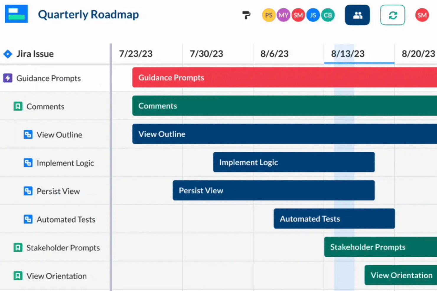
Timeline and Gantt Views
Switch between timeline and traditional Gantt chart layouts instantly. Drag-and-drop bars make date adjustments quick and visual.
Field-Level Collaboration
Allow teammates to comment and edit at the field level in real time. This helps keep input organized and actionable during project planning.
Customizable Data Fields
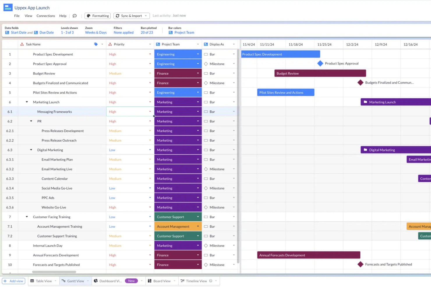
Create and modify columns for tasks, owners, status, and more. Tailor fields to fit any project’s tracking requirements.
Grid Editing
Edit multiple tasks at once within a familiar spreadsheet grid. Bulk update tasks for faster schedule management.
Color Coding and Conditional Formatting
Apply custom colors and formatting to highlight priorities or dependencies. Visual cues make it easy to spot delays or blockers.
Activity History and Undo
Track all changes made over time and undo mistakes with a click. Teams can review activity logs for transparency and accountability.
Ease of Use
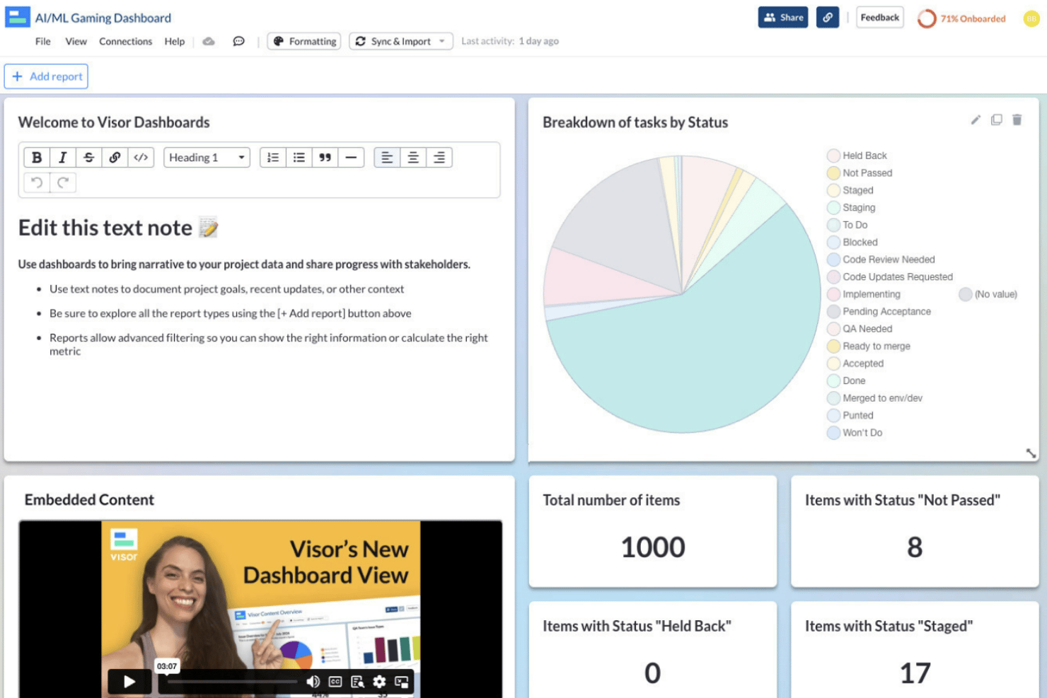
Visor’s usability stands out thanks to its approachable grid-based editing, quick timeline adjustments, and in-line collaboration, which most users say reduces onboarding friction. Field-level commenting, an uncluttered layout, and transparent activity logs make it easy for both technical and non-technical users to update, share, and review project progress with minimal confusion.
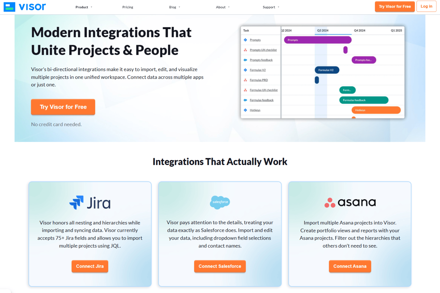
Integrations
Visor integrates with Jira, Airtable, Google Sheets, Salesforce, HubSpot, Asana, Smartsheet, Monday.com, Trello, and ClickUp.
Visor also offers a public API for custom integrations and supports connections through Zapier.
Visor Specs
- API
- Batch Permissions & Access
- Calendar Management
- Collaboration Support
- Contact Management
- Contact Sharing
- CRM Integration
- Customer Management
- Data Export
- Data Import
- Database
- Email Integration
- File Transfer
- Google Apps Integration
- Multi-Account
- Multi-App
- Multi-Site
- Multi-User
- Password & Access Management
- Project Management
- Report & Compliance
- Resource Management
- Social-Media Integration
- Software Integration
- Task Scheduling/Tracking
- Timesheets
- Workflow Management