I Tested 10 Reporting Tools: My Top Picks for 2026

10 Best Reporting Tools List


There are seemingly countless reporting tools available, so figuring out which is best for you is tough. You want to share data with your team in the most accessible and accurate way possible but need to figure out which tool is the best fit. I've got you!
In this post I make things simple, leveraging my experience using a variety of different project management reporting tools for everything from large projects to business growth to bring you this shortlist of the best reporting tools.
Why You Can Trust Us
We’ve been testing and reviewing project management software since 2012. As project managers ourselves, we know how critical and difficult it is to make the right decision when selecting software.
We invest in deep research to help our audience make better software purchasing decisions. We’ve tested more than 2,000 tools for different project management use cases and written over 1,000 comprehensive software reviews. Learn how we stay transparent & our software review methodology.
Compare Software Specs Side-by-Side
Here is a table you can use to compare all the tools we just covered in the overviews.
| Tool | Best For | Trial Info | Price | ||
|---|---|---|---|---|---|
| 1 | Best for unified cross-channel customer insights | Free plan + free demo available | Pricing upon request | Website | |
| 2 | Best reporting tool for data-driven PPM decisions | Free trial + free demo available | From $10/user/month (billed annually) | Website | |
| 3 | Best for integrating Google Sheets and Excel | Free plan available | From $49/month (billed annually) | Website | |
| 4 | Best reporting tool for easy-to-read charts | 15-day free trial + free plan + free demo available | From $24/month (billed annually) | Website | |
| 5 | Best reporting tool for integrating over 150 data sources | 14-day free trial + free demo available | From $44/month (billed annually) | Website | |
| 6 | Best for automated reporting without an analyst | Free plan available | From $29/month | Website | |
| 7 | Best reporting software for small business accounting | 30-day free trial | From $19/month | Website | |
| 8 | Unlimited users, data sources, and integrations in all plans. | 14-day free trial + free demo available | From $44/month (billed annually) | Website | |
| 9 | Best reporting tool for agile teams | Free trial + free plan + free demo available | From $13/user/month (billed annually) | Website | |
| 10 | Best reporting software for embedded analytics | Free trial + free plan available | From $15/user/month (billed annually) | Website |

-

Celoxis
Visit WebsiteThis is an aggregated rating for this tool including ratings from Crozdesk users and ratings from other sites.4.4 -
Smartsheet
Visit WebsiteThis is an aggregated rating for this tool including ratings from Crozdesk users and ratings from other sites.4.5 -
Accelo
Visit WebsiteThis is an aggregated rating for this tool including ratings from Crozdesk users and ratings from other sites.4.4


Overviews Of The Best Reporting Tools
Below is a description of each tool, how it handles report generation, and why it was chosen for this list. I’ve added screenshots of the tool so you get an idea of what it looks like from a user’s perspective.
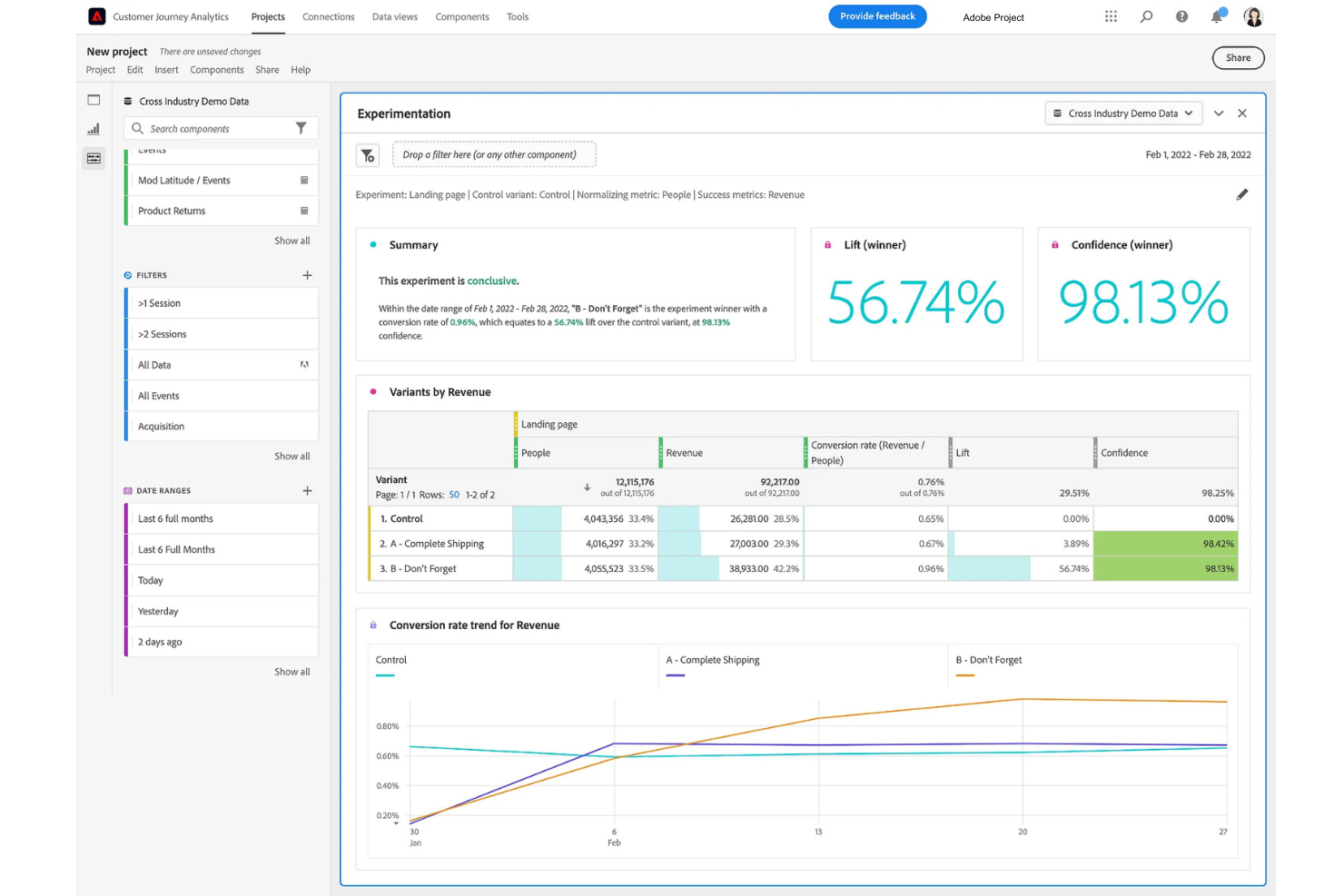
Adobe Customer Journey Analytics is a reporting and analytics platform that lets you analyze, visualize, and report on customer journeys across multiple channels using unified data sets and customizable dashboards.
Who Is Adobe Customer Journey Analytics Best For?
Marketing and analytics teams at large enterprises who need to analyze complex, multi-channel customer data.
Why I Picked Adobe Customer Journey Analytics
I picked Adobe Customer Journey Analytics as one of the best because I can bring together data from web, mobile, email, and offline sources into a single reporting environment. I like how the platform lets me build unified dashboards that visualize customer journeys across every channel. My team uses its cross-channel attribution and segmentation tools to break down silos and get a complete view of user behavior.
Adobe Customer Journey Analytics Key Features
- Data query workspace: Build custom queries and analyze large datasets with a drag-and-drop interface.
- Scheduled reporting: Automate delivery of recurring reports to stakeholders on a set schedule.
- Advanced filtering: Apply granular filters to focus on specific segments or behaviors in your reports.
- Collaboration tools: Share dashboards and insights with team members directly within the platform.
Adobe Customer Journey Analytics Integrations
Adobe Customer Journey Analytics offers native integrations with Adobe Experience Platform, Adobe Analytics, Adobe Target, Adobe Audience Manager, and Adobe Campaign. It also provides an API for custom integrations and supports connections to cloud data warehouses like Google BigQuery, Amazon Redshift, and Microsoft Azure Synapse Analytics.
Pros and Cons
Pros:
- Real-time dashboards for live performance tracking
- Advanced attribution modeling for customer journeys
- Built-in privacy and governance controls
Cons:
- Limited native integrations outside Adobe ecosystem
- Steep setup and configuration process
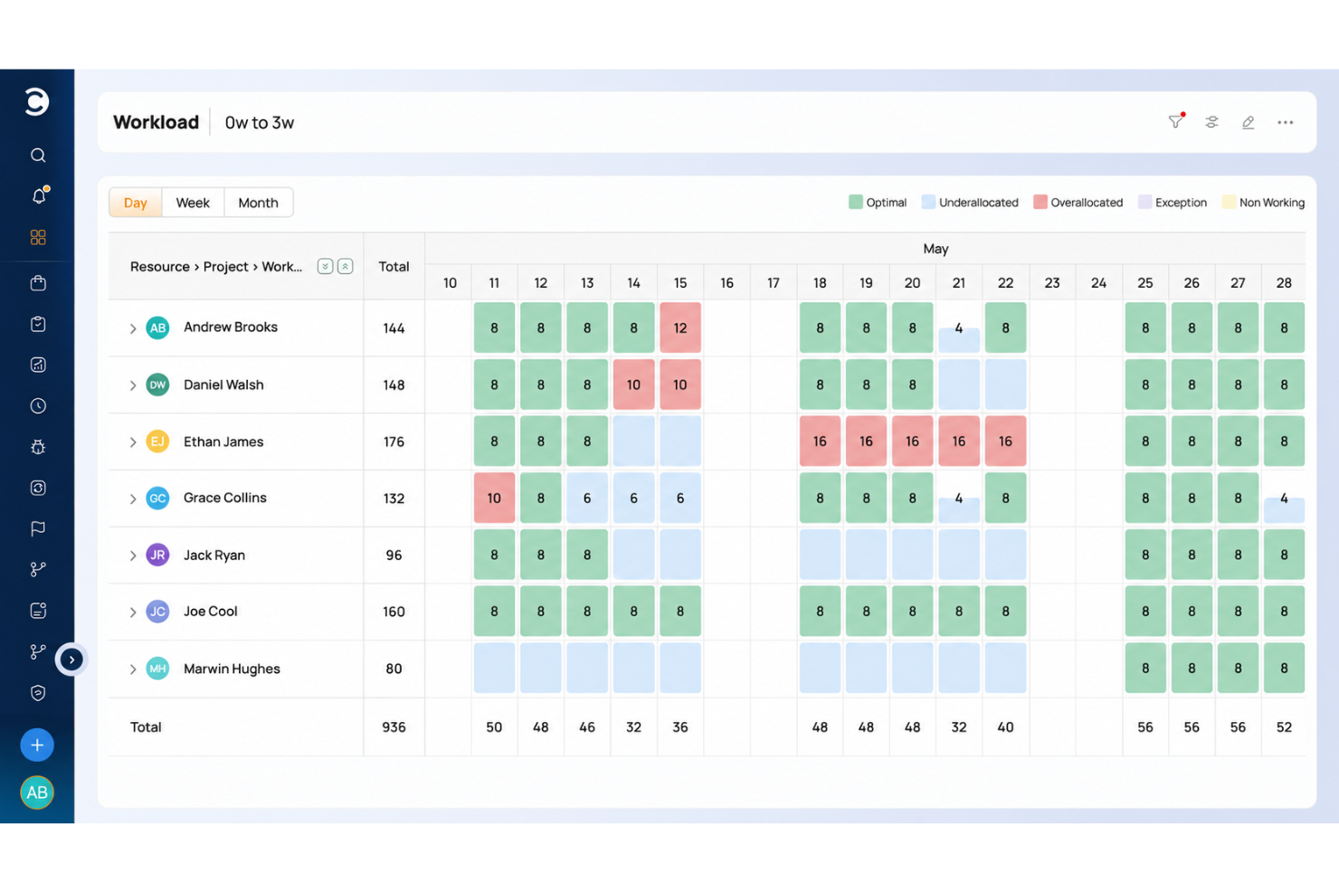
Celoxis is a project and portfolio management solution, with reporting tools that transform data into actionable insights. With its AI-powered reporting capabilities and intuitive simple command feature, Celoxis enhances how teams access and analyze critical project metrics. Users can instantly open dashboards or generate detailed reports by typing commands like, “Show project health dashboard” or “Generate resource utilization report.” This eliminates complex navigation, providing instant visibility into the metrics that matter most.
The platform’s AI-driven analytics deliver predictive insights by analyzing real-time and historical data to identify trends, flag risks, and recommend solutions before issues arise. Whether it’s forecasting potential timeline delays, resource conflicts, or budget overruns, Celoxis equips project managers with the intelligence needed to act proactively. Beyond prediction, its automation capabilities streamline routine reporting tasks, such as scheduling report deliveries and updating dashboards.
Celoxis’ customizable dashboards and reporting tools provide real-time updates on KPIs, project health, and portfolio performance. With advanced features like dynamic filtering, multi-level grouping, and drill-down capabilities, users can dive deep into data with ease. A diverse range of visualization options—bar, line, donut, and Gantt charts—ensures that complex information is presented clearly and intuitively, making it suitable for both detailed analysis and high-level executive reviews.
The platform also offers advanced features like earned value analysis (EVA) to measure cost and schedule performance, schedule projections to forecast variances, and automated alerts to keep stakeholders aligned.
Celoxis integrates with Zapier, Microsoft Teams, Slack, Excel, Google Drive, Microsoft Project, QuickBooks Online, Outlook, Salesforce, JIRA, Slack, Trello, and more.
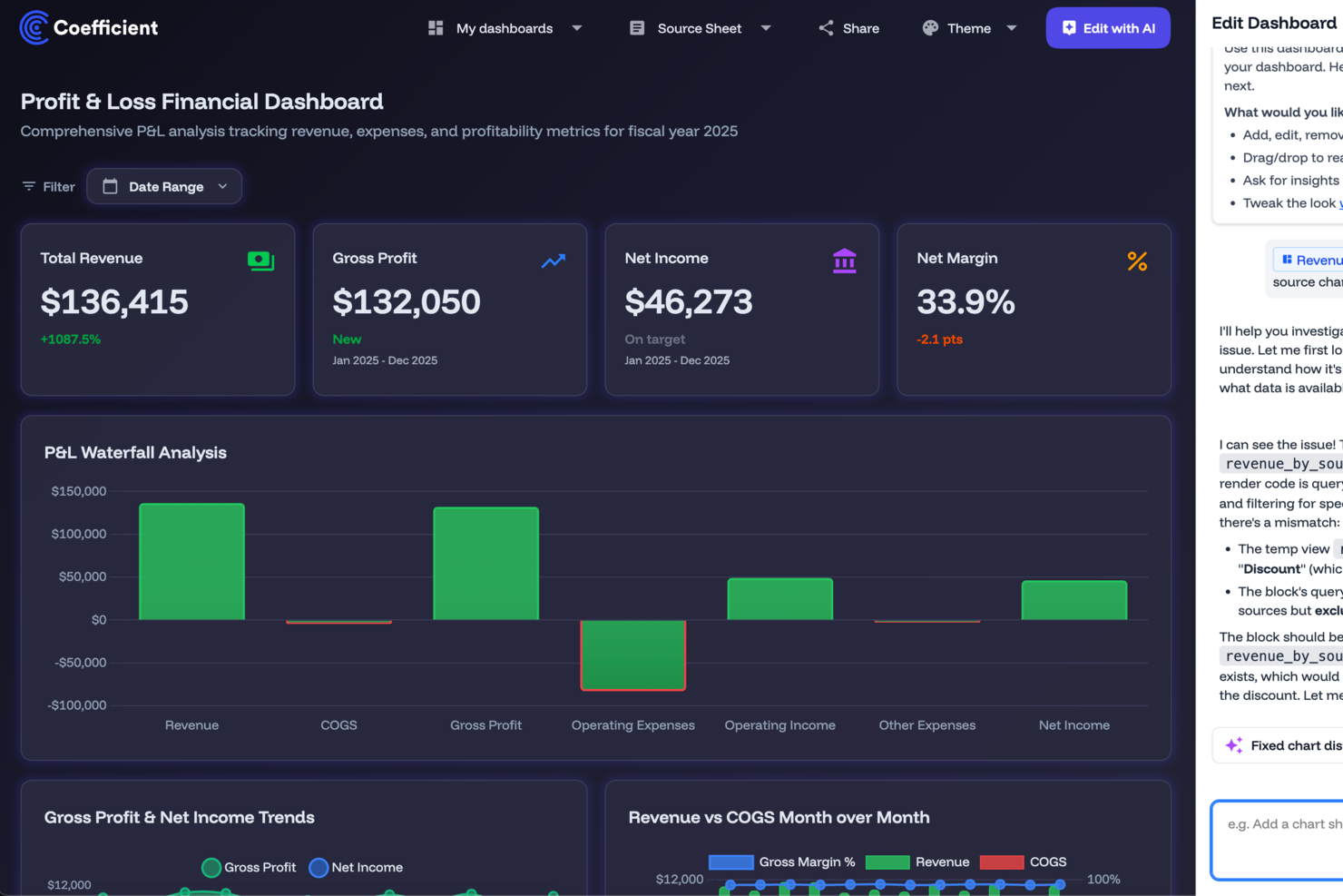
Coefficient connects your data sources directly to Google Sheets or Excel, offering an easy way to create live dashboards and analyses without the need for coding. This tool is particularly appealing to professionals in revenue operations, marketing, finance, and business intelligence who are looking to enhance their decision-making process and automate data integration. By providing AI-driven tools and pre-built resources, Coefficient addresses the challenges of managing vast amounts of data, making it easier to generate insightful reports.
Why I Picked Coefficient
I picked Coefficient for its ability to integrate Google Sheets and Excel with over 100 data sources, which is important for creating dynamic reports. The tool's AI-driven modeling allows you to perform forecasting directly from spreadsheets, enhancing your analytical capabilities. Additionally, Coefficient's customizable alerts via Slack or email ensure that you and your team are always updated on critical data changes. These features cater to the core needs of reporting tools users, making it a compelling choice.
Coefficient Key Features
In addition to its integration capabilities and AI modeling, I also found the following features valuable for reporting:
- Import agent: Connect spreadsheets to 100+ systems with one-click data imports.
- API agent: Build custom connectors for flexible data integration.
- Scheduled auto-refresh: Keep reports and dashboards automatically up to date.
- Shareable live dashboards: Turn spreadsheet reports into AI-powered dashboards for stakeholders.
Coefficient Integrations
Integrations include Salesforce, HubSpot, QuickBooks, Snowflake, BigQuery, Google Sheets, and Excel, with additional connections available through custom API integrations. Coefficient also supports connecting to any system with an API, offering flexibility beyond fixed connector catalogs.
Pros and Cons
Pros:
- Two-way data sync
- Creates no-code custom dashboards
- Allows advanced data modeling and forecasting
Cons:
- Advanced syncing requires higher-tier plans
- Dependence on Google Sheets and Excel
Zoho Analytics is an analytics and reporting tool to help you convert raw business data into comprehensive reports and dashboards. You can use it to collect, enrich, and filter data to make it easier to analyze. It has an AI assistant feature to help you generate insights, spot patterns, and forecast trends. Zoho Analytics has a mobile app version that works on iOS and Android.
Zoho Analytics lets you use charts, widgets, and pivot tables ensuring you can present data in the best possible way. Zoho Analytics allows you to collaborate with other users to build and share custom reports and dashboards. Its user permission settings give you control over who can view and edit your data according to need and/or authority.
Zoho Analytics cost starts at $24/month/up to 2 users. They offer a 15-day free trial.
Best reporting tool for integrating over 150 data sources

Supermetrics is a comprehensive reporting tool that simplifies the process of collecting, integrating, and analyzing marketing data from over 150 data sources. It enables businesses to streamline their data workflows by aggregating data from multiple sources into a single destination, making it easier to create cohesive and insightful reports.
One of the key features that make Supermetrics an excellent reporting tool is its ability to automate data transfers, reducing the time and effort required for manual data collection. Users can set up automated data refreshes, ensuring that their reports are always up-to-date with the latest data. This automation extends to scheduling regular data imports, allowing businesses to maintain consistent reporting schedules without manual intervention.
Additionally, Supermetrics offers powerful data transformation capabilities, enabling users to customize their data for specific reporting needs. The tool allows for filtering, combining, and modifying data before it reaches the final destination.
Its compatibility with various reporting platforms like Google Data Studio and Power BI also allows users to create detailed and visually appealing reports that provide deeper insights into their marketing performance.
Integrations include Google Analytics, Google Ads, Facebook Ads, Instagram Insights, LinkedIn Ads, Twitter Ads, Microsoft Advertising, HubSpot, Mailchimp, Shopify, YouTube, Bing Ads, Reddit Ads, Snapchat Ads, Pinterest Ads, Salesforce, Snowflake, and Amazon Ads.
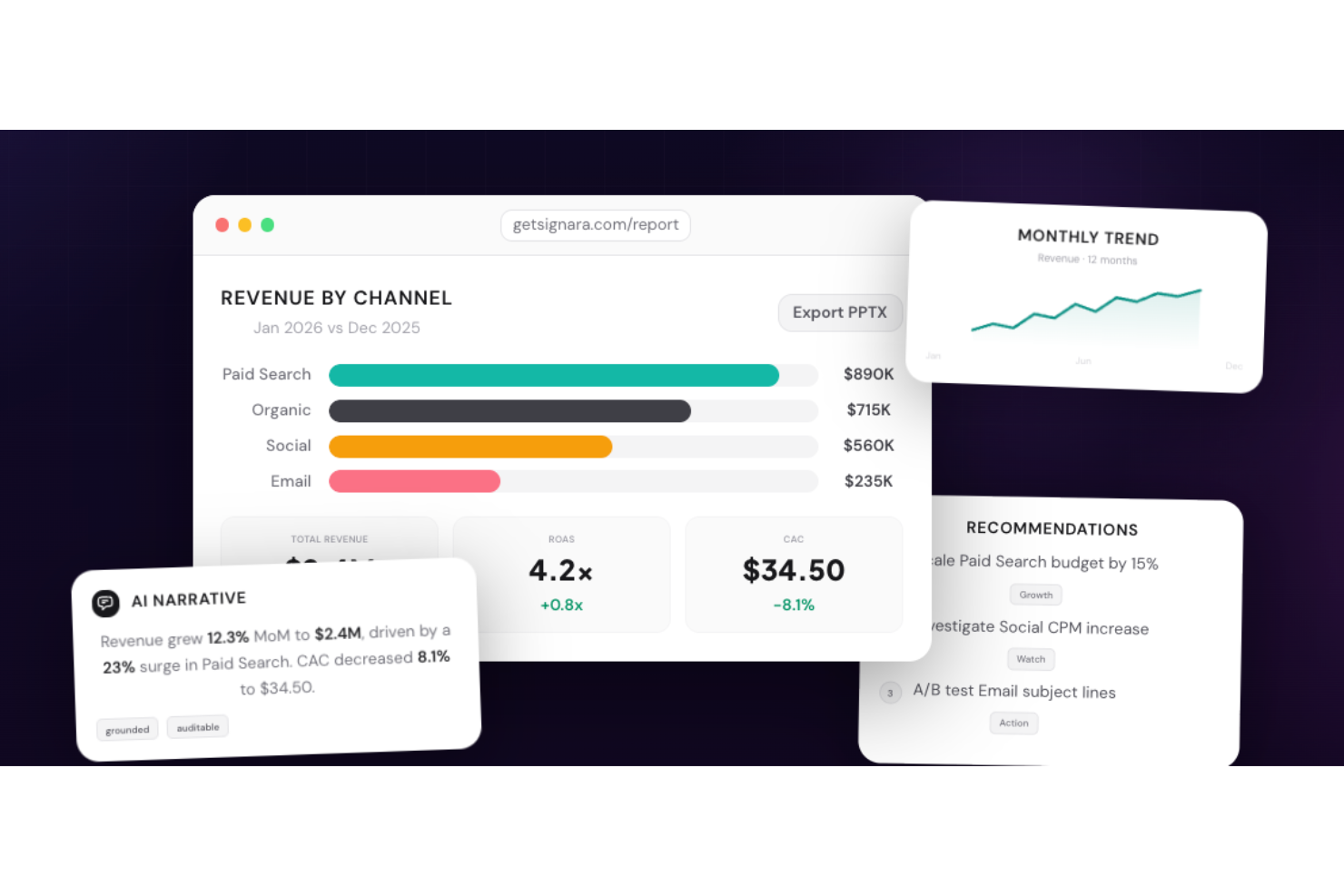
Signara is an AI-powered analytics reporting tool for marketing teams that automatically generates interactive dashboards and PPTX reports—complete with KPI calculations, driver analysis, and AI-written narratives—directly from connected data sources.
Who Is Signara Best For?
Signara is a good fit for marketing analysts and performance teams who need automated, presentation-ready reports without manual data wrangling.
Why I Picked Signara
I've included Signara in my top picks because its interactive dashboards make it easy to display any marketing KPI set in a format that's genuinely ready to share publicly. I can configure which metrics surface, how channels are grouped, and how period comparisons appear, so every display reflects the exact data story I want to tell. The AI-generated narratives also add context automatically, explaining what changed and why, which means public-facing dashboards don't just show numbers.
Signara Key Features
- PPTX report export: Generate a fully formatted, presentation-ready PowerPoint deck directly from your dashboard output in one click.
- Driver analysis: Signara's agent layer identifies what moved, why, and by how much across your marketing channels before the report is ever built.
- Deterministic KPI engine: Every metric is calculated using locked, auditable formulas in code, so no KPI is ever guessed or approximated.
- AI-generated recommendations: Alongside narrative summaries, Signara surfaces prioritized next steps, such as scaling a channel budget or investigating a CPM spike.
Signara Integrations
Signara offers native integrations with HubSpot, Snowflake, BigQuery, Databricks, PostgreSQL, MySQL, Google Sheets, and Google Analytics (GA4), and also supports drag-and-drop uploads for Excel and CSV files. An API is available for connecting additional data sources.
Pros and Cons
Pros:
- Reports generate without analyst involvement
- No raw data stored on platform
- AI narratives explain what changed and why
Cons:
- No mobile app for on-the-go access
- Limited to marketing and finance use cases
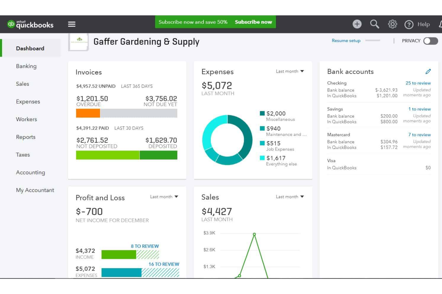
QuickBooks is an accounting solution that helps small businesses track their expenses, manage their invoicing, and report on their financials. The software tracks your transaction details, helping you keep accurate records. Based on the finances you track in the system, you can view how much you're spending in each expense category from your dashboard.
The platform offers a simple, low-cost expense reporting solution for small- and medium-sized businesses. Receipts are sorted automatically, and you can reclassify transactions in bulk. You can also generate invoices, and even set up recurring invoices for repeat clients or customers.
QuickBooks Online integrates with over 450 business apps like Square, Stripe, Paychex, Insightly CRM, Mailchimp, Shopify, eBay, BigCommerce, Magento, Squarespace, Etsy, Katana, and ProjectWorks. Pricing starts from $30 per month, and a 30-day free trial is available.
New Product Updates from QuickBooks Online

QuickBooks Adds AI Bank Feeds, Payroll Tools, and Built-In Time Tracking
QuickBooks has added AI bank feed updates, payroll tools, and built-in time tracking to improve accounting workflows. These updates help users review transactions, manage payroll, and track employee time faster. For more information, visit QuickBooks’ official site.
DashThis
Unlimited users, data sources, and integrations in all plans.

DashThis is an automated marketing reporting tool that lets you bring multiple platforms into one, co-create powerful dashboards, and automate their delivery. The features included in the product can help anyone from freelancers to world-renowned agencies like DDB.
The first thing I immediately liked about this product is that all their plans have unlimited users, data sources, and integrations. The difference comes in the number of dashboards you can create and the level of customization in white-label reports.
Since reporting can be one of our most time-consuming activities, DashThis has prepared a bunch of templates that help you get started right away. You just have to select the template you prefer, plug in your data, and run the report on your preferred time periods. Once you find your perfect report, you can clone it, export it, or generate and share it automatically via email to your clients every month.
DashThis has over 34 useful integrations that will help you bring all your marketing data into one place and extract comprehensive reports. These integrations include social media platforms, Google Analytics, SEMrush, Mailchimp, Perfect Audience, TikTok Ads, and more.
DashThis starts at $38/month (paid annually) for 3 dashboards and comes with a free 15-day trial (10 dashboards).
New Product Updates from DashThis

DashThis Launches Shopify Integration in Beta
DashThis’s Shopify integration is now available to all users in beta, adding Shopify metrics, dimensions, and preset widgets to report on ecommerce performance alongside other marketing channels. For more information, visit DashThis's official site.
 .
.
MeisterTask is a task and project management tool designed primarily for agile teams. The tool offers a variety of reporting features for monitoring team productivity, as well as custom dashboards and the ability for team members to create personal agendas organized to fit their way of working. MeisterTask is intuitive and simple to use, with a clean interface
Users can view progress reports, time reports, and safety reports. View and download reports showing tasks that are completed, overdue, or upcoming. Project managers and team leads can also get reports on how much time team members are tracking, as well as reports related to data security, privacy, and compliance.
MeisterTask integrates with sister software MindMeister as well as Gmail, Outlook, Slack, Microsoft Teams, GitHub, Zendesk, Google Drive, and more.
MeisterTask costs from $8.25/user/month. They also offer a freemium plan.

Tableau is a visual analytics platform for exploring, understanding, and managing business data. It uses a drag and drop method to create reports using the available data visualizations and widgets.Tableau uses interactive data visualizations so you can create visually-compelling reports that viewers can click to explore.
If you need to build powerful dashboards quickly, Tableau is the best reporting tool for you because of its embedded analytics features. The embedded analytics are customizable through an API so you can insert data collection and reporting functionality into your pre-existing workflow. This can also help you personalize your customers’ data experience.
Tableau integrates with other business tools, including Google Cloud, Microsoft SQL Server, Google Sheets, Hive, and SAP.
Tableau pricing starts at $12/user/month, and they offer a 14-day free trial.
Other Dashboard Reporting Tools
Here are a few more auto-reporting tools that didn’t make the top list. If you need additional suggestions for the handy ad hoc report tool, check these out.
- Reportei
For quickly generating digital marketing dashboards and reports
- Adverity
For BI tool integration
- Whatagraph
Reporting tool for marketing agencies
- Xero
For reporting on project quotes, time, and financials
- Jira
Reporting tool for agile teams
- Office Timeline
For easy PowerPoint reports
- Google Data Studio
For sharing & collaboration
- Power BI for Office 365
Reporting platform for scaling organizations
- ThoughtSpot
Reporting tool for beginners
- SegMetrics
Reporting tool for marketing and sales teams
- Octoboard
Reporting software for automated reporting
- FanRuan Software
Reporting software for enterprises
- Rippling Spend
For expense reporting
- ClickUp
Reporting dashboards that promote collaboration
- Hive
Reporting tool with interactive dashboards
- Wrike
For collaboration on project reporting
- Bonsai Agency Software
For real-time agency performance reporting
- Smartsheet
Connect and integrate with tools and apps you already use to glean real-time insights into the work that teams are doing across the organization.
- Mixpanel
Behavioral analytics tool to analyze website site user engagement, monitor KPIs, and easily generate reports.
- Sisense
API-first cloud technology with interactive dashboards, self-service analytics, and white-labeled BI apps for your use.
- Planview AdaptiveWork
Capture and track all your project and team data in real-time, including effort, status, issues, and change requests.
- Klipfolio
Connect hundreds of data sources, including spreadsheets, files, databases, and web services applications to build data visualizations.
- Domo
Works with your data lakes, data warehouses, ETL tools, and more, to deliver data insights with built-in collaboration and productivity tools.
- Funnel
Automatically collect all the data you need from any data source and feed it directly to your data warehouse, dashboard solution, or any other tool you’re using.
- Looker
Connect with Redshift, Snowflake, BigQuery, as well as 50+ supported SQL dialects to build embedded visualizations and data science workflows.
- Qlik
Combines all your data and makes it analysis-ready for everyone to freely explore, amplified by machine intelligence for better results.
- Supermetrics
Centralize all your marketing data in their marketing data warehouse, build dashboards and reports with ad-hoc analysis.
- Board
Explore your data, run effective analysis, build interactive dashboards, and create impactful reports.
- TapClicks
Marketing report tool (TapReports) and marketing performance analytics (TapAnalytics) with a clean, streamlined UI.
- ProWorkflow
Reporting software for graphical data reports


How I Evaluate Reporting Tools
I split my evaluation into baseline criteria every tool must meet—like multi-source connectivity and scheduled delivery—and differentiators that separate a good fit from the right fit for your team.
Core Functionality (Table Stakes for This List)
These core capabilities serve as the acceptance criteria for inclusion on my list of reporting tools:
- Multi-Source Data Connectivity: I check whether a tool connects natively to the databases, warehouses, and SaaS apps your data actually lives in—think Snowflake, Google Sheets, or Salesforce.
- Report Building & Design: Whether it's a drag-and-drop builder or a SQL-driven interface, I look for flexible layout control and reusable templates for recurring deliverables.
- Interactive Dashboards & Visualizations: I evaluate chart variety, cross-filtering, and drill-down depth—things like clicking a revenue bar to see the deals behind it.
- Scheduled & Automated Distribution: I look for the ability to schedule reports and push them to stakeholders via email, Slack, or shared links without manual intervention.
- Data Transformation & Calculations: Calculated fields, joins, and custom metrics matter. I check whether you can blend sources and define formulas directly in the reporting layer.
- Export & Sharing Options: I evaluate format support (PDF, Excel, CSV), permission controls, and whether you can share reports externally with clients or leadership.
I rank each vendor on a scale from 0 (does not offer the functionality) to 5 (excels in this area) for each criterion.
Vendors need to achieve a minimum average score to be considered for inclusion on my list. From there, I consider what sets each platform apart.
Differentiating Factors (What Sets Vendors Apart)
Once I've curated my list, here's how I contrast and compare different vendors in the reporting tools space:
Standout Features
I look for AI-powered features that let users surface trends or generate narrative insights directly from their data—especially helpful for executive summaries. Embedded analytics is another key differentiator, since some teams need to share dashboards in customer portals or partner systems via secure embedding. For teams with significant compliance needs, I pay attention to semantic layer support and data governance tools, making sure reports always align with certified definitions and metrics.
Beyond Features
Integration ecosystem matters a lot here—I check whether a tool connects natively with the warehouses and business apps your team already relies on, like Snowflake, Salesforce, or NetSuite. Pricing structure is equally important, especially how a vendor handles creator versus viewer licenses, since reporting tools often serve a small group of builders and a much larger audience of consumers. I also evaluate security posture, looking for SOC 2 Type II certification, row-level security, and SSO support—table stakes for any team handling sensitive financial or operational data.
How to Choose Reporting Tools
It’s easy to get bogged down in long feature lists and complex pricing structures. To help you stay focused as you work through your unique software selection process, here’s a checklist of factors to keep in mind:
| Factor | What to Consider |
| Scalability | Ensure that the tool can grow with your business. Look for options that handle increasing data volumes and user counts without slowing down. |
| Integrations | Check if the tool integrates seamlessly with your existing systems like CRMs, ERPs, or project management software. |
| Customizability | Assess how much you can tailor reports, dashboards, and metrics to fit your team’s unique workflows and KPIs. |
| Ease of Use | Look for an intuitive interface that lets your team generate insights quickly without extensive training or technical support. |
| Budget | Compare pricing structures to your budget. Watch for hidden costs like additional charges for more users, data storage, or advanced features. |
| Security Safeguards | Confirm the tool includes encryption, user access controls, and compliance with regulations like GDPR to protect sensitive data. |
| Support | Evaluate the level of customer support available, such as 24/7 assistance or dedicated account managers for troubleshooting and training. |
| Data Visualization | Look for visualization options like charts, graphs, and dashboards that make data easy to interpret and actionable for your team. |
Trends in Reporting Tools for 2026
In my research, I sourced countless product updates, press releases, and release logs from different reporting tool vendors. Here are some of the emerging trends I’m keeping an eye on:
- AI-Driven Insights: Tools are using AI to analyze data patterns and suggest actionable insights, saving users time and helping them make better decisions. For example, some tools flag anomalies in financial reports or recommend metrics to track based on historical data.
- Natural Language Querying: Users can now ask questions in plain language to generate reports. This makes reporting accessible to non-technical team members. For instance, a user might type “What were sales last quarter?” and instantly get a charted answer.
- Embedded Analytics: More tools are offering embedded analytics so businesses can integrate reports directly into their own software or customer portals. This is useful for SaaS companies providing analytics to their clients.
- Data Storytelling Features: Tools are adding features to turn raw numbers into narratives with automated captions and highlights. This helps teams share findings more effectively during presentations or updates.
- Data Privacy Enhancements: Vendors are building more privacy controls to meet stricter regulations like GDPR and CCPA. For example, some tools now offer data anonymization or limit access to sensitive metrics based on user roles.
These trends aren’t limited to standalone reporting platforms; many are making their way into other software categories as well. For instance, visual project management software is increasingly integrating advanced reporting capabilities like real-time dashboards, AI-generated insights, and customizable data visualizations to help teams track project performance more intuitively.
What are Reporting Tools?
Reporting tools are software that help businesses collect, process, and present data in an organized and understandable format. They pull data from various sources, like databases and spreadsheets, and turn it into reports that display trends, patterns, and insights. These reports can be in the form of tables, charts, graphs, and dashboards, making complex data easier to understand at a glance.
Reporting software is invaluable for decision-making, as it provides managers and stakeholders with the information needed to understand performance, identify areas for improvement, and plan future actions, which can mean more informed strategies, efficient operations, and a stronger bottom line.
Features of Reporting Tools
When selecting reporting tools, keep an eye out for the following key features:
- Customizable dashboards: Allow you to organize and display the data most relevant to your team in a format that suits your workflow. For branded customization with minimal coding, check out white label dashboard tools.
- Real-time reporting: Updates reports automatically as new data comes in, helping you make decisions based on the most current information.
- Data visualization options: Provides charts, graphs, and heatmaps to make complex data easier to interpret and share with stakeholders.
- Scheduled reports: Lets you automate report generation and delivery, saving time and ensuring consistent updates for your team.
- Role-based access controls: Restricts access to sensitive reports or data based on user roles to enhance security and compliance.
- Drill-down capabilities: Enables you to click into specific metrics for deeper insights, helping you understand what’s driving the numbers.
- Multi-source integration: Combines data from various platforms and tools into a single report for a more comprehensive view.
- Export options: Lets you export reports in different formats like PDF, Excel, or CSV for easy sharing and further analysis.
- Trend analysis tools: Highlights patterns in your data over time, helping you predict future outcomes and plan accordingly.
- Annotation tools: Allows users to add comments or notes directly on reports for better collaboration and context sharing.
Benefits of Reporting Tools
Implementing reporting tools provides several benefits for your team and your business. Here are a few you can look forward to:
- Improved decision-making: Gives your team real-time insights and clear visuals to base decisions on accurate, up-to-date data.
- Time savings: Automates report generation and data updates, freeing up time for other important tasks.
- Better collaboration: Lets teams share dashboards and add comments directly on reports, making it easier to align on key insights.
- Increased data accuracy: Reduces manual data entry and calculation errors by pulling information directly from integrated systems.
- Enhanced accountability: Tracks key performance indicators and assigns responsibility with metrics that are easy to monitor and report.
- Faster trend identification: Analyzes patterns in your data to help you spot opportunities and challenges early.
- Scalable reporting: Adapts to your growing needs, allowing you to handle larger datasets and more complex analyses over time.
Costs & Pricing for Reporting Tools
Selecting reporting tools requires an understanding of the various pricing models and plans available. Costs vary based on features, team size, add-ons, and more. The table below summarizes common plans, their average prices, and typical features included in reporting tool solutions:
Plan Comparison Table for Reporting Tools
| Plan Type | Average Price | Common Features |
| Free Plan | $0 | Basic reporting, limited dashboards, data export in CSV, and single-user access. |
| Personal Plan | $5-$25/user/month | Advanced dashboards, customizable templates, email reporting, and priority support. |
| Business Plan | $30-$75/user/month | Multi-user access, role-based permissions, integrations with popular tools, and trend analysis. |
| Enterprise Plan | $100+/user/month | Unlimited users, advanced analytics, API access, custom branding, and dedicated support. |
Reporting Tools Frequently Asked Questions
Find answers to common questions other people ask about this topic.
What are the types of reporting tools?
There are many types of reporting tools, such as dashboard software, data visualization software, scorecard tools, and ad-hoc report writers.
Dashboard software lets you put the reports that matter most to you front and center. Data visualization software turns data into something visually-oriented that users can easily read.
Then, scorecarding tools are all about performance data. Therefore you know who your high achievers are. Lastly, ad-hoc report writers create various styles of in-the-moment reports for companies that have ever-changing needs.
What is business intelligence software?
BI software is a critical tool for gathering raw data, analyzing it, and presenting it in a user-friendly way to support informed decision-making. BI software aggregates and processes data from various sources, offering project managers a comprehensive and cohesive view of project performance. It enables them to identify trends, monitor key performance indicators (KPIs), and make data-driven decisions that contribute to the successful execution of projects.
Not looking for report software at the moment?
Check out our other lists of other project management tools you might find useful:
- Look at project portfolio management tools. They can help you conduct and communicate your reports on a higher level and across projects.
- Communication, communication, communication. If you haven’t nailed this, you can’t really get started on anything else. Try these 10 Best Communication Tools & Software.
- Find a project reporting tool within other software, such as my list of the best marketing project management software.
What’s Next:
If you're in the process of researching reporting tools, connect with a SoftwareSelect advisor for free recommendations.
You fill out a form and have a quick chat where they get into the specifics of your needs. Then you'll get a shortlist of software to review. They'll even support you through the entire buying process, including price negotiations.