Ultimate Guide To Burndown Charts: How To Create Them

Burndown charts are an excellent and straightforward way to monitor your team’s progress during a project. This tool is widely used in agile development and Scrum methodologies and can be used to track progress visually, thus making it easier for teams to communicate with stakeholders and make informed decisions.
In this ultimate guide, I’ll be exploring everything you need to know about burndown charts and how to make them effortlessly.
What is a Burndown Chart?
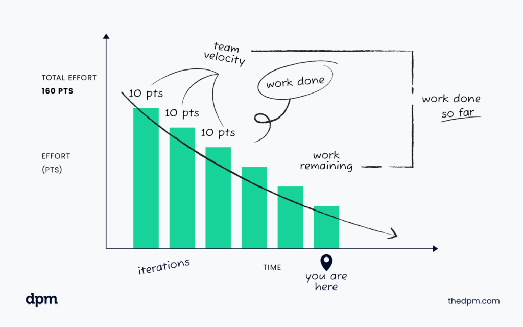
A burndown chart is a tool that enables you to plot the progress of project tasks (such as user stories) against a set timeline.
Depending on your chosen metric, it tracks the number of tasks or the number of story points remaining in your project or product backlog against the time remaining, and shows how quickly your team is progressing.
Burndown charts typically go from top to bottom, with the Y-axis showing the total number of remaining tasks while the X-axis shows the progress timeline. At the start of the project (ie. at your starting point in the chart), the graph should show a declining diagonal line until the project is complete.
Burndown charts are commonly used in agile software development methodologies such as Scrum and Kanban. They are a visual representation of the team's progress during a pre-defined iteration cycle like a release or sprint and are used to help the team stay on track and meet their project deadlines.
The chart can be updated daily or weekly, depending on the project's timeline, and can be used to identify any potential roadblocks or delays in the project. Scrum masters usually automate this workflow by using software solutions like Jira, which you find tips and tricks for here.
One of the benefits of using a burndown chart is that it provides transparency to the entire Scrum team including developers, the Scrum master and the product owner.
Everyone can see the progress being made and can identify any areas where they may need to focus their efforts. It also helps to keep the team motivated as they can see the progress they are making and the tasks they have completed.
Another advantage of using a burndown chart is that it provides a clear picture of the project's timeline. It can help development teams to identify any potential delays and to adjust their approach accordingly.
For example, if the chart shows that the team is falling behind schedule, they may need to increase their efforts or adjust their priorities to ensure that they meet their deadlines.
Burndown Charts vs Burnup Charts
Although burndown charts and burnup charts have similar applications, they have some differences.
A burnup chart tracks the cumulative progress of completed work, while a burndown chart tracks the total amount of work remaining against the projected timeline. Burndown charts are commonly used in Scrum projects, while burnup charts are mostly used in the Lean methodology.
When it comes to burndown charts, the focus is on how much work is left to be completed within a given time frame. This allows project managers to identify potential roadblocks and adjust the team's strategy accordingly.
Burndown charts can also be used to track the progress of individual team members, which can help identify areas where additional training or support may be needed.
On the other hand, burnup charts focus on the amount of work that has been completed over time. This allows project managers to see how much progress has been made and whether the team is on track to meet its goals.
Burnup charts can also be used to identify potential areas of improvement, such as bottlenecks in the production process or areas where additional resources may be needed.
While both burndown and burnup charts can be useful tools for project management, the choice of which chart to use will depend on the specific needs of the project. For example, if the project is focused on completing a specific set of tasks within a given timeframe, a burndown chart may be the best choice.
However, if the project is focused on measuring progress over time, a burnup chart may be more appropriate.
Ultimately, the key to successful project management is to choose the right tools and methodologies for the job at hand. By understanding the differences between burndown and burnup charts, project managers can make informed decisions about which chart to use and how to use it to achieve their goals.

How To Read a Burndown Chart
Reading a burndown chart may seem complicated, but it’s relatively easy to understand. At every point of the timeline, the burndown chart shows the remaining tasks in the project sprint and how it should look if the team continues to work at their current pace.
The perfect lines indicating total ideal progress and actual team progress to date are regularly used to determine if the team is ahead or behind schedule.
One key thing to remember when reading a burndown chart is that it is a tool used to track progress and identify potential issues. It is not a measure of individual performance or a way to assign blame. Instead, it is a way to help the team work together to achieve their goals.
There are two types of burndown charts, namely:
- Sprint burndown chart: These charts show the progress of a team for a particular sprint. Sprint burndown charts are often used in agile development methodologies like Scrum. They are an essential tool for tracking progress and ensuring that the team is on track to meet their sprint goals.
- Release burndown chart: These charts track the progress of a project over a more extended period, often an entire release cycle. Release burndown charts are useful for identifying trends in the team's progress and can help to identify potential issues early on in the project.
When reading a burndown chart, it's essential to pay attention to the trends. If the team is consistently behind schedule, it may be time to reevaluate the project timeline or adjust the team's workload. Similarly, if the team is consistently ahead of schedule, it may be time to take on additional tasks or increase the project's scope.
Another important thing to keep in mind when reading a burndown chart is that it is just one tool in the project management toolbox. While it can be a useful way to track progress, it should not be the only way that progress is measured.
Other tools, like daily stand-up meetings and project retrospectives, can help to provide a more complete picture of the team's progress and identify areas for improvement.
3 Examples of Burndown Charts
When it comes to agile project management, burndown charts are an essential tool. They provide a visual representation of the team's progress and help identify potential roadblocks in the project timeline.
Here are three examples of burndown charts that’ll give you an idea of how they appear and their practical use.
Efficient Sprint Burndown Chart
This sprint burndown chart shows a typical result on an agile project that goes according to plan. The chart displays consistent progress, with the team completing all their project tasks in due time before the last day of the sprint.
It's worth noting that this type of burndown chart is the ideal scenario for any agile team. However, it's not always possible to achieve such consistent progress. The team members must work together to ensure that they stay on track and complete their tasks within the given timeline.
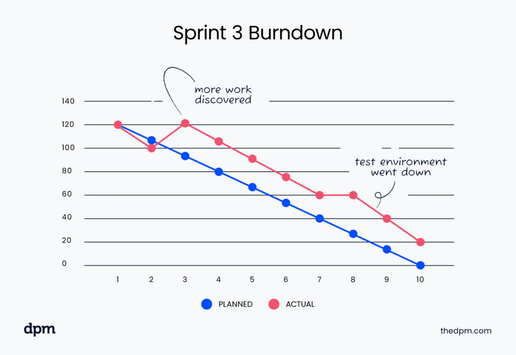
Inefficient Sprint Burndown Chart
This chart displays a sprint that didn't go well since the team was not able to complete the work in time.
It's not uncommon for agile teams to face roadblocks and challenges during a sprint. In this particular case, the team was not able to complete their tasks within the given timeline. It's crucial for the team members to identify the cause of the problem and work together to find a solution.
Release Burndown Chart
This chart shows a situation where a team had to complete a project within seven sprints. The first three sprints show that the team had a slow start, but progress picks up in the second half of the project timeline.
The team has to pace themselves to ensure that they complete their tasks within the given timeline. In this particular case, the team had a slow start, but they were able to pick up the pace and complete their tasks within the given timeline.

When To Use a Burndown Chart
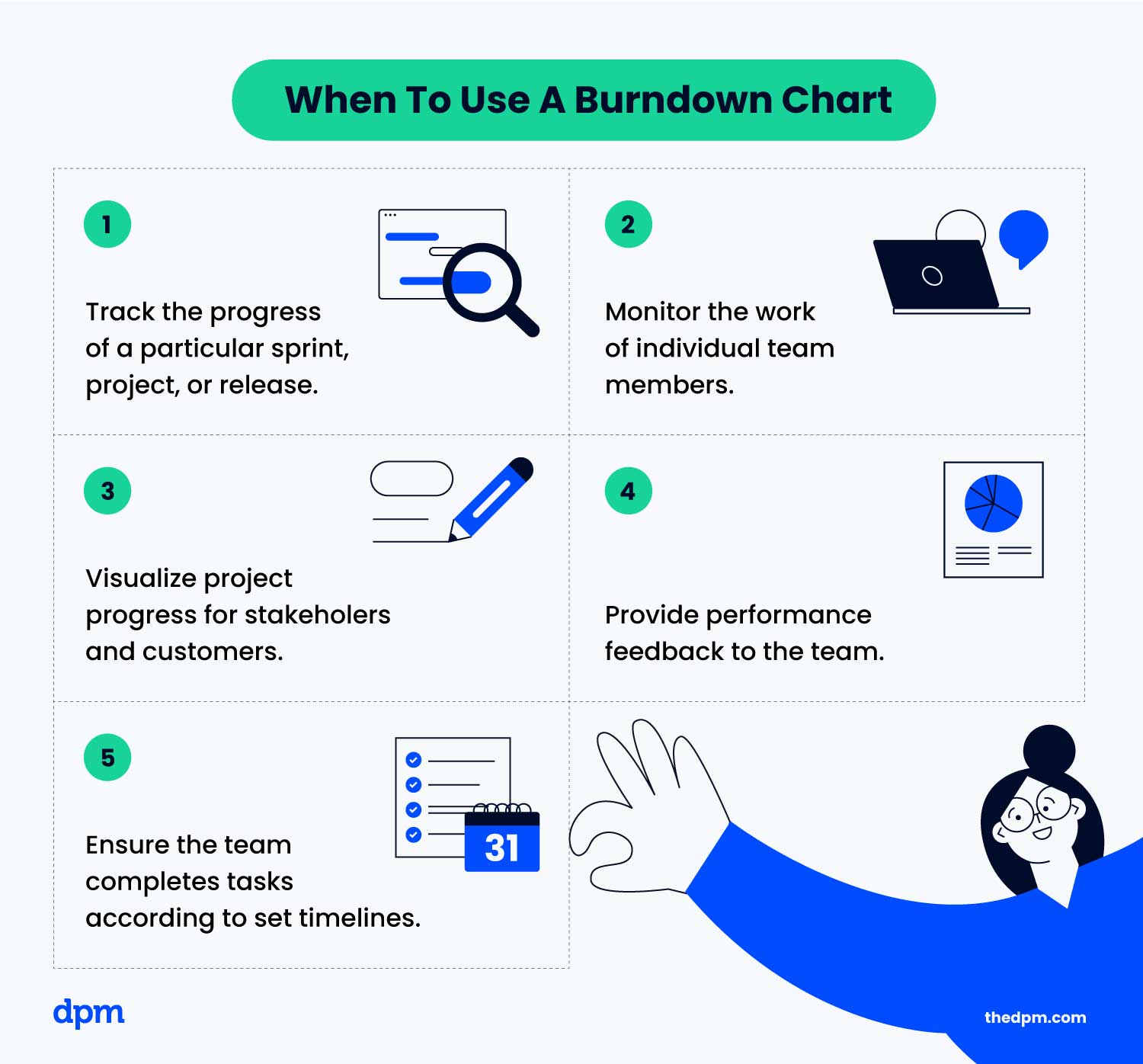
Burndown charts are a great way to track progress, but they are most effective when applied appropriately. Use them when you want to:
- Track the progress of a particular sprint, project, or release
- Monitor the work of individual team members
- Visualize project progress for stakeholders and customers
- Provide performance feedback to the team
- Ensure the team completes tasks according to set timelines
How To Create A Burndown Chart
Creating a burndown chart might seem complicated, but it’s not. Here are the steps:
- Setup the axes: On the vertical axis (Y-axis), plot the number of tasks remaining. Add dates or time left in the project on the horizontal axis (the X-axis).
- Add the ideal work remaining line: Plot an ideal line showing how the remaining tasks should be tracking against time.
- Add actual work line: Add the actual team's progress so far, with a solid line.
- Add the legend: Add a legend explaining which one is the actual and ideal line by using different colors.
- Customize: Customize the chart based on your design preferences.
6 Benefits of Burndown Charts
Burndown charts provide a plethora of benefits, namely:
- Real-time monitoring of project progress
- Visualize sprint progress, release progress, and project progress
- Facilitates accurate planning and decision-making
- Allows the team to identify problems early and find solutions more efficiently
- Provides an easy way to track the progress of individual team members
- Facilitates communication between the team, customers, and stakeholders
3 Drawbacks of Burndown Charts
Despite their benefits, burndown charts have some limitations, namely:
- The accuracy of the chart is based on initial estimations, which may not be entirely correct.
- The chart doesn't account for unexpected issues like bugs, sudden changes from stakeholders, or delayed deliverables from third-party entities, also known as scope creep.
- The burndown chart may only reflect a portion of the project, often a specified duration, and may not provide a comprehensive overview of the entire project.
Ready To Track Your Project Progress?
As you can see, burndown charts are a valuable tool for your team and should never be overlooked. With all the best practices and techniques included in this guide, you’re now ready to successfully start using these charts to estimate work and improve your efficiency in no time!
Keeping close track of your project’s progress will provide more accurate results and ensure that everyone involved is on the same page. What are you waiting for? Join us today and subscribe to The Digital Project Manager newsletter.
