10 Best Open Source Reporting Software Reviewed In 2026

10 Best Open Source Reporting Software Shortlist


Open source reporting software allows you to create and distribute interactive reports with ease. With my extensive background in managing digital projects and a deep familiarity with a wide range of productivity tools, I've sifted through the options to find the best for you. Here are my picks for the best open source reporting software.
Why Trust Our Software Reviews
We’ve been testing and reviewing project management software since 2012. As project managers ourselves, we know how critical and difficult it is to make the right decision when selecting software.
We invest in deep research to help our audience make better software purchasing decisions. We’ve tested more than 2,000 tools for different project management use cases and written over 1,000 comprehensive software reviews. Learn how we stay transparent & our software review methodology.
Table of Contents
- Best Open Source Reporting Software Shortlist
- Why Trust Us
- Compare Specs
- Reviews
- Other Open Source Reporting Software
- Related Open Source Software Reviews
- Selection Criteria
- How to Choose
- Trends in Open Source Reporting Software
- What is Open Source Reporting Software?
- Features
- Benefits
- Costs & Pricing
- FAQs
Best Open Source Reporting Software Summary
| Tool | Best For | Trial Info | Price | ||
|---|---|---|---|---|---|
| 1 | Best for workflow-based data analysis | Free plan available | From $19/month | Website | |
| 2 | Best for real-time monitoring dashboards | Free plan available | From $19/month | Website | |
| 3 | Best for Java environment integration | Free demo + trial available | Pricing upon request | Website | |
| 4 | Best for custom data visualization | Not available | Free download available | Website | |
| 5 | Best for scalable data exploration | Free to download | Free and open-source | Website | |
| 6 | Best for personal database needs | Not available | Free to use | Website | |
| 7 | Best for user-friendly data analytics | Free plan available | From $100/month (billed monthly) + $6/user/month | Website | |
| 8 | Best for querying and visualizing data | Not available | Pricing upon request | Website | |
| 9 | Best for ad-hoc reporting | Free plan + free demo available | From $4,385/server (one-time purchase) | Website | |
| 10 | Best for self-service BI reporting | Free demo available | Free download available | Website |
-

Accelo
Visit WebsiteThis is an aggregated rating for this tool including ratings from Crozdesk users and ratings from other sites.4.4 -
Celoxis
Visit WebsiteThis is an aggregated rating for this tool including ratings from Crozdesk users and ratings from other sites.4.4 -
Wrike
Visit WebsiteThis is an aggregated rating for this tool including ratings from Crozdesk users and ratings from other sites.4.3


Best Open Source Reporting Software Reviews
Check out my detailed reviews of leading open source reporting software, where we dissect the advantages and limitations of each platform. Here are in-depth feature breakdowns and insights to determine the ideal tool for your reporting needs.
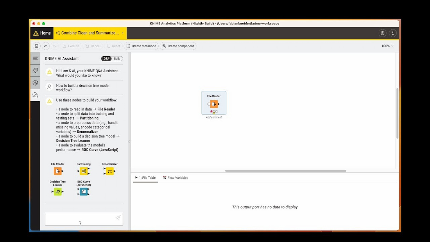
KNIME is the tool I recommend when teams want complete flexibility in building and automating workflow-based data analysis, especially for open source projects that involve reporting. What sets KNIME apart is how you assemble data pipelines visually, with nodes for imports, transformations, calculations, and custom visualizations.
I like how you can connect multiple data sources, handle advanced analytics, and output shareable, configurable reports without relying on code. KNIME works best for teams with complex or evolving analytics needs who want to keep everything open and reproducible.
KNIME’s Best For
- Data analysts who need to build custom reporting workflows
- Teams working with complex, multi-source analytics projects
KNIME’s Not Great For
- Non-technical users who want out-of-the-box reports
- Teams looking for simple, prebuilt reporting templates
What sets KNIME apart
KNIME stands out by letting you design analysis and reporting workflows visually, node by node, instead of relying on code or prebuilt templates like Metabase or Google Data Studio. You connect sources, transformations, and outputs in a modular interface that feels closer to building a flowchart than writing scripts. This works best when you want granular control over every step of the process and need to piece together custom analytics that would be difficult in a typical BI dashboard or spreadsheet tool.
Tradeoffs with KNIME
KNIME optimizes for workflow flexibility and customization, but you lose the quick set-up and low barrier to entry that dashboard tools like Metabase offer. In practice, setup and maintenance take longer, which can slow teams that want to move fast with ready-made reports.
Pros and Cons
Pros:
- Strong support for collaboration and sharing
- Extensive analytics and machine learning features
- Comprehensive data blending capabilities
Cons:
- Limited real-time analytics capabilities
- Steeper learning curve for advanced features
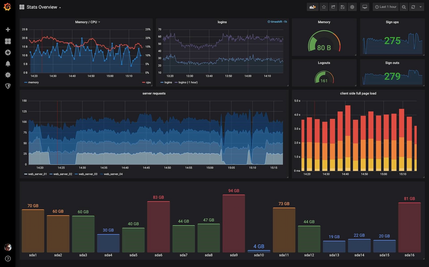
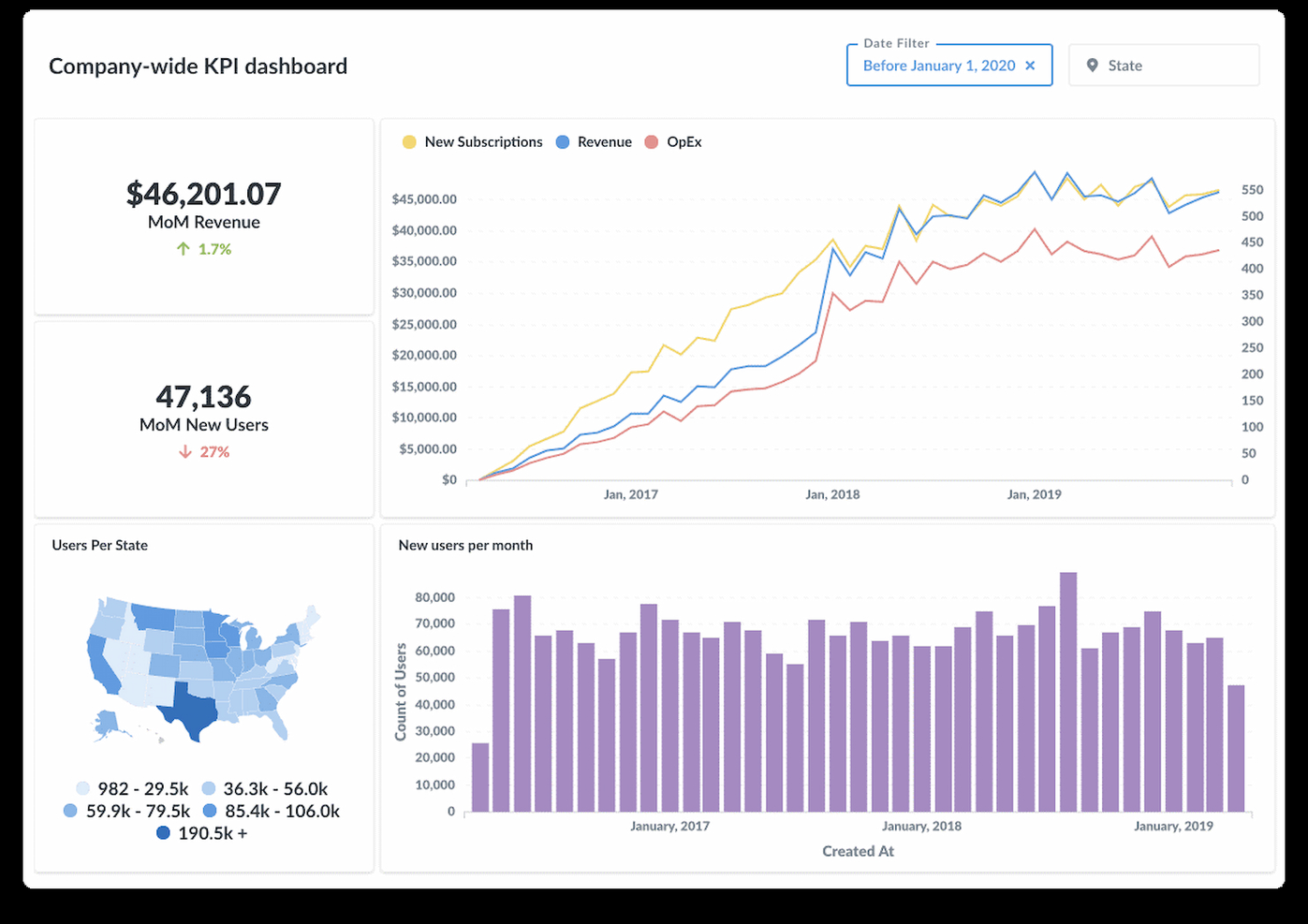
Grafana Cloud makes my list for its focus on real-time data visualizations and flexible dashboards built for technical teams. I've seen teams use it to monitor diverse data streams like application metrics, infrastructure health, and business KPIs—all in a single pane.
What I appreciate is how you can visualize live data, set up tailored alerting, and slice custom time ranges for fast diagnostics. It's my pick when you need immediate insights and configurable reporting that adapts as your environment changes.
Grafana Cloud’s Best For
- Technical teams monitoring real-time metrics and infrastructure health
- Organizations needing custom, interactive reporting dashboards
Grafana Cloud’s Not Great For
- Non-technical users needing simple reporting templates
- Teams wanting built-in, out-of-the-box business reports
What sets Grafana Cloud apart
Grafana Cloud focuses on giving you highly customizable dashboards to track metrics as they happen. Unlike Google Data Studio or Tableau, which are built around static business reports, I find Grafana expects you to treat monitoring as a living process. This tool works best when you want real-time signals and flexible configuration, not just periodic reporting snapshots.
Tradeoffs with Grafana Cloud
Grafana Cloud optimizes for technical flexibility and live data, but that means non-technical users often struggle to build or interpret reports. In practice, teams without dedicated data engineers can be slowed by the learning curve.
Pros and Cons
Pros:
- Pre-made dashboards for quick setup
- Extensive support for various data sources
- Real-time data visualization and monitoring
Cons:
- Community support may vary in responsiveness
- Can be complex to set up for new users
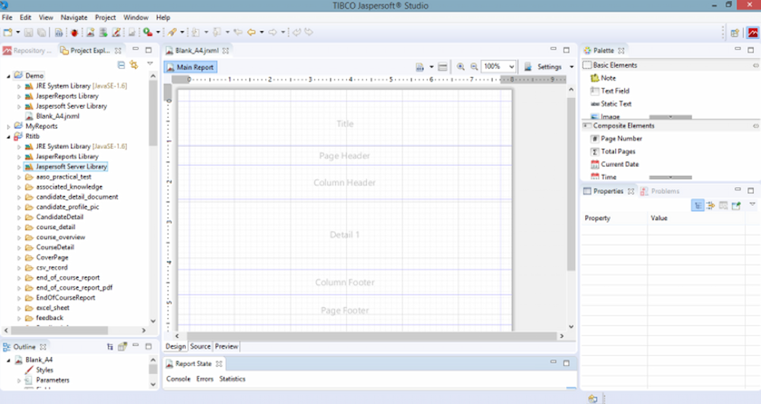
JasperReports earns its spot here thanks to how smoothly it fits into Java-driven environments. When I see development teams already working in Java, they tend to favor JasperReports for integrating custom report generation directly within their apps.
What I like is the way it handles pixel-perfect reports, subreports, and complex data visualizations, while letting you design everything in XML, so your workflows stay code-driven but flexible.
JasperReports' Best For
- Java developers who need embedded reporting in applications
- Teams building highly customized, code-driven report templates
JasperReports' Not Great For
- Non-technical users who want visual report builders
- Organizations that avoid Java or need low-code solutions
What sets JasperReports apart
JasperReports stands out because it’s made specifically for Java application teams who need to build report logic into their codebase. Unlike Metabase or Redash, which focus on web-based, interactive dashboards, JasperReports expects you to design and generate reports programmatically. This works best when your reports have to be bundled, automated, or controlled at the code level, like in embedded or on-prem software.
Tradeoffs with JasperReports
JasperReports optimizes for custom, embedded reporting in Java apps, but that comes at the cost of accessibility for non-developers, who often find the learning curve steep and the workflow technical.
Pros and Cons
Pros:
- Large and active community for support
- Extensive design capabilities with Jaspersoft Studio
- Robust Java-based architecture
Cons:
- Steeper learning curve for advanced features and apps
- Lack of transparent pricing information
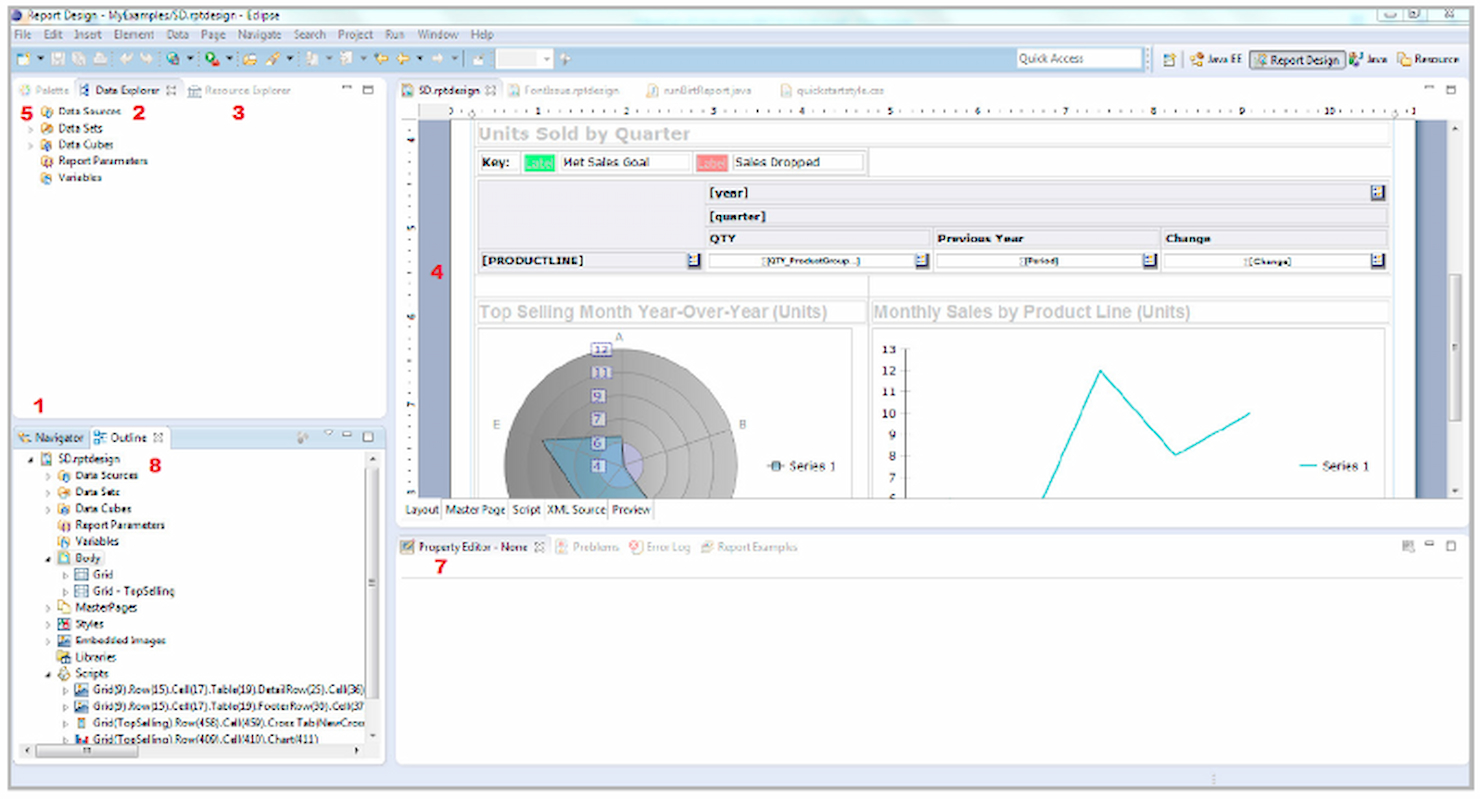
BIRT stands out to me because of how flexible its report design environment is when you need detailed, tailor-made visualizations. I often see development teams rely on BIRT when generic dashboards from other open source tools just can’t display their complex, multi-dimensional data. What I like is how you can embed almost any visualization, from custom charts to richly formatted PDFs, and tap into many data sources.
BIRT’s Best For
- Developers building custom reports and interactive dashboards
- Organizations with technical skills needing advanced data visualizations
BIRT’s Not Great For
- Non-technical users needing quick report setup
- Teams wanting pre-built templates and guided report creation
What sets BIRT apart
BIRT is built around the idea that your reports should adapt to your data, not the other way around. Instead of relying on templatized dashboards like you see in Metabase or Redash, BIRT expects you to design reports from scratch using its Eclipse-based environment. I find this works best when you need visualizations that map to unique business processes or deeply nested data.
Tradeoffs with BIRT
BIRT optimizes for flexibility and custom design, but this means setup, report building, and changes require more technical skills. Non-technical users or teams who want a quick start often get stuck or need extra support to get the basics working.
Pros and Cons
Pros:
- Extensive APIs for customization
- Strong integration capabilities with Java/Java EE
- Comprehensive design options for reports
Cons:
- Requires manual setup and configuration
- Limited support for non-Java environments

Superset stands out to me for letting teams explore, visualize, and analyze huge datasets without hitting a wall as data scales up. I like how it brings together a flexible dashboard builder with SQL editor and charting that actually performs well even with billions of rows.
What I appreciate most is how you can build self-service exploration—teams can dig into data on their own without flooding engineers with ad hoc report requests.
Superset’s Best For
- Data engineering or BI teams working with huge datasets
- Users who need interactive data exploration and custom dashboards
Superset’s Not Great For
- Non-technical users who want simple report builders
- Teams needing out-of-the-box, prebuilt business reports
What sets Superset apart
Superset stands out to me by prioritizing flexibility and self-service for exploring data at scale. Unlike basic tools such as Google Data Studio, Superset expects you to work directly with queries and actively build your own dashboards. In practice, this works best when your data team wants freedom over how reports are built and shared, instead of relying on IT or fixed templates.
Tradeoffs with Superset
Superset optimizes for customization and scale, but you give up guided setup and prebuilt visuals, so less technical users can get stuck during setup or dashboard design.
Pros and Cons
Pros:
- Rich set of integrations and visualizations
- Customizable and extensible
- Handles large datasets with ease
Cons:
- Requires technical expertise for advanced customizations
- Steep learning curve for new users
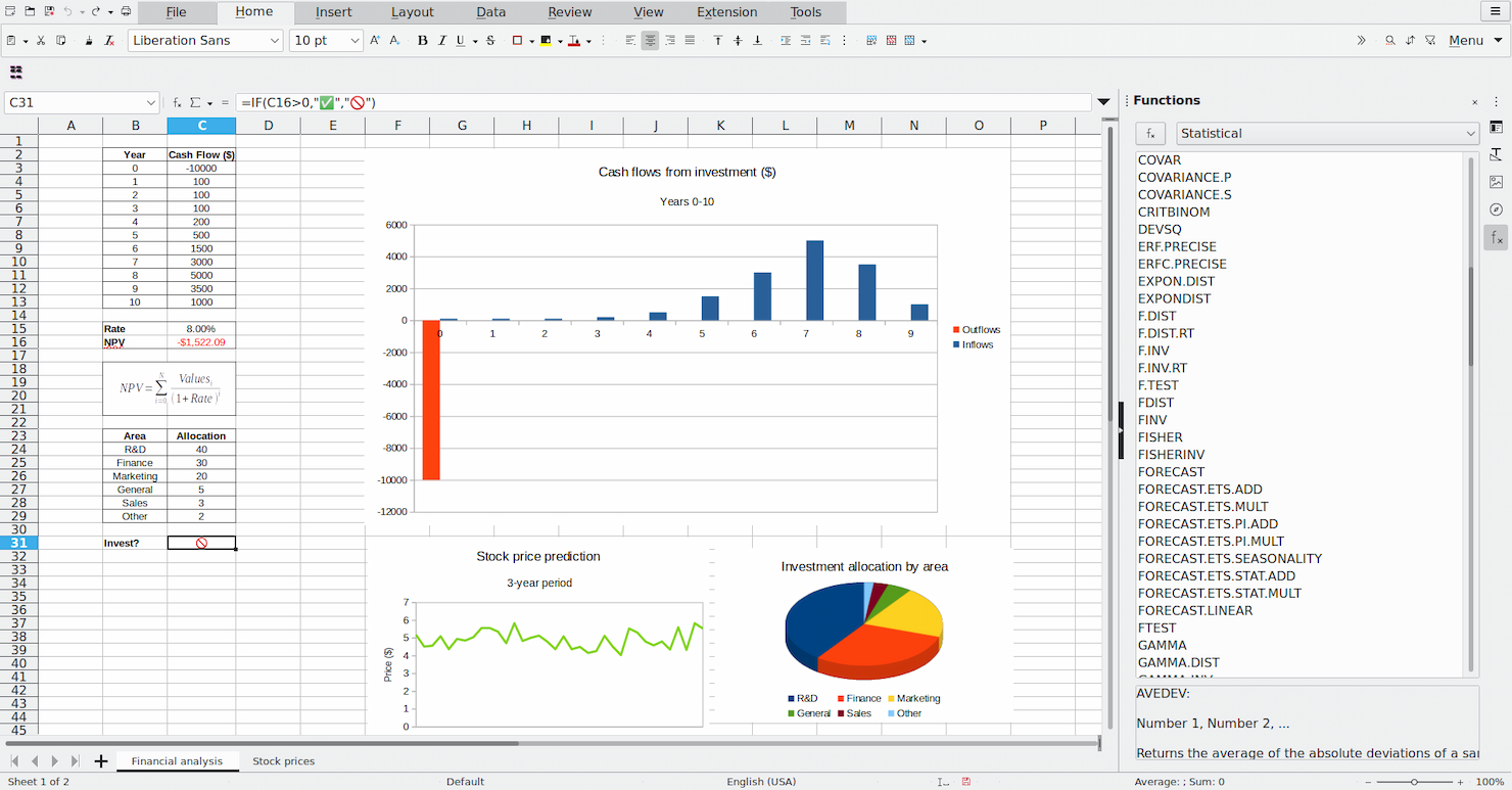
LibreOffice Base is on my list because it gives you full database creation and management without vendor lock-in or licensing headaches. I recommend it when you're working solo or handling personal projects that need real relational data and reporting, but not enterprise features.
What I like is how you can build custom forms, create ad-hoc queries, and generate simple reports using its built-in wizards and report designer. It’s best when you want local control and flexibility, especially for home office needs or single-user database solutions.
LibreOffice Base’s Best For
- Individuals managing personal or small-scale databases
- Users who want offline, open-source data entry and reporting
LibreOffice Base’s Not Great For
- Teams that need collaborative, cloud-based reporting tools
- Complex business use cases with advanced analytics or automation
What sets LibreOffice Base apart
LibreOffice Base is designed for people who want local control and hands-on database management without extra complexity. It feels closest to Microsoft Access but with an open-source approach that doesn’t tie you to a platform or cloud account.
You get the basics of relational database building and reporting, which works well for individuals or small projects that don’t need real-time team collaboration.
Tradeoffs with LibreOffice Base
Base optimizes for local, single-user control, but you lose out on real-time collaboration and modern cloud features. This means working with others or moving between devices becomes clunky.
Pros and Cons
Pros:
- Integration with the LibreOffice suite
- Comprehensive database management features
- No cost to use
Cons:
- Community-based support may be less reliable
- Less advanced features than some commercial databases
Metabase earned a spot on my shortlist because it’s the most approachable open source reporting tool I’ve seen for non-technical teams. From my experience testing it, teams create interactive dashboards and ask ad hoc questions straight from the browser, no SQL required. I like how the visualization options and sharing features are simple enough that anyone can build and share a report without extra training.
Metabase’s Best For
- Non-technical teams needing self-service dashboards and reports
- Product or ops teams that want fast data visualizations
Metabase’s Not Great For
- Engineering teams needing advanced analytics or modeling
- Organizations with strict security or complex access controls
What sets Metabase apart
Metabase expects teams to ask questions and explore data in an interactive way, without writing code. Unlike tools like Redash, which still lean on SQL skills, Metabase brings data exploration into a visual workflow. This tool will work well for product or operations teams that want to pull reports on their own, without relying on data analysts.
Tradeoffs with Metabase
Metabase optimizes for approachability and ease of use, but that simplicity limits support for complex analytics. When teams need advanced modeling or granular permission controls, they hit a ceiling.
Pros and Cons
Pros:
- Interactive dashboards with diverse visualizations
- No SQL knowledge required for querying
- User-friendly interface
Cons:
- Limited customization for advanced users
- Performance issues with large datasets
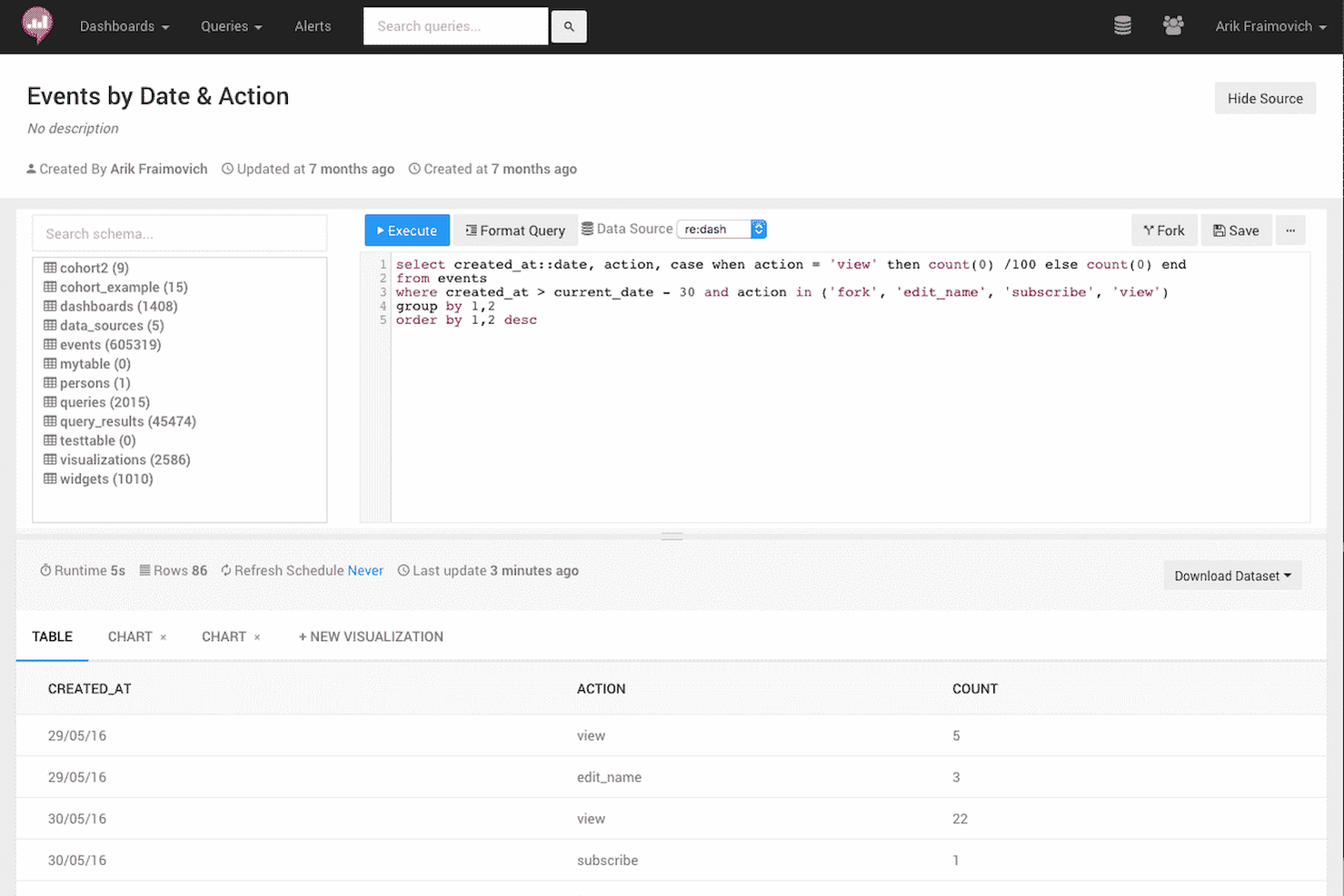
Redash earns a spot on my shortlist because it lowers the bar for querying and visualizing data across many data sources. What stands out to me is how you can write SQL queries directly in the browser and instantly turn them into live dashboards or shareable visualizations, which teams often need when the standard BI stack is overkill or too slow to deploy.
I've seen smaller data teams gravitate toward Redash when they want open source reporting that’s quick, collaborative, and doesn’t force them through heavy data modeling. I like that it’s built for situations where you want to see results fast, work iteratively, and swap insights easily with colleagues.
Redash’s Best For
- Data analysts and engineers comfortable writing SQL queries
- Organizations needing quick, interactive dashboards from multiple data sources
Redash’s Not Great For
- Teams needing drag-and-drop report builders or WYSIWYG tools
- Users without SQL knowledge or data literacy
What sets Redash apart
Redash is designed for people who want direct, hands-on control over their data without heavy setup or a data modeling layer. It assumes you know your way around SQL and want to query live data sources quickly, then share findings in a visual format others can access. Unlike Tableau, which layers on lots of abstraction and drag-and-drop, Redash lets you start from raw queries. This approach fits teams who outgrow spreadsheets but don't want a heavy business intelligence stack.
Tradeoffs with Redash
Redash optimizes for speed and flexibility with raw data, but you lose out on user-friendly drag-and-drop and in-depth data preparation. Non-technical users will likely struggle to build or customize reports without help.
Pros and Cons
Pros:
- Customizable alerts for data monitoring
- Extensive support for various data sources
- Real-time collaboration on queries and dashboards
Cons:
- Higher complexity for initial setup compared to some alternatives
- Limited visual customization options
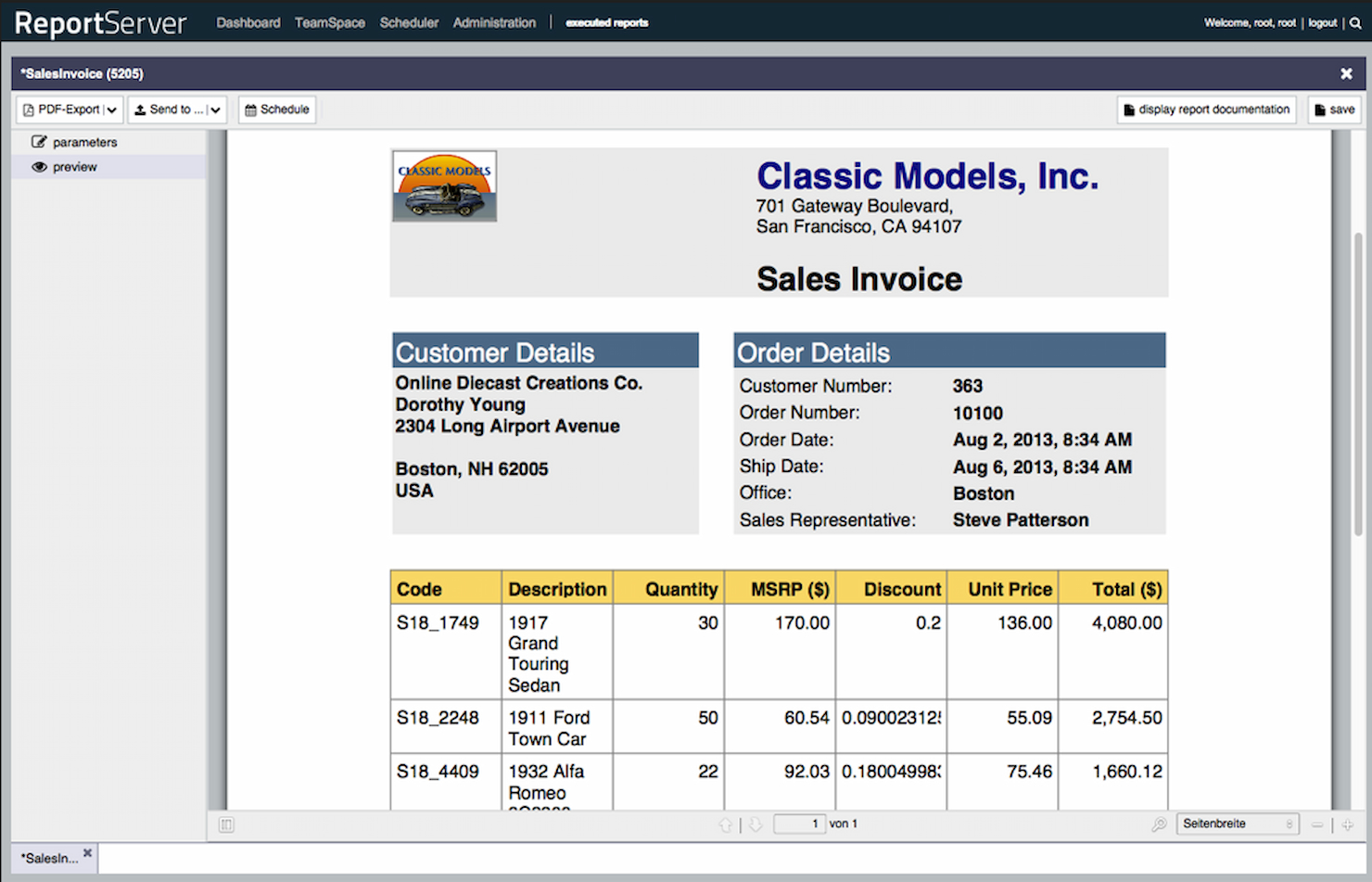
ReportServer lands on my shortlist because its ad-hoc reporting engine stands out for flexible, on-the-fly analysis. I see teams using ReportServer when canned, fixed-layout reports aren't enough, and they need ways for end users to build or tweak reports themselves with pivot tables, dynamic lists, and drill-downs.
What I like most is how it helps people slice, filter, and rearrange live data in their web browser, without admins having to step in. This makes it a fit for organizations where department users want to pull custom insights as their needs shift.
ReportServer’s Best For
- Organizations needing flexible, self-service ad-hoc reporting
- Teams with mixed technical ability who want custom insights
ReportServer’s Not Great For
- Companies wanting pre-built, highly designed dashboards
- Those requiring strong data visualization or charting features
What sets ReportServer apart
ReportServer takes a different approach by focusing on end-user flexibility instead of rigid, pre-designed reports. It lets people build, tweak, and filter reports live in the browser, so the process feels less like configuring a dashboard in something like Grafana and more like working with a familiar spreadsheet. Teams use it when they want data answers now, not after a report designer steps in.
Tradeoffs with ReportServer
ReportServer optimizes for letting users interact with data directly, but the tradeoff is limited charting and visualization options. If you need polished dashboards or visually rich reports, you could find its output underwhelming.
Pros and Cons
Pros:
- Advanced user management and dashboarding features
- Supports a wide range of output formats
- Dynamic list for flexible ad-hoc reporting
Cons:
- Requires technical knowledge for setup and customization
- May experience performance issues with larger datasets
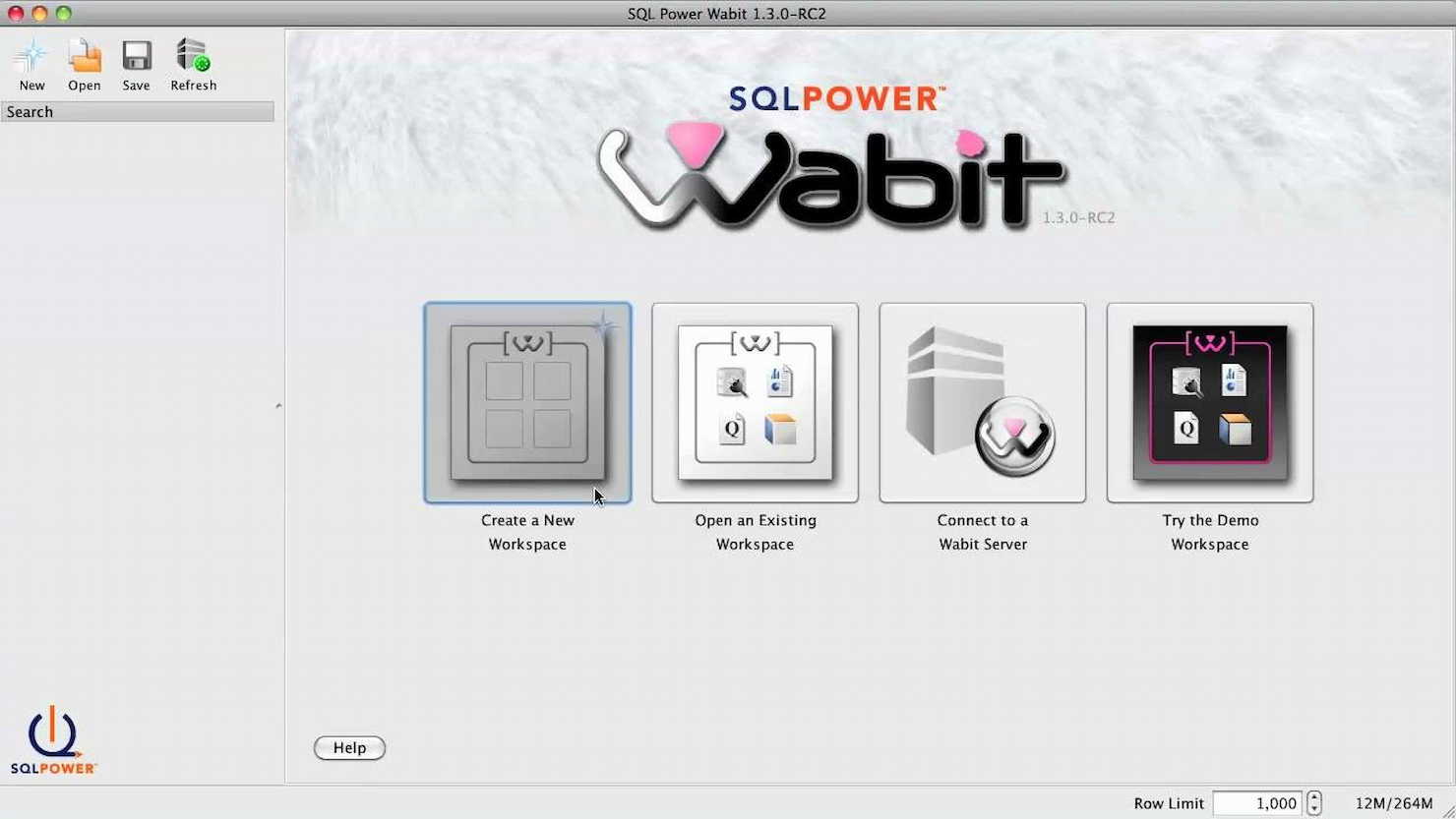
SQL Power Wabit makes my list for teams looking to give end users direct access to build their own business reports without complex setup. When I tested this tool, I really appreciated that you can design ad hoc queries and dashboards visually, then drill through to raw data with just a few clicks.
It stands out when your analysts need flexibility: they can explore datasets, create pixel-perfect scheduled reports, and automate distribution right from an open-source package.
SQL Power Wabit’s Best For
- Technical teams building ad hoc or custom BI reports
- Organizations wanting open source, self-service analytics
SQL Power Wabit’s Not Great For
- Non-technical users who prefer fully guided report builders
- Enterprises needing embedded analytics or native cloud support
What sets SQL Power Wabit apart
SQL Power Wabit stands out by letting analysts design and run reports directly on live databases, using a visual query builder rather than hand-coding SQL. Instead of abstracting everything away like Google Data Studio does, Wabit rewards users who want hands-on exploration of data structure and relationships. In practice, this works well if you prefer open access to data and direct control over queries while building dashboards.
Tradeoffs with SQL Power Wabit
Wabit optimizes for technical users’ needs and customization, but this means non-technical users can struggle unless they know basic data structure and query concepts.
Pros and Cons
Pros:
- Ad-hoc reporting capabilities
- Real-time results update
- User-friendly drag-and-drop interface
Cons:
- May not cater to advanced technical requirements
- Limited information on native integrations and big data
Other Open Source Reporting Software
Below is a list of additional open source reporting software that we shortlisted, but did not make it to the top list. Definitely worth checking them out.
- OpenReports
For robust report generation
- Helical Insight
For instant BI with AI


Related Management Software Reviews
If you still haven't found what you're looking for here, check out these other related tools that we've tested and evaluated:
- Project Management Software
- Resource Management Software
- Workflow Automation Software
- Time Tracking Software
- Task Management Software
- Collaboration Tools
- Gantt Chart Maker
- Productivity Tools
- Project Tracking Software
- Project Scheduling Software
How I Evaluate Open-Source Reporting Software
I look for two things: baseline requirements—like a genuine OSI license and self-hosted deployment—and differentiators that separate tools built for PMO workflows from generic BI platforms.
Core Functionality (Table Stakes For This List)
When I'm selecting tools for my list, I rank each one on a scale from 0 (does not offer the functionality) to 5 (excels in this area) for each core functionality listed below. Then, I calculate the tool's total score into a percentage. Each tool needs to achieve a minimum total score of 65% to be considered for inclusion.
- Open Source Licensing: I check that the tool uses a recognized OSI-approved license and that the source code is publicly accessible—not just "source available" with restrictive terms.
- Self-Hosting Capability: Deployment flexibility matters, so I evaluate whether the tool supports Docker, Kubernetes, or bare-metal installs with clear documentation.
- Project Data Connectivity: I look for native connectors or API access to PM tools like Jira, GitLab, or Redmine, plus support for SQL databases and REST endpoints.
- Report Building & Visualization: The tool should offer project-relevant visuals—burndown charts, Gantt views, milestone tracking—beyond standard bar and line graphs.
- Customizable Dashboards: PMO teams need role-based views, so I evaluate whether dashboards support filters, parameters, and layouts tailored to different stakeholders.
- Scheduled & Exportable Outputs: Stakeholder updates shouldn't be manual, so I look for automated report delivery via email and exports to PDF, Excel, or HTML.
Once I have a list of tools that meet this criteria, I consider what sets each platform apart.
Differentiating Factors (What Sets Vendors Apart)
Here's how I compare and contrast different vendors:
Standout Features
Row-level security is a big one for PMO teams managing multiple client projects—it lets you restrict dashboard views so each stakeholder only sees their own portfolio data. I also evaluate whether a tool supports embedded analytics, since teams often need to surface reports inside internal portals or project wikis rather than switching apps. Real-time data streaming is worth noting too, especially for delivery leads tracking sprint progress across active CI/CD pipelines.
Beyond Features
Community health matters more than most buyers realize. I look at commit frequency, release cadence, and contributor diversity—a project with one maintainer is a risk for any PMO betting its reporting stack on it. Total cost of ownership is another factor I weigh carefully, since open source doesn't mean free; self-hosting requires infrastructure, and open-core models often gate key connectors behind paid tiers. I also evaluate how well each tool plugs into the PM ecosystem your team already runs, from Jira and GitLab to time-tracking and resource planning platforms.
How to Choose Open Source Reporting Software
As you work through your own unique software selection process, keep the following points in mind:
- Feature Set: Ensure that the software has the necessary features to meet your reporting needs. Open source reporting tools can vary widely in functionality, from simple data visualization to complex data processing and analysis. For instance, a non-profit organization might need customizable templates for donor reports, while a tech startup may require real-time analytics and dashboard capabilities.
- Community Support: Unlike commercial project reporting software, an open-source version is mostly supported by its community. Therefore, evaluate the strength and activity of the community around the software. A vibrant community can provide valuable support, plugins, and updates. This is particularly important for small businesses without a dedicated IT team, as they can rely on community forums and contributions for troubleshooting and enhancements.
- Integration Capabilities: Consider how well the software integrates with your existing systems. Open source reporting tools should be able to connect to various data sources and work with other tools in your stack. For example, a retail company might need software that integrates with their inventory management system to track and report stock levels accurately.
- Scalability: Assess whether the software can scale with your organization's growth. Open source solutions should be able to handle an increasing amount of data and users without significant performance degradation. A growing e-commerce platform will require a reporting tool that can keep up with the expanding volume of sales data and customer information.
- License Restrictions: Understand the licensing terms associated with the software. Open source doesn't always mean free of restrictions; some licenses may have conditions that could affect how you use the software. A software development agency, for example, needs to ensure that the open source license allows for commercial use and redistribution within their client projects.
Trends in Open Source Reporting Software
Open source reporting tools are evolving rapidly. Here's what to watch:
- Integration with Machine Learning and AI: Open source data analytics software is increasingly incorporating AI and machine learning algorithms. This integration allows for predictive analytics and smarter data processing, enhancing decision-making capabilities. The trend is significant for its potential to transform raw data into strategic insights.
- Enhanced Data Visualization Capabilities: Visualization tools within open source BI reporting tools are becoming more sophisticated. They now offer interactive and real-time data representation, making complex information easily understandable. This is important for its ability to facilitate quick and informed decisions across organizations.
- Increased Focus on Security and Privacy: As data breaches become more common, data analytics open source tools are prioritizing built-in security features. Encryption and access controls are being enhanced to protect sensitive information. This trend is crucial in maintaining trust and compliance in data management.
- Adoption of Cloud-based Reporting Solutions: There's a shift towards cloud-based open source reporting platforms. These solutions offer scalability, remote access, and reduced infrastructure costs. The move to cloud-based services is interesting for its promise of flexibility and cost-efficiency.
- Collaboration and Sharing Features: Collaboration is becoming a key feature in open source power BI software. Real-time sharing and editing capabilities are being integrated to facilitate teamwork. This trend is important for enhancing productivity and streamlining workflows in distributed teams.
What is Open Source Reporting Software?
Open source reporting software enables the creation, management, and distribution of structured reports or dashboards. It is typically used by data analysts, IT professionals, and business users to generate insights from data and to support decision-making processes. The dashboard software is open source, meaning it is freely available to modify, distribute, and use, which provides flexibility and cost savings for organizations.
The components of open source report tools include data connectors, report designers, a reporting engine, and distribution mechanisms. Data connectors allow the open source BI dashboard to access various data sources, while report designers enable users to create report layouts. The reporting engine processes data and generates reports, and distribution mechanisms disseminate the reports to the intended audience.
Features of Open Source Reporting Software
When selecting the best open source business intelligence software, it's essential to consider the features that will best meet your project management and reporting needs. These tools are designed to help manage data, create reports, and provide insights that can drive decision-making. Here are some of the most important features to look for:
- Data Connectivity: This feature allows the BI tools open source to connect to various data sources. It is crucial because it enables the integration of different types of data into the reporting system, which is the backbone of any comprehensive reporting tool.
- Customizable Reports: Customizability is important, as it allows for the creation of reports that are relevant to the specific needs of a project or organization. Tools like white label dashboard software can also enable customization such as branded reports with minimal coding.
- Interactive Dashboards: These provide a dynamic way to view and interact with data. The importance lies in their ability to give users a quick, at-a-glance understanding of key metrics and trends.
- Data Visualization: The BI dashboard open source offers tools to create graphs, charts, and maps. Effective data visualization is important because it makes complex data more accessible and understandable to a wider audience.
- Real-time Reporting: This enables the generation of reports with up-to-the-minute data to help users make timely decisions in a fast-paced project environment.
- Collaboration Tools: Collaboration ensures that insights and data can be shared and refined by team members, leading to more accurate and comprehensive reports.
- Open Source Community Support: Open source charting software with strong community support provides a resource for solving problems and improving the software through collective knowledge and experience.
- Scalability: The ability to handle growing amounts of data and users. Scalability is important to ensure that the software can continue to perform well as the organization or project grows.
- Security Features: Added security is vital for data analytics tools that are open source, as it safeguards confidential information from unauthorized access or breaches.
- Exporting Capabilities: With the option to export reports in various formats, users can distribute reports in formats that are most useful or required by different stakeholders.
Benefits of Open Source Reporting Software
Open source reporting software offers a range of advantages that can be particularly appealing to businesses and individual users who are looking for robust, customizable, and cost-effective solutions for their data analysis and reporting needs.
These benefits stem from the inherent qualities of open source software, including its collaborative nature and the freedom it provides to users. Here are some of the primary benefits that potential buyers should consider:
- Cost Efficiency: Utilizing open source reporting software can significantly reduce costs, as there are typically no licensing fees required to use the software. This makes it an attractive option for organizations looking to minimize expenses without compromising on functionality.
- Customizability: Open source software is known for its flexibility; users can modify the code to suit their specific needs. This level of customization allows businesses to tailor the reporting tools to their unique requirements, enhancing the relevance and effectiveness of the software.
- Community Support: A vibrant community often backs open source projects, providing a wealth of resources, including forums, documentation, and shared code. Users benefit from the collective knowledge and support of this community, which can help resolve issues and improve the dashboard tool open source over time.
- Transparency and Security: The transparent nature of open source dashboards tools, where the source code is available for review, can lead to enhanced security. Users can examine the code for vulnerabilities themselves, and the community quickly addresses any discovered issues, making the dashboarding tools open source more secure.
- Interoperability: Open source reporting tools are often designed with interoperability in mind, allowing them to work well with different systems and software. This ensures that users can integrate these tools into their existing infrastructure, facilitating data exchange and analysis.
Costs and Pricing of Open Source Reporting Software
Open source reporting software offers a range of options for software buyers who are looking to integrate reporting capabilities into their applications without the high costs associated with proprietary software.
These tools are particularly beneficial for small to medium-sized businesses or startups that require flexibility and customization in their reporting tools but have limited budgets. Open source software can be a cost-effective solution, as the platforms are often available as free open source dashboard tools or at a lower cost than commercial software.
Plan Comparison Table for Open Source Reporting Software
| Plan Type | Average Price | Common Features |
|---|---|---|
| Free Option | $0 | Data visualizations, dashboards, ad hoc reporting, benchmarking, data connectors, KPIs, metadata management, performance metrics, predictive analytics, profitability analysis, publishing/sharing, trend/problem indicators, visual analytics, and self-service data preparation |
| Self-Service User | $19/month | Customizable reports, interactive dashboards, data analysis tools, and integration with other systems |
| Core User | $106/month | Advanced data visualizations, enhanced security features, additional integrations, and support services |
| Advanced User | $192/month | Full suite of BI tools, predictive modeling, AI capabilities, dedicated support, and training services |
Open Source Reporting Software FAQs
Here are some commonly asked questions about open source reporting software:
What is the purpose of open source reporting software?
Open source reporting software serves the purpose of generating reports from various data sources to help in data analysis and business intelligence. These tools are designed to be freely accessible and modifiable, allowing organizations to customize the software to fit their specific reporting needs. They are essential for businesses looking to analyze data without the cost of proprietary software.
How does open source reporting software differ from proprietary software?
Open source reporting software differs from proprietary software in terms of cost, accessibility, and customization. Open source software is generally free to use and modify, which can significantly reduce costs for businesses. It also has a community of developers who contribute to its improvement, which can lead to more frequent updates and a wider range of features. Proprietary software, on the other hand, often comes with licensing fees, and the code is not available for users to alter.
Can open source reporting software be integrated with other systems?
Yes, open source reporting software can typically be integrated with other systems. Many open source tools offer APIs and support various data connectors that enable them to work with different databases and applications. This integration capability allows for data flow between systems and enhances the overall functionality of the business’s IT ecosystem.
Is open source reporting software suitable for all sizes of businesses?
Open source reporting software is suitable for businesses of all sizes. Small businesses can benefit from the low cost and flexibility, while larger enterprises can take advantage of the scalability and customization options. The adaptability of open source software makes it a viable option for any business that needs to perform data analysis and reporting.
What kind of support is available for open source reporting software?
Support for open source reporting software can come from various sources, including community forums, dedicated support teams for certain projects, and third-party service providers. While open source software does not typically come with official support from a vendor, the community and ecosystem around the software often provide extensive resources and help.
How secure is open source reporting software?
Open source reporting software can be secure, but it depends on the community and developers behind the software to maintain and update it. Because the source code is available to the public, it can be reviewed and vetted by anyone, which can lead to the identification and resolution of security issues. However, it is important for organizations to ensure they keep their software updated with the latest security patches.
What are the challenges of using open source reporting software?
Challenges of using open source reporting software can include the need for technical expertise to install, configure, and customize the software. Additionally, because these tools are often developed by a community, there may be variability in the quality and documentation. Businesses may also need to invest in training or hire specialists to effectively use and maintain the software.
What’s Next?
Subscribe to the DPM newsletter to get regular updates when we publish fresh how-to guides and articles on digital project management topics.