20 Best Cyfe Alternatives in 2026

Best Cyfe Alternatives Shortlist


The strongest Cyfe alternatives offer project management dashboards that actually fit your reporting style, data sources, and project needs. If you’re hunting for Cyfe alternatives, you probably need dashboards that make your project data easier to gather, visualize, and share with your team—without sacrificing customization or integration headaches.
With so many dashboard tools on the market, knowing which ones keep your team focused, informed, and aligned can make a dramatic difference in project delivery. This list gives you a clear snapshot of the top Cyfe competitors so you can quickly compare options and find the dashboard software that supports your workflow.
What is Cyfe?
Cyfe is a dashboard software platform that helps you monitor and visualize data from multiple sources in one place. Teams use Cyfe to create and customize project management dashboards, track KPIs, and share actionable insights with stakeholders.
Its integrations and widgets support real-time reporting across sales, marketing, social media, and operations, letting you manage projects and performance data without switching between tools. Cyfe is widely used for centralizing project analytics and team performance metrics.
Best Cyfe Alternatives Summary
This comparison chart summarizes pricing details for my top Cyfe alternative selections to help you find the best one for your budget and business needs.
| Tool | Best For | Trial Info | Price | ||
|---|---|---|---|---|---|
| 1 | Best for custom data modeling | 14-day free trial | From $120/month (billed annually) | Website | |
| 2 | Best for complex visual data exploration | Free plan available | From $15/user/month (billed annually) | Website | |
| 3 | Best for live office wall displays | 14-day free trial | From $119/month (billed annually) | Website | |
| 4 | Best for visual cross-channel reports | Free plan available | From $229/month (billed annually) | Website | |
| 5 | Best for automated marketing data cleaning | Free demo available | Pricing upon request | Website | |
| 6 | Best for mobile KPI monitoring | Free plan + free trial + free demo available | From $64/month (billed annually) | Website | |
| 7 | Best for enterprise-scale data agility | 30-day free trial + free demo available | Pricing upon request | Website | |
| 8 | Best for white-label embedded analytics | 7-day free trial + free demo available | Pricing upon request | Website | |
| 9 | Best for free Google native reporting | Free plan available | From $9/user/project/month | Website | |
| 10 | Best for omnichannel marketing automation | Free demo available | Pricing upon request | Website |
Why You Can Trust Us
We’ve been testing and reviewing project management software since 2012. As project managers ourselves, we know how critical and difficult it is to make the right decision when selecting software.
We invest in deep research to help our audience make better software purchasing decisions. We’ve tested more than 2,000 tools for different project management use cases and written over 1,000 comprehensive software reviews. Learn how we stay transparent & our software review methodology.
-

Accelo
Visit WebsiteThis is an aggregated rating for this tool including ratings from Crozdesk users and ratings from other sites.4.4 -
Celoxis
Visit WebsiteThis is an aggregated rating for this tool including ratings from Crozdesk users and ratings from other sites.4.4 -
Wrike
Visit WebsiteThis is an aggregated rating for this tool including ratings from Crozdesk users and ratings from other sites.4.3


Cyfe Alternatives Reviews
Below are my detailed summaries of the best Cyfe alternatives that made it onto my shortlist. My reviews offer a detailed look at the features, integrations, and best use cases of each platform to help you find the best one for you.

Klipfolio is a dashboard platform designed for teams who need highly customizable data visualization and reporting from various sources. I think businesses with complex analytics or unique metric tracking needs will find it especially helpful for building tailored dashboards that deliver precise project insights.
Who Is Klipfolio Best For?
Data analysts and operations teams at midsize companies who need custom data models and advanced visualization options.
Why Klipfolio Is a Good Cyfe Alternative
I picked Klipfolio because it gives teams a level of control over their data that most dashboard tools simply don't offer. The Klips editor lets me write custom formulas and transformations directly on incoming data, so I can build metrics that don't exist natively in any source system.
I also like that Klipfolio supports SQL queries, REST API connections, and file-based data sources—meaning I can pull from almost anywhere and shape the data exactly how I need it before it hits the dashboard. For teams managing complex, multi-source reporting where off-the-shelf metrics never quite fit, that flexibility is hard to match.
Klipfolio Key Features
- Automatic data refresh: Set data feeds to refresh on a schedule so dashboards always reflect the latest numbers without manual updates.
- 30+ visualization types: Choose from a library of chart and graph options, including gauges, bullet charts, and scatter plots, to match the right visual to your data.
- White-label and custom theming: Apply custom colors, logos, and branding to dashboards, which is especially useful for agencies building client-facing reports.
- Drill-down support: Click into a chart to explore underlying data at a more granular level without leaving the dashboard view.
Klipfolio Integrations
Klipfolio offers 100+ native integrations, including Google Analytics, Salesforce, HubSpot, Google Sheets, QuickBooks, Shopify, Xero, Intercom, and more. An API is available for custom integrations.
Pros and Cons
Pros:
- Offers extensive white-label branding options
- Connects to data via REST, SQL, and files
- Allows calculated metrics with custom formulas
Cons:
- Lacks built-in goal tracking widgets
- Real-time data streaming not available
Tableau is a leading business intelligence software designed for teams that rely on deep, interactive visualizations to understand complex project data. You’ll likely appreciate its ability to uncover patterns and insights that standard dashboards can’t deliver.
Who Is Tableau Best For?
Project analysts and business intelligence teams at large organizations who need maximum flexibility and depth in visualizing project data.
Why Tableau Is a Good Cyfe Alternative
I picked Tableau because no other tool in this space matches its depth of visual data exploration. The drag-and-drop visual query builder lets me build complex, multi-dimensional views without writing a single line of SQL—I can slice project data by team, timeline, budget, and status all in one view.
I also appreciate Tableau's calculated fields, which let me define custom metrics directly inside a visualization. For teams where Cyfe's simpler widgets aren't cutting it, Tableau gives you the analytical depth to actually interrogate your data.
Tableau Key Features
- Viz extensions: Add custom web-based components directly inside a dashboard to expand visualization types beyond Tableau's built-in library.
- Tableau Prep: Visually combine, shape, and clean data before analysis using a dedicated data preparation interface.
- Dashboard accelerators: Access pre-built, industry-specific dashboard templates through Tableau Exchange to reduce setup time.
- Offline analysis: Connect to data, build visualizations, and explore insights without an internet connection using Tableau Desktop.
Tableau Integrations
Tableau offers native integrations with Salesforce, Google Analytics, Snowflake, Amazon Redshift, Google BigQuery, Microsoft SQL Server, Oracle, ServiceNow, and Dropbox. An API is available for custom integrations.
Pros and Cons
Pros:
- Enables pixel-perfect dashboard design control
- Supports advanced geographic and spatial analyses
- Handles huge datasets with strong performance
Cons:
- Steep resource needs for enterprise deployment
- Requires desktop software for dashboard editing
Geckoboard is a business dashboard platform tailored for teams who need to keep performance data visible, fresh, and accessible across shared spaces. It's a solid fit for businesses wanting to display live data from multiple sources to promote transparency and data-driven decisions.
Who Is Geckoboard Best For?
Operations teams and office managers who need to broadcast real-time data across shared workspaces.
Why Geckoboard Is a Good Cyfe Alternative
I picked Geckoboard specifically for teams who want to turn a screen into a live performance display without any technical setup. The TV mode is the standout feature here—I can push a dashboard to any screen via a shareable link, and it auto-refreshes continuously without anyone touching it.
I also like that Geckoboard lets me set goals and status indicators directly on dashboard widgets, so a wall-mounted display instantly shows whether the team is on track or behind. For office environments where visibility drives accountability, that kind of always-on context is hard to replicate with other tools.
Geckoboard Key Features
- Drag-and-drop dashboard builder: Build dashboards with an intuitive interface without any coding, using a visual editor to move, resize, and group visualizations.
- Custom themes and logos: Apply your brand colors and logo to dashboards, keeping presentations consistent across teams and stakeholders.
- Scheduled snapshots: Automatically send dashboard screenshots to email, Slack, or Microsoft Teams on a set schedule, daily, weekly, or monthly.
- Dashboard embedding: Embed live dashboards into tools like Notion, Microsoft Teams, Miro, or Zendesk using a simple code snippet.
Geckoboard Integrations
Geckoboard offers 90+ integrations, including Google Sheets, Salesforce, Zendesk, Freshdesk, HubSpot, Intercom, Xero, Shopify, Trello, and Google Analytics. An API is available for custom integrations.
Pros and Cons
Pros:
- Scorecard widgets for tracking KPIs visually
- Native support for sharing dashboards on TVs
- Live dashboards auto-refresh for real-time updates
Cons:
- Lacks multi-dashboard data blending
- No report or CSV export scheduling
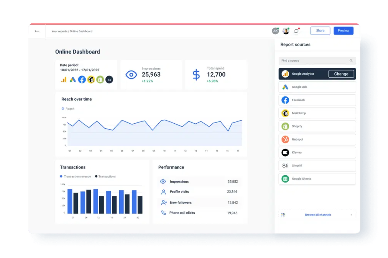
Whatagraph is a data reporting platform designed for marketing teams and agencies that need to present multi-channel campaign performance visually. You can automate digital marketing client reporting and quickly turn complex cross-platform data into visually engaging dashboards without manual data wrangling.
Who Is Whatagraph Best For?
Whatagraph is suited to marketing agencies and in-house teams who need to visualize and aggregate performance data from multiple channels for client or stakeholder reporting.
Why Whatagraph Is a Good Cyfe Alternative
I picked Whatagraph specifically for cross-channel visual reporting because it handles data blending across platforms in a way Cyfe simply doesn't. The Source Blends feature lets me combine data from Google Ads and Meta Ads into a single unified table, so stakeholders see one coherent picture instead of switching between channel views.
I also rely heavily on the 20+ widget types—mixing metric tiles, comparison tables, and trend charts in the same report gives clients a visual narrative that's hard to replicate elsewhere.
Whatagraph Key Features
- Report sharing: Share live reports with clients via a unique URL or schedule automated email delivery.
- Custom branding: Add your logo, colors, and custom domain to reports for a white-label client experience.
- Pre-built templates: Choose from a library of ready-made report templates organized by channel and use case.
- Multi-source dashboards: Pull data from multiple platforms into a single dashboard without manual exports.
Whatagraph Integrations
Whatagraph offers 45+ native integrations, including Google Analytics, Meta Ads, LinkedIn Ads, Google Sheets, HubSpot, Mailchimp, Shopify, Semrush, YouTube, and Google Search Console, with an API for custom integrations.
Pros and Cons
Pros:
- Custom widgets track niche marketing KPIs
- White labeling enables client-specific branding
- Scheduled report automation reduces manual effort
Cons:
- Dashboard layouts can’t display Gantt charts
- Focused only on marketing and analytics data
Improvado is a marketing analytics platform built for agencies and in-house teams who need to centralize and prepare data from hundreds of channels. You can use it to collect, sync, and transform cross-channel performance data for better reporting and campaign management.
Who Is Improvado Best For?
Marketing operations and analytics teams at mid-sized to large organizations that manage high volumes of campaign data across multiple channels.
Why Improvado Is a Good Cyfe Alternative
I picked Improvado specifically for its automated data cleaning capabilities, which address one of the messiest parts of cross-channel marketing reporting. When you're pulling data from dozens of ad platforms, the field naming inconsistencies alone can break your reporting logic.
Improvado handles that through automated data transformation and normalization, mapping 40,000+ unique fields across 500+ sources into a consistent structure. I also like the pre-built data models that let you skip manual transformation work and get clean, analysis-ready data without writing any code.
Improvado Key Features
- No-code rule builder: Create custom data governance rules using natural language, without any coding.
- Budget pacing: Track daily spend and ROAS across all platforms in a single view.
- Multi-currency reporting: Automatically convert currencies to standardize metrics across global campaigns.
- AI agent: Query your marketing data using natural language and get answers in seconds, with results displayed as charts, graphs, or tables.
Improvado Integrations
Improvado offers native integrations with Google Ads, Google Analytics, HubSpot, Salesforce, Shopify, LinkedIn Ads, Amazon Ads, and Twitter Ads, and provides an API for custom integrations.
Pros and Cons
Pros:
- Prebuilt schemas for marketing data normalization
- Handles high-volume data extraction efficiently
- Granular control over marketing channel integrations
Cons:
- Data warehouse integration can be technical
- Requires manual setup for complex mapping needs
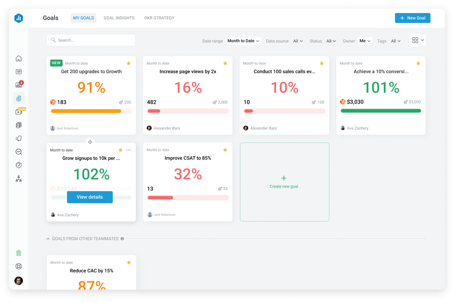
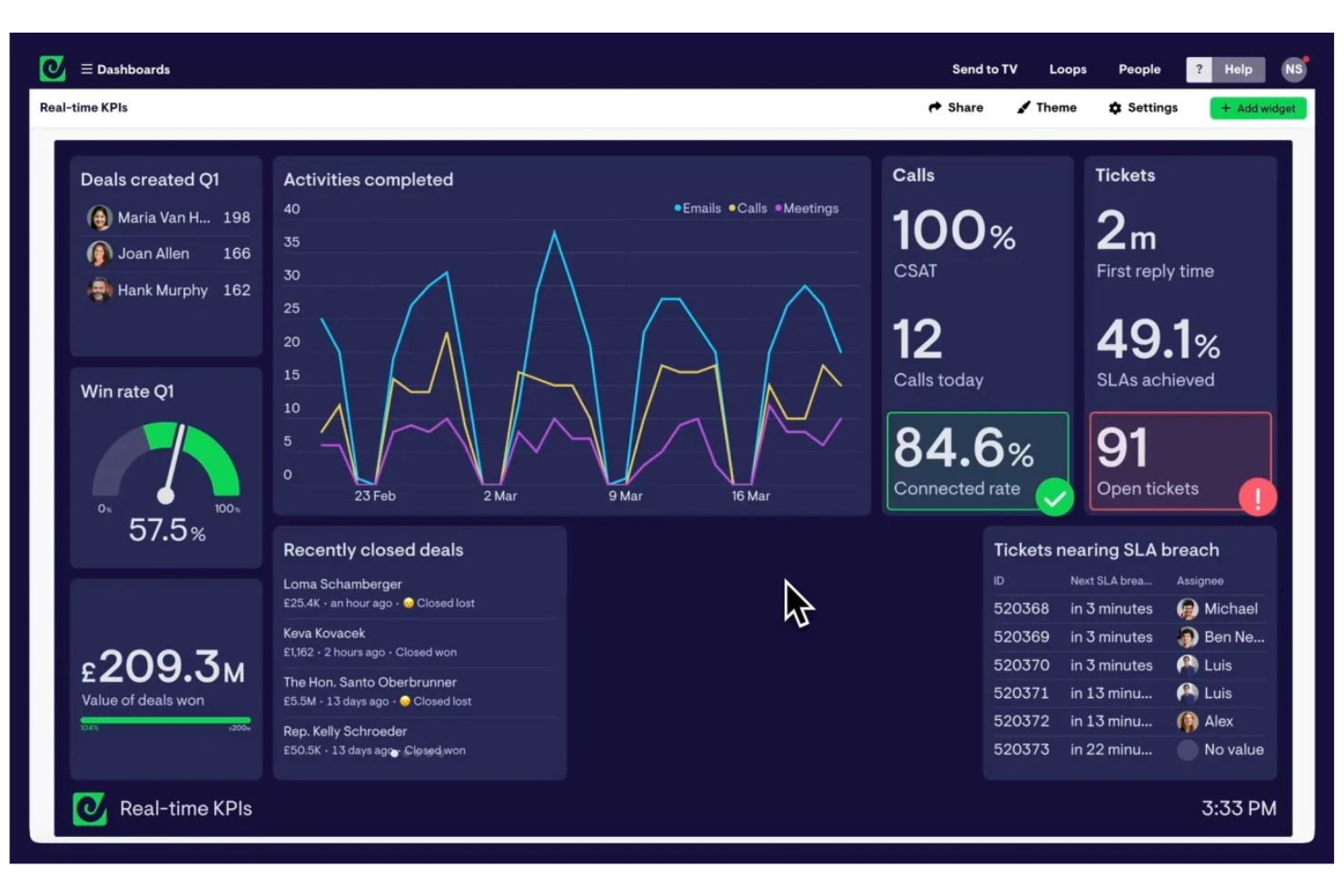
Databox is a data analytics tool designed for teams and agencies that need to monitor business KPIs and share progress from anywhere. It stands out in project management dashboard software for its mobile access, goal tracking, and automated performance alerts.
Who Is Databox Best For?
Project managers and marketing teams who need to monitor KPIs on the go.
Why Databox Is a Good Cyfe Alternative
I picked Databox for mobile KPI monitoring because it's one of the few dashboard tools built with a native mobile app that's actually functional, not just a scaled-down view. I appreciate how Scorecards let my team set goals and track progress against targets directly inside the dashboard, so performance gaps are visible at a glance.
The Datawall feature lets me display live KPI dashboards on a TV screen in the office without any manual refresh. For teams that need KPI visibility, whether they're at their desk or not, Databox delivers that consistently.
Databox Key Features
- Genie AI analyst: Ask natural language questions about your data and get AI-generated answers, trend analysis, and recommendations directly inside Databox.
- Anomaly detection: Databox automatically flags when a metric deviates from its typical pattern, so you can spot performance issues without manually reviewing dashboards.
- Performance forecasting: View projected metric performance with best- and worst-case scenario modeling built into each metric's detail view.
- Data Stories: Add dynamic elements like live metric values, time periods, and percentage changes directly into report text to give context alongside the numbers.
Databox Integrations
Databox offers over 100 native integrations, including Google Analytics, HubSpot, Salesforce, Shopify, Google Sheets, QuickBooks, Mailchimp, LinkedIn, Intercom, and Zapier. An API is available for custom integrations.
Pros and Cons
Pros:
- Scorecard goal tracking inside dashboards
- Real-time alerts for KPI anomalies
- Mobile app offers full dashboard functionality
Cons:
- Advanced permissions require higher-tier plans
- Custom visualizations are limited
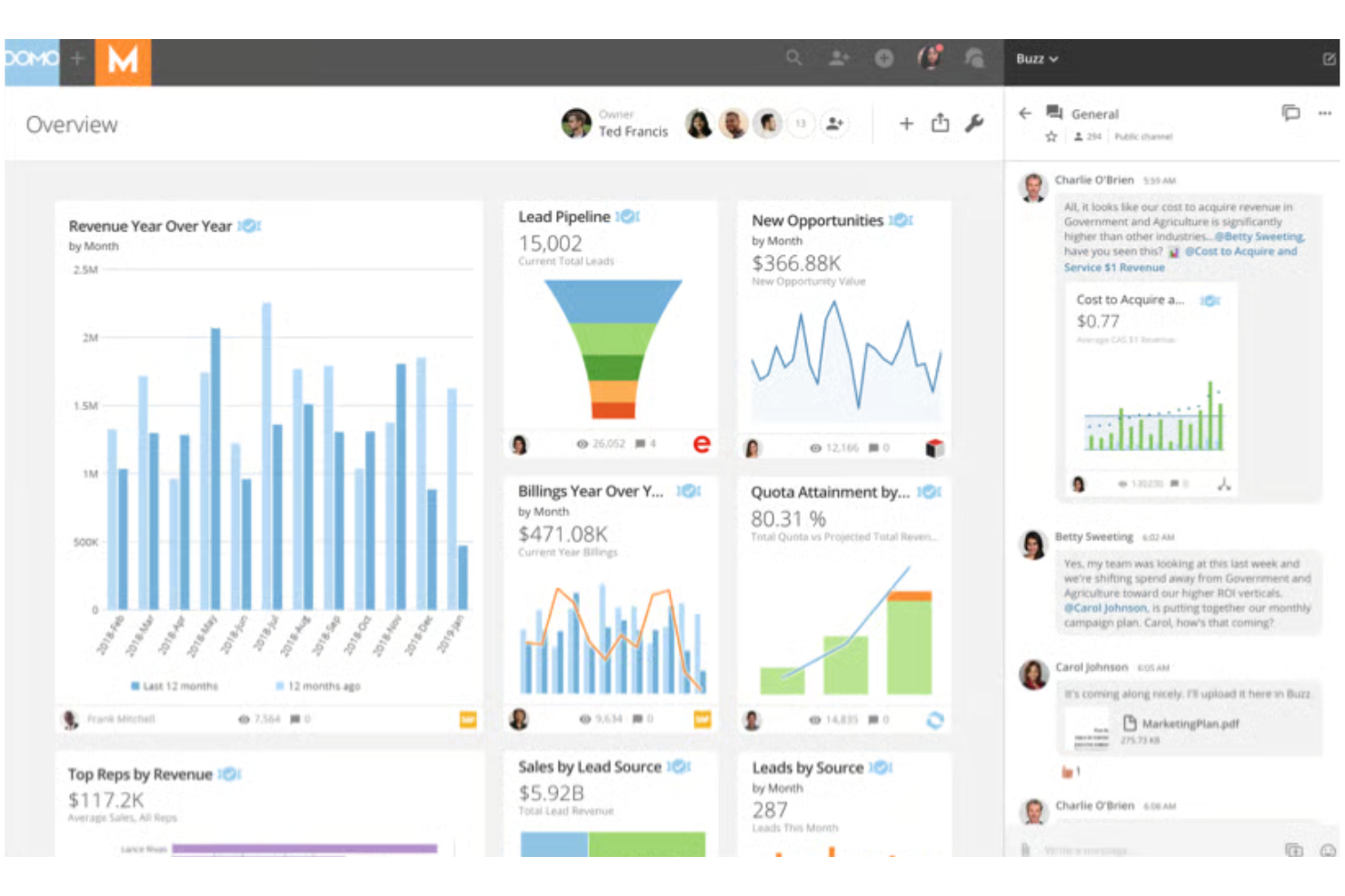
Domo is an enterprise data management and analytics platform built for companies that need to unify data and reporting at scale with cloud-first flexibility. Teams looking for broad connectivity and fast, secure data sharing across departments will find Domo especially valuable.
Who Is Domo Best For?
Large enterprises or data-intensive organizations that need unified dashboards and fast data access across departments.
Why Domo Is a Good Cyfe Alternative
I picked Domo because it's one of the few BI platforms that bundles data integration, transformation, and live dashboards in a single cloud environment. Where Cyfe relies on widgets pulling pre-formatted data, Domo lets me connect to 1,000+ sources and reshape raw data before it ever hits a dashboard using Magic ETL—a visual, drag-and-drop data pipeline builder.
I also appreciate Beast Mode, Domo's formula layer that lets me define custom calculations directly inside a card without touching the underlying dataset. For enterprise teams managing dozens of data sources across departments, that combination of live connectivity and in-platform transformation is hard to match.
Domo Key Features
- Domo Everywhere: Embed live, branded dashboards directly into external websites, portals, or customer-facing applications without rebuilding visualizations.
- Workspaces: Organize dashboards, datasets, apps, and dataflows into shared project or department folders within a single collaborative environment.
- Report Builder: Create and schedule delivery of branded, mobile-friendly reports to specific audiences with tailored views and interactive links.
- Domo Buzz: Hold data-contextual conversations directly on dashboards and cards, keeping discussion and decisions tied to the underlying data.
Domo Integrations
Domo offers 1,000+ native integrations with tools like Salesforce, Google Analytics, HubSpot, Adobe Analytics, Zendesk, Box, Snowflake, Google BigQuery, Microsoft SQL Server, and Amazon Redshift. An API is available for custom integrations.
Pros and Cons
Pros:
- Enables branded embedded analytics for clients
- Handles massive datasets without slowing down
- Connects to more than 1,000 data sources
Cons:
- Pricing is not transparent
- Requires significant setup time and planning

Sisense is a data analytics platform that lets you build and embed customizable dashboards directly into your apps and workflows. I think it's a fit for teams that want to deliver advanced reporting or BI features to their own users without building from scratch.
Who Is Sisense Best For?
Product and development teams at SaaS companies that want to embed analytics directly into client-facing platforms.
Why Sisense Is a Good Cyfe Alternative
I picked Sisense specifically for its white-label embedded analytics, which go well beyond what Cyfe offers. Using Compose SDK, I can embed fully branded dashboards directly into a product or client-facing app with pixel-perfect styling control—no Sisense branding in sight.
I also appreciate Sisense.JS, a JavaScript library that lets me embed individual widgets and filters while keeping full interactivity intact. For SaaS teams that need to ship analytics as part of their own product, that level of control is what sets Sisense apart.
Sisense Key Features
- Perspectives: Create sub-models that inherit from a central data model, giving different user groups tailored data views without duplicating logic or data.
- ElastiCube engine: Cache and query large datasets at high speed using Sisense's proprietary analytical database, built for complex, large-scale data sets.
- Embedded Jupyter Notebooks: Run SQL, Python, and R directly within Sisense to perform advanced data prep and modeling without leaving the platform.
- MCP server connectivity: Connect external AI tools like ChatGPT or Claude to governed Sisense data models for trusted, structured insights across AI interfaces.
Sisense Integrations
Sisense offers native integrations with Salesforce, Google BigQuery, Amazon Redshift, Snowflake, Microsoft SQL Server, Google Sheets, and AWS S3. An API is available for custom integrations.
Pros and Cons
Pros:
- Handles large, complex data sets at scale
- Offers API and SDKs for custom app embedding
- Supports granular roles and row-level permissions
Cons:
- Custom visualizations are limited out-of-the-box
- Requires technical resources for full deployment

Google Looker Studio (now known as Google Data Studio) is a cloud-based data reporting tool tailored for teams who already use Google Workspace tools. Project managers can create interactive dashboards that bring together Google Analytics, Sheets, and BigQuery data for easy project tracking and executive reporting.
Who Is Looker Studio Best For?
I picked Looker Studio because it's the only tool on this list that's completely free for most teams, with no per-seat cost for the core product. I like how the native connection to Google Analytics and Google Sheets lets my team pull live campaign and project data into a single dashboard without any data prep work.
The user-friendly drag-and-drop report editor makes it easy for non-technical team members to build and share polished reports. For teams already living in Google Workspace, the reporting loop from data to dashboard is genuinely fast.
Looker Studio Key Features
- Multi-tab report builder: Build self-service reports with multiple pages and tabs, each displaying different data views or project metrics in one shareable document.
- Community connectors: Access over 1,300 community-built connectors to pull data from popular databases and third-party applications into your dashboards.
- Report embedding: Embed live Data Studio reports into any web page or internal intranet so stakeholders can access them without logging in.
- Conversational analytics: Ask questions about your BigQuery data in natural language directly inside Data Studio using AI-powered agents built in BigQuery.
Looker Studio Integrations
Google Data Studio offers native integrations with Google Sheets, Google Analytics, Google Ads, BigQuery, Campaign Manager 360, Display & Video 360, Search Console, MySQL, and YouTube Analytics, and provides an API for custom integrations.
Pros and Cons
Pros:
- Real-time data refresh from Google sources
- Native connectors with Google products
- Free unlimited dashboards for any user
Cons:
- Limited customization of chart interactivity
- Lacks direct Slack or Microsoft Teams integration
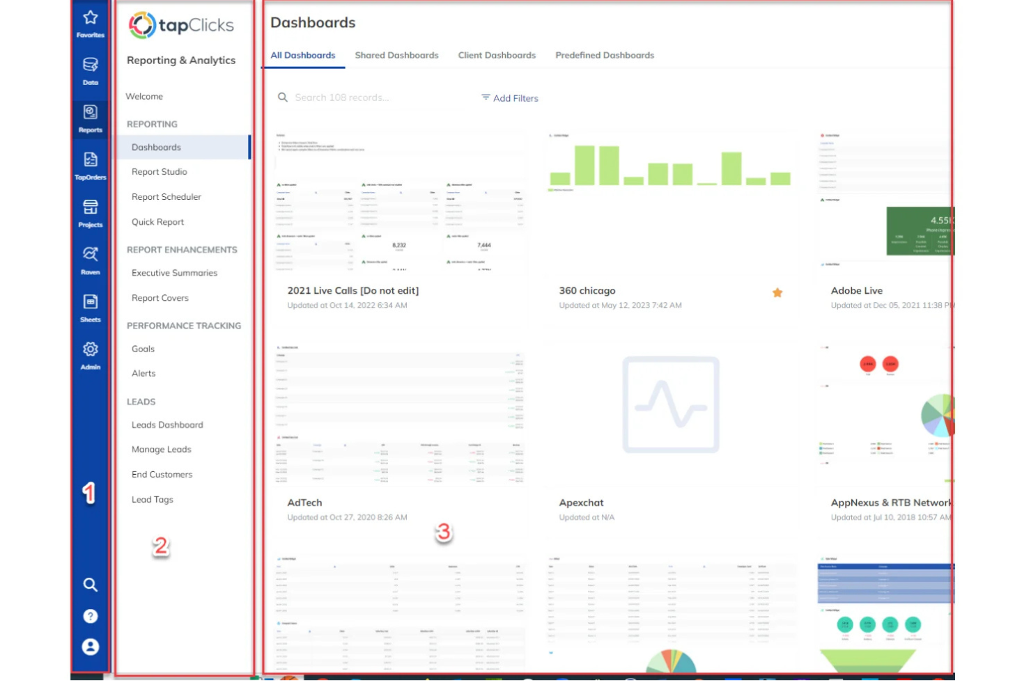
TapClicks is a unified marketing operations platform built for agencies and enterprise marketing teams who want centralized campaign management and analytics. If you need a dashboard that brings together aggregated marketing data and workflow automation, TapClicks helps simplify client reporting and daily operations.
Who Is TapClicks Best For?
TapClicks fits mid-size to large marketing agencies and enterprise teams who manage complex, multi-channel campaigns and client reporting.
Why TapClicks Is a Good Cyfe Alternative
What sets TapClicks apart for me is TapWorkflow's automated campaign fulfillment engine. When a campaign order comes in through TapOrders, TapWorkflow automatically routes tasks to the right team members based on rules I've configured—no manual handoffs, no status-update chasing.
I also rely on the SmartSuite AI Agents, which monitor live campaign performance across channels and push anomaly alerts to HubSpot or email before clients even notice a dip..
TapClicks Key Features
- SmartSlides deck builder: Converts campaign performance data into branded, presentation-ready slides in one click.
- Data load status monitoring: Displays a real-time overview of all active data syncs so you can spot and fix issues immediately.
- SmartConnector™: Builds custom connections to any data source not covered by the 250+ native connectors, without engineering support.
- Role-based access control: Restricts data visibility at the user level, so clients and team members see only the data relevant to them.
TapClicks Integrations
TapClicks offers native integrations with Google Analytics, Snowflake, Google Ads, LinkedIn Ads, HubSpot, Mailchimp, Shopify, and Amazon Ads. An API is available for custom integrations.
Pros and Cons
Pros:
- Custom widgets for niche KPI tracking
- Scheduled reporting for multiple client accounts
- Automated workflows integrate data across platforms
Cons:
- Limited internal team communication features
- Data refresh intervals are not real-time
Other Cyfe Alternatives
Here are some additional Cyfe alternative options that didn’t make it onto my shortlist but are still worth checking out:
- Microsoft Power BI
For Microsoft ecosystem integration
- DashThis
For automated monthly reporting
- AgencyAnalytics
For client reporting automation
- Supermetrics
For moving data to preferred destinations
- Grow
For full-stack business intelligence
- Zoho Analytics
For Zoho ecosystem users
- Swydo
For digital agency workflow efficiency
- Plecto
For team gamification and motivation
- Coefficient
For syncing live data to spreadsheets
- Datapad
For AI-powered dashboard creation


Cyfe Alternatives Selection Criteria
When selecting the best Cyfe alternatives to include in this list, I considered common buyer needs and pain points related to project management dashboard software products, like visualizing cross-channel project metrics and automating regular reporting. I also used the following framework to keep my evaluation structured and fair:
Core Functionality (25% of total score)
To be considered for inclusion in this list, each solution had to fulfill these common use cases:
- Track and monitor project progress
- Visualize key project metrics and KPIs
- Share dashboards and reports with stakeholders
- Support multiple data sources and integrations
- Set up custom alerts or notifications
Additional Standout Features (25% of total score)
To help further narrow down the competition, I also looked for unique features, such as:
- White label dashboard and reporting options
- Automated data refresh and anomaly detection
- AI-powered insights and recommendations
- Interactive data exploration tools
- Role-based access controls for sensitive data
Usability (10% of total score)
To get a sense of the usability of each system, I considered the following:
- Clean and intuitive dashboard interface
- Consistent navigation across all modules
- Customizable widgets and layouts
- Minimal manual setup and ease of use
- Responsive performance with large data sets
Onboarding (10% of total score)
To evaluate the onboarding experience for each platform, I considered the following:
- Step-by-step onboarding guides or checklists
- Availability of video tutorials and webinars
- Pre-built templates for fast setup
- Product tours or interactive walkthroughs
- Knowledge base and chatbot access
Customer Support (10% of total score)
To assess each software provider’s customer support services, I considered the following:
- Live chat and email response speeds
- Access to knowledgeable support reps
- Clear escalation paths for complex issues
- Availability of user community forums
- Documentation and troubleshooting resources
Value For Money (10% of total score)
To evaluate the value for money of each platform, I considered the following:
- Transparent pricing with no hidden costs
- Range of features included at each tier
- Flexible plans for different business sizes
- Clear ROI from automation and reporting features
- Free trial or money-back guarantee options
Customer Reviews (10% of total score)
To get a sense of overall customer satisfaction, I considered the following when reading customer reviews:
- Consistent positive feedback on feature set
- High marks for reliability and uptime
- Satisfaction with integrations and customization options
- Praise of customer support experiences
- Transparent handling of product updates or issues
Why Look For A Cyfe Alternative?
While Cyfe is a good choice of project management dashboard software, there are a number of reasons why some users seek out alternative solutions. You might be looking for a Cyfe alternative because…
- Needing deeper marketing or business intelligence integrations
- Wanting more advanced automation of data workflows
- Requiring custom reporting for multiple clients or brands
- Outgrowing Cyfe’s visualization or widget limitations
- Looking for better white label or branding options
- Needing stronger user permission controls
If any of these sound like you, you’ve come to the right place. My list contains several project management dashboard software options that are better suited for teams facing these challenges with Cyfe and looking for alternative solutions.
Cyfe Key Features
Here are some of the key features of Cyfe to help you contrast and compare what alternative solutions offer:
- All-in-one dashboard: Brings together data from marketing, sales, web analytics, and finance into one interface where you can view, analyze, and report on cross-departmental activity.
- Pre-built widgets: Lets you select from dozens of ready-made widgets for sources like Google Analytics, Facebook, Salesforce, and more, making it fast to connect popular channels and visualize data instantly.
- Custom data sources: Allows you to bring in data from niche tools or internal databases using custom widgets or API integrations, giving you more flexibility over the data you track and display.
- Scheduled reporting: Automates the delivery of dashboard snapshots via email to your team or clients at regular intervals, helping to keep stakeholders aligned without manual updates.
- Historical data tracking: Stores and displays historical metrics, letting you identify patterns and run trend analysis over weeks, months, or years without building custom reports from scratch.
- Multiple dashboard support: Permits you to set up unique dashboards for teams, clients, or goals, so each view is simplified for a specific audience or use case.
- User management and permissions: Enables you to set user roles and access levels, meaning you can restrict who can view or edit certain dashboards and widgets across your organization.
- Embedded dashboards: Gives you the ability to embed Cyfe dashboards directly on client portals, team intranets, or your website, sharing live data with external audiences in a controlled way.
- KPI alerting: Lets you configure smart alerts for key metrics so your team’s notified instantly when numbers hit thresholds that matter to your projects or business.
- Data export options: Supports exporting dashboard data into CSV, PDF, or image formats, allowing for ad hoc sharing or further analysis outside of Cyfe.