10 Best BI Tools For Better Decisions In 2026

10 Best BI Tools Shortlist


Business intelligence tools help teams turn raw data into actionable insights by consolidating information, visualizing trends, and supporting smarter decision-making. Whether you're tracking KPIs, analyzing customer behavior, or forecasting revenue, the right BI tool can uncover patterns that drive growth and improve performance across your organization.
To help you choose the right platform, I tested and reviewed leading business intelligence tools based on their data integration capabilities, dashboard features, ease of use, and scalability. This guide highlights the top BI tools available in 2026 so you can find one that meets your team’s data needs and supports strategic decision-making.
What Are Business Intelligence Tools?
Business intelligence tools are software applications that collect, analyze, and visualize data to help organizations make smarter, data-driven decisions.
They consolidate information from sources like databases, spreadsheets, and cloud services into interactive dashboards and reports. With features like real-time analytics, data visualization, and reporting, BI tools turn raw data into actionable insights for teams across departments.
Why You Can Trust Us
We’ve been testing and reviewing project management software since 2012. As project managers ourselves, we know how critical and difficult it is to make the right decision when selecting software.
We invest in deep research to help our audience make better software purchasing decisions. We’ve tested more than 2,000 tools for different project management use cases and written over 1,000 comprehensive software reviews. Learn how we stay transparent & our software review methodology.
The Best Business Intelligence Tools Comparison Chart
You can use the following chart to find the best BI tool for your needs:
| Tool | Best For | Trial Info | Price | ||
|---|---|---|---|---|---|
| 1 | Best for real-time cross-channel journey mapping | Free plan + free demo available | Pricing upon request | Website | |
| 2 | Best business intelligence tool for small companies | 15-day free trial + free plan + free demo available | From $24/month (billed annually) | Website | |
| 3 | Best for integrating over 150 data sources | 14-day free trial + free demo available | From $44/month (billed annually) | Website | |
| 4 | Best for integrating data into spreadsheets | Free plan available | From $49/month (billed annually) | Website | |
| 5 | Best enterprise business intelligence tool | Free trial + free plan available | From $15/user/month (billed annually) | Website | |
| 6 | Best database BI reporting tool | Free plan available | From $9/user/project/month | Website | |
| 7 | Best for sharing analytics with external vendor portals | 30-day free trial + free demo available | Pricing upon request | Website | |
| 8 | Best business intelligence API for building analytics into your products and tools | 7-day free trial + free demo available | Pricing upon request | Website | |
| 9 | Best for building and embedding dashboards in your applications | 15-day free trial + free demo available | From $265/month (billed annually) | Website | |
| 10 | Best for Jira integration & custom views | Free plan available | From $18/user/month | Website |
-

Smartsheet
Visit WebsiteThis is an aggregated rating for this tool including ratings from Crozdesk users and ratings from other sites.4.5 -
Accelo
Visit WebsiteThis is an aggregated rating for this tool including ratings from Crozdesk users and ratings from other sites.4.4 -
Celoxis
Visit WebsiteThis is an aggregated rating for this tool including ratings from Crozdesk users and ratings from other sites.4.4


Best Business Intelligence Tools Overviews
These are overviews of the best BI tools on the market right now:
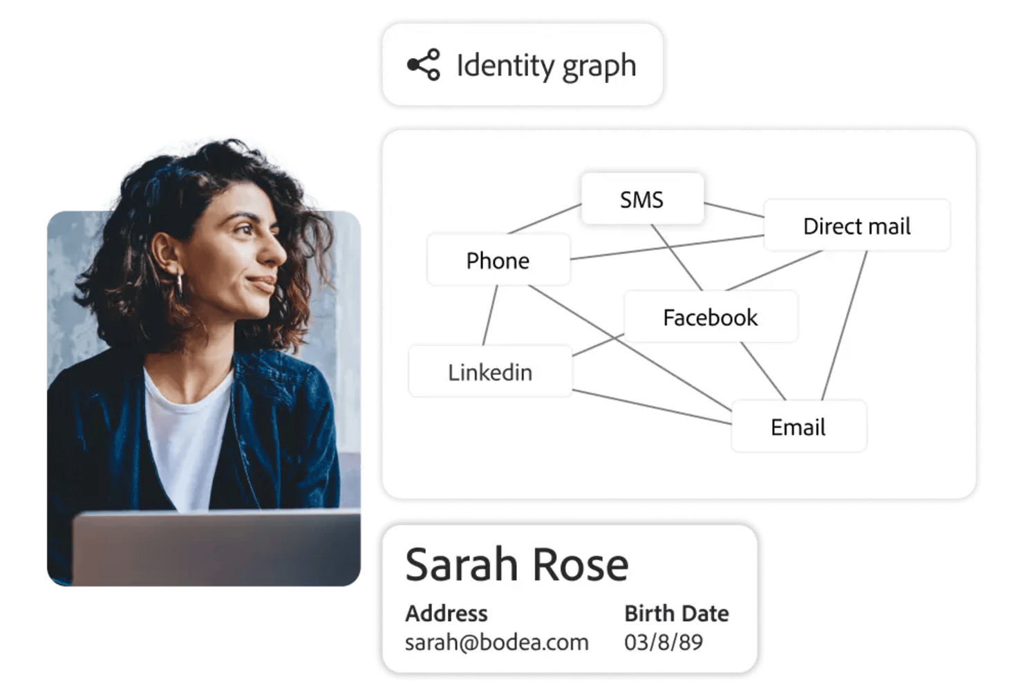
Adobe Customer Journey Analytics is a business intelligence tool that lets you analyze and visualize customer journeys across multiple channels using real-time data, customizable dashboards, and advanced analytics features.
Who Is Adobe Customer Journey Analytics Best For?
Marketing and analytics teams at large enterprises who need to analyze complex, multi-channel customer journeys.
Why I Picked Adobe Customer Journey Analytics
I picked Adobe Customer Journey Analytics as one of the best because I can map customer journeys across web, mobile, and offline channels in real time. I use its visual flow analysis to see how users move between touchpoints and spot drop-off points instantly. My team relies on its unified data model to blend data from multiple sources, so we always have a complete view of the customer experience.
Adobe Customer Journey Analytics Key Features
- Customizable dashboards: Build interactive dashboards to visualize and share key metrics with your team.
- Advanced segmentation: Create granular audience segments based on behavior, demographics, or custom criteria.
- Scheduled reporting: Automate report delivery to stakeholders on a set schedule.
- Data connectors: Import and unify data from CRM, ecommerce, and other external systems.
Adobe Customer Journey Analytics Integrations
Adobe Customer Journey Analytics offers native integrations with Adobe Experience Platform, Adobe Analytics, Adobe Target, Adobe Audience Manager, and Adobe Campaign. It also provides an API for custom integrations and supports connections to external data sources through Adobe Experience Platform connectors.
Pros and Cons
Pros:
- Flexible calculated metrics and custom data views
- Deep integration with Adobe Experience Platform
- AI-powered anomaly detection and root cause analysis
Cons:
- Advanced features may require technical expertise
- Limited native integrations outside Adobe products

Zoho Analytics is a great business intelligence tool for small businesses, given their large feature set, simple interface, and affordable pricing for a small number of users. For one tour operator managing 17 multi-day trips, Zoho Analytics proved invaluable: “I have used Zoho Analytics to monitor guide performance, guest ratings and trip logistics on all our 17 multi-day tours. Zoho Analytics assisted me in revealing the trends of guest behavior and trip flow in the rural areas. It allowed us to reduce overtime by monitoring inefficiencies that we could not see on spreadsheets.”
This tool lets you pull data from a wide range of sources and build out intuitive and functional reports in order to analyze the visualized data. AI assistant “Zia” will answer questions typed into a query box using the data collected, combined with machine learning and natural language processing technologies.
Zoho Analytics takes the prize for my favorite in features and functionality. While most of the software reviewed here can sport a robust BI system, Zoho goes above and beyond with features like their AI assistant, their focus on ease of collaboration, tons of third party integration options, and Android and iOS mobile apps.
A few minor cons for Zoho include that the SQL tutorials could be built out a little bit better. Additionally, the reporting pivot view/summaries would benefit from having an “OR” or “CONTAINS” command in order to better pull out the data that you need.
They have integrations with Zoho Analytics, SAlesforce CRM, Microsoft Dynamics CRM, Hubspot CRM, Mailchimp, Google Analytics, Bing Ads, Zoho Surveys, Survey Monkey, Facebook, TWitter, YouTube,QuickBooks, Xero, Shopify, Zendesk, and more.
Zoho Analytics starts from $24/month for 2 users and has a free 15-day trial.

Supermetrics is a powerful data integration tool that simplifies the collection and analysis of marketing data, making it an essential resource for business intelligence (BI). By enabling users to aggregate data from over 150 different sources, including major platforms like Google Ads, Facebook Ads, and LinkedIn Ads, Supermetrics ensures that businesses can compile comprehensive datasets for more informed decision-making. For example, Baris Zeren, CEO of Bookyourdata, explained how impactful the platform has been for his team: “Supermetrics has made reporting easier because it automatically pulls data on marketing and sales into one dashboard. It is unique in that it saved the team hours per week and provided us with a cohesive and consistent perspective on campaign efficacy.”
One of the standout features of Supermetrics as a BI tool is its automation capabilities. Users can set up automated data transfers, which ensure that their reports are always populated with the latest data without manual intervention. This automation extends to the scheduling of regular data imports,
Supermetrics also offers robust data transformation options. Users can filter, combine, and modify data before it reaches its final destination, allowing for customized reports that meet specific business requirements. These transformation capabilities are critical for BI, as they enable businesses to tailor their data to uncover precise insights and trends. The tool’s compatibility with leading BI platforms such as Google Data Studio and Power BI further enhances its utility, allowing for sophisticated data visualization and analysis.
Additionally, Supermetrics supports a wide array of integrations with various marketing and sales platforms, like Google Analytics, HubSpot, Shopify, and Salesforce, ensuring that all relevant data can be consolidated into a single source of truth.
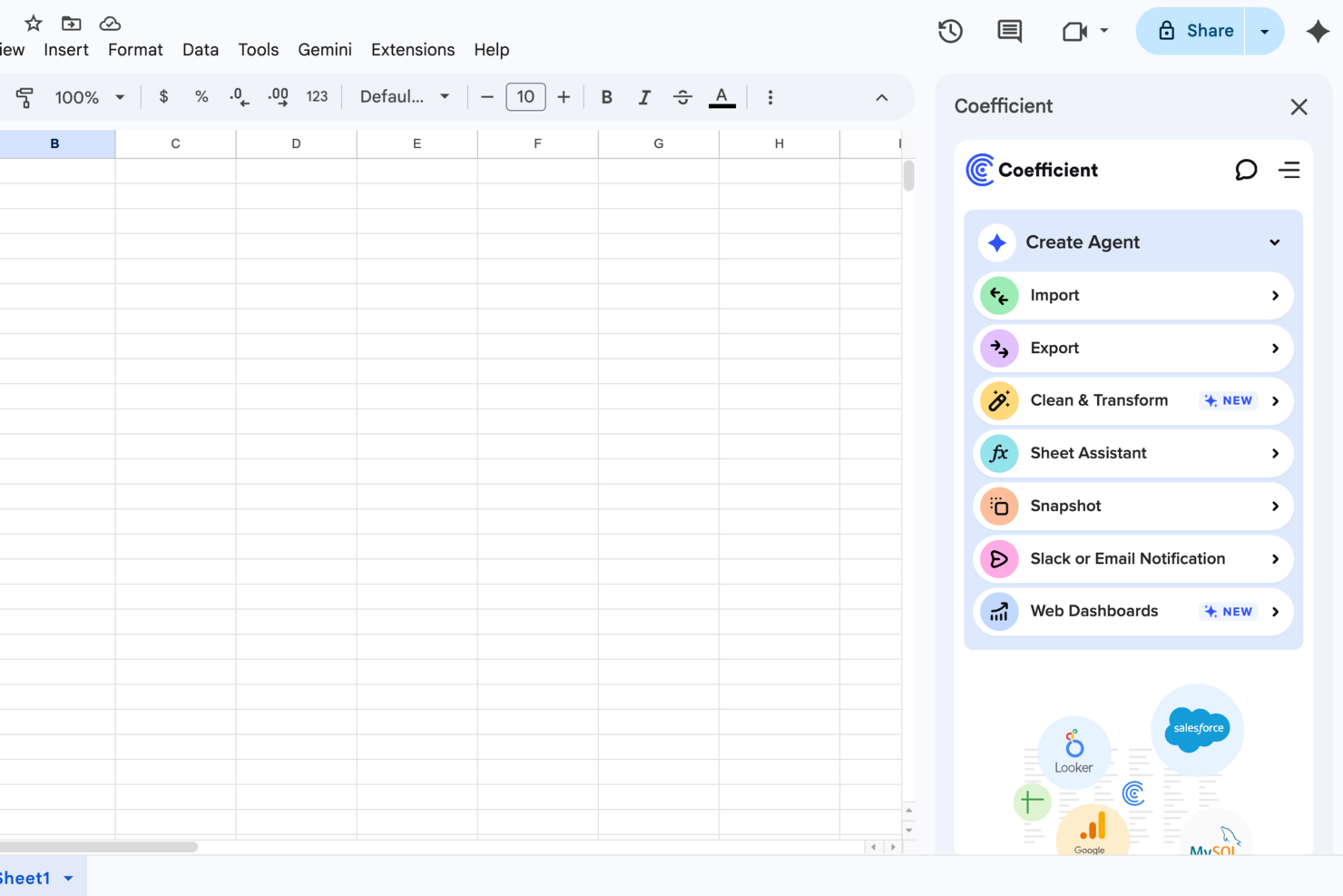
For businesses eager to harness the power of data without the complexity of traditional BI tools, Coefficient offers a refreshing alternative. Designed to integrate easily with platforms like Google Sheets and Excel, it appeals to professionals across revenue operations, marketing, finance, and analytics. By simplifying data collection and reporting through AI-powered features, Coefficient addresses the challenge of making data-driven decisions accessible to all, regardless of technical expertise.
Why I Picked Coefficient
I picked Coefficient because it transforms the way you interact with data by integrating 100+ data sources directly into spreadsheets. This unique capability allows you to build live dashboards and generate insights without needing extensive technical skills. Additionally, features like the SQL query builder and pre-built dashboards enable your team to visualize data in real-time, making it easier to drive informed decisions. By automating data enrichment and reporting, Coefficient effectively reduces the time spent on manual data tasks, letting you focus on strategic initiatives.
Coefficient Key Features
In addition to its impressive integrations, I also found several other features that make Coefficient stand out:
- Import Agent: This feature allows you to connect to various data sources, bringing live data into your spreadsheets without manual input.
- API Agent: You can create custom connectors to integrate with unique data sources, ensuring your specific business needs are met.
- Browser Agent: This tool enables web scraping directly from your browser, allowing you to gather and analyze data from the web effortlessly.
- Automated Alerts: Stay informed with real-time updates via Slack or email, ensuring your team is always aware of critical data changes.
Coefficient Integrations
Integrations include Salesforce, QuickBooks, Snowflake, HubSpot, MySQL, Redshift, NetSuite, and more. An API is also available for custom integrations.
Pros and Cons
Pros:
- Native spreadsheet environment
- No-code interface for non-technical users
- Real-time data syncing
Cons:
- Limited offline functionality
- Limited to spreadsheet-based visualization

Tableau is a robust, scalable analytics platform with desktop, cloud, or on-site options. It boasts an interactive, visual analysis style and allows you to securely consume your data via browser, desktop, mobile, or embedded into any application. They offer over 900 learning resources, including over 100 training videos. For Gianluca Ferruggia, General Manager at DesignRush, Tableau’s impact was immediate: “Tableau transformed our unrefined data into graphic stories, its drag-and-drop dashboards changed the game by enabling us to see trends our spreadsheets were hiding.”
They excel in a specific area of the features and functions evaluations criteria section: flexibility. Tableau is easily scalable; offered by server, desktop and/or cloud; available on all device types, be it PC or smartphone; and they have free analytics resources for students, educators and smaller not-for-profits. Whatever your niche, you are sure to find something that fits.
Tableau can join with data collection systems like ServiceNow, Splunk, and Google Analytics. Other integrations, or “Technology Partners as they call them, include 0xdata, AIMMS, Aircloak, AllSight, Amazon Web Services, Astera, Axiomatics, Birst, Datawatch,
Element Analytics, Google Cloud Platform, IBM, Microsoft, and many, many more.
The pricing is a bit steep to begin with and costs go up at the end of the year long contract. Multi-year contracts are not available, so they got dinged in our value for cost section because of the high and shifting price schema, which can come across as predatory.
Tableau starts at $70/user/month and has a free 14-day trial.

Create easy-to-read reports and visual-oriented interactive dashboards that display data-rich actionable insight for defining business metrics, locating value, and discovering interconnectivity between tables. Resources and features include custom applications, embedded visualizations, data science workflows, the ability to host on Public Clouds (like AWS and GCP), and more. For Amit Chandak, Chief Analytics Officer at Kanerika Inc, Looker proved to be a powerful solution for client data challenges: “We used Looker to deliver real-time, trusted insights for a client struggling with fragmented data—once implemented, reporting speed improved by 50% and decision-making accelerated significantly thanks to clear, actionable dashboards.”
They offer a free interactive training course and many other tutorial-like resources, which is why I was able to score them so highly in the usability section of the evaluation criteria. Beneath the “Getting Started” tab, you’ll notice that they have plenty of self-help resources for viewing raw data, building tools, and developing models.
The downfall of this software is that writing the queries is not incredibly user friendly. On top of that, data analytics tasks take a significant amount of time to render and run queries. When it comes to big data, it may get sluggish.
They connect with databases from Redshift, Snowflake, BigQuery, as well as 50+ supported SQL dialects like Amazon Redshift, Google BigQuery, Snowflake, MySQL, Oracle, Amazon Athena, Amazon Aurora, and more.
Looker starts at $3,000/month for 10 users ($50/additional user) and has a free demo.
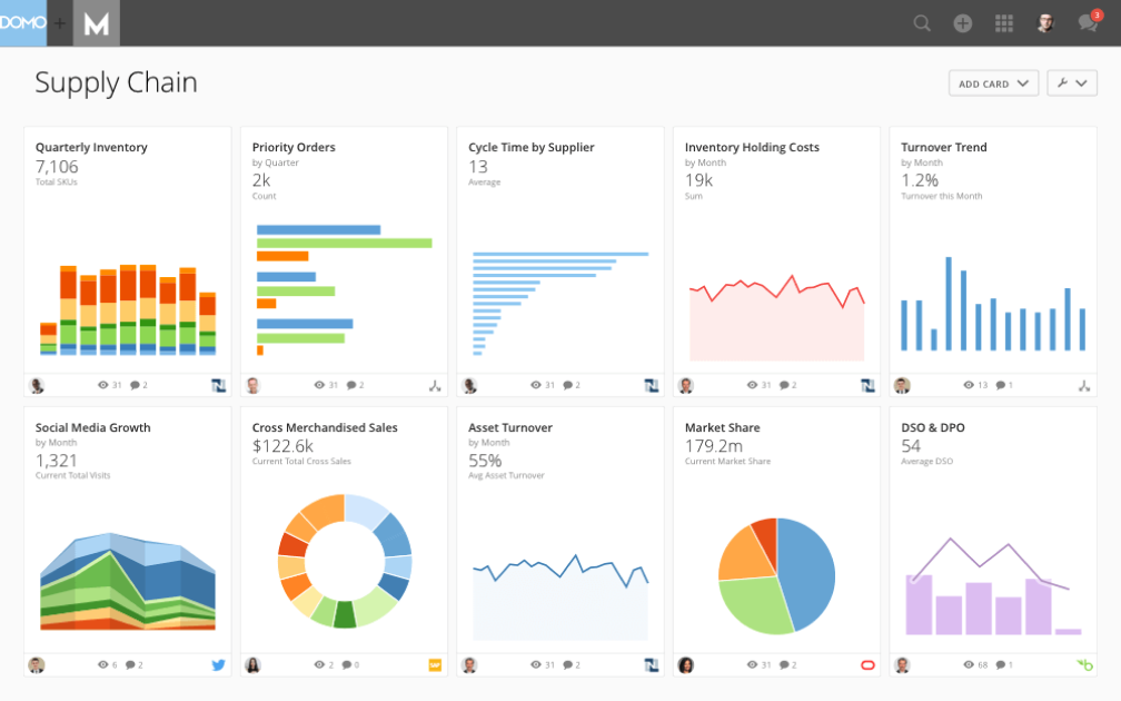
The Domo Business Cloud is a platform that lets you aggregate data from multiple sources and build custom workflow apps. Their features include dashboards and reporting, machine learning, predictive analytics, and external self-service reporting. For many organizations, Domo’s ability to step in when other tools fall short is a major advantage. Nicola Leiper, the Director and Head of Project Management at Espresso Translations, shared her experience: “Excel crashed and Domo rescued our largest customer relationship. Domo not only organized our data but saved our reputation and exposed some of the underperforming parts of our operations that cost us thousands.”
I like the focus that Domo places on your external relationships with vendors and other stakeholders. The name is Domo Everywhere, and it’s a feature that lets you build portals for your external partners. Therefore, they can analyze the data you decide to share with them on their own and draw their own insights.
Further, the data visualization boards are independent widgets that can be edited, filtered, and resized with a couple of clicks. Lastly, the platform allows you to set permissions on both internal and external users, regardless of the account (Domo or not Domo).
Domo integrates with external data sources through their 1000+ pre-built connectors, which include Shopify, Salesforce, Amazon S3, Adobe Analytics, Sharepoint, and Survey Monkey.
Domo has a free trial available, and prices can be quoted upon request.
Sisense
Best business intelligence API for building analytics into your products and tools

A hybrid-cloud platform built to leverage all of your data together and make it available to you through interactive dashboards, self-service analytics, and/or white-labeled BI apps. They offer support, analytics, and reporting for business areas such as customer service measurables, digital marketing, finances, human resources, retail and eCommerce, IT analytics, and more.
As far as our usability and UI evaluation criteria expectations, I found that Sisense is easy to use, easy to instal and setup, and sports an intuitive interface and streamlined UX. The customer service team is responsive and adaptive so this would be a decent choice for companies with lower levels of technology experience who might need some extra assistance.
A few cons include that the marketing connector could be more robust. Also, some functions are so simplified that they get in the way, for example not having to write a query seems like a time saving mechanism until your needs don’t match their pre-existing data and you have to jump through hoops to find a creative solution to get what you need.
Use ODBC to connect directly to Sisense’s powerful back-end from any third party application you like, from Excel to popular data visualization and reporting tools. They also offer a marketplace for extensions and plug-ins that they or their partners provide for use. Some are available free and others are only available with a premium account.
Sisense offers custom pricing and has a free demo as well as a free trial.
ClicData
Best for building and embedding dashboards in your applications

ClicData is a data aggregation platform with over 250 connectors. This allows you to bring data from anywhere in the company. After, a data warehouse stores that information and makes it available for you to design real-time dashboards.
The last step is for you to design your dashboard. ClicData's dashboard designer has a drag-and-drop functionality that makes it easy to build your data visualizations. Add elements like annotations, Gauges, maps, audio, tables, and any graph you can think of. After that, you can embed your charts in a website, portal or ERP using its API.
Although the platform does not offer any out-of-the-box, prebuilt integrations, its API is available for your IT team to do it. The API enables integrated software to send information to ClicData as soon as it’s received, so you can always see real-time updated information.
ClicData paid plans start at $75/month and offer a 15-day free trial.
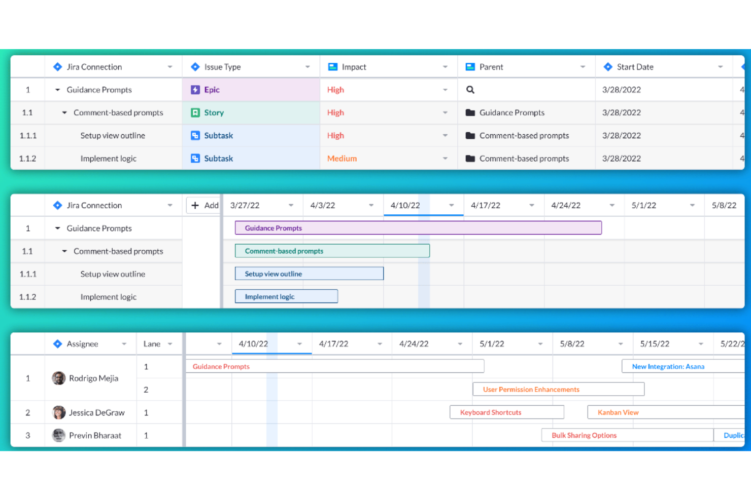
Visor is a workspace tool that connects to various SaaS applications, aiming to bring people together with data for a more collaborative work environment. It allows users to create custom views and visualizations of their nested Jira data, offering bi-directional integration with Jira for accurate and customizable sharing.
Visor operates as a workspace tool that enhances the functionality of SaaS applications by providing users with a unified view of their data. Visor also emphasizes secure sharing, featuring a straightforward drag-and-drop interface for ease of use. It additionally includes an advanced JQL importer and supports over 75 Jira field types, catering to a wide range of data management needs.
Moreover, Visor facilitates collaboration and communication among team members, with features such as Gantt charts, roadmaps, and the ability to customize views with colors and conditional formatting. This can save time and improve the efficiency of project planning and reporting processes.
Visor integrates with Salesforce, Jira, and HubSpot.
Pricing for Visor starts from $9/user/month.
Other Options
In my research, I found a few tools that didn’t quite make the list but that deserve a shout-out nevertheless.
- Power BI
Business intelligence solution for Microsoft users
- Logi Analytics
Out-of-the-box embedded business analytics tool for software teams
- InetSoft
Data intelligence tool for scalable architecture and advanced modeling
- Metric Insights
Enterprise BI portal builder
- Exago BI
Business intelligence reporting tool for beginners and non-technical folks
- Izenda
Business intelligence software for embedding in web-based applications
- ClickUp
For BI tool integrations
- Klipfolio
Intuitive data visualization software for companies of all sizes.
- Funnel
Easy to understand and manipulate marketing and advertising data.
- Improvado
150+ integrations – like Facebook Ads, Google Analytics, YouTube and LinkedIn – to plot all marketing initiatives on one dashboard.
- AgencyAnalytics
SEO, PPC, social, email, review and call tracking dashboards all-in-one system.
- AnswerRocket
A searchable database of statistics and reports that is designed to answer questions of the everyday user.
- Tray
An iPaaS solution with API integration, CSV automation and an easy drag-and-drop workflow.
- ClicData
A business intelligence platform complete with a data warehouse, processing and management, dashboard designer and automation.
- BrightFunnel
Easy to understand and manipulate marketing and advertising data.
- Adaptive Insights
Modernized planning, modeling, budgeting, and forecasting tools.


How I Evaluate Business Intelligence Tools
From helping a finance team ditch their weekly Excel-to-PowerPoint ritual to giving a product team real-time visibility into feature adoption across customer segments, business intelligence tools are where raw data actually becomes something people act on. When I evaluate them, I think in two layers: what every tool needs to do just to earn a spot on this list, and what separates the ones worth recommending from the ones that technically work but frustrate everyone who touches them.
Core Functionality (Table Stakes for This List)
For business intelligence tools, the core functionality I test and evaluate is:
- Data connectivity: I check whether the tool connects natively to the sources teams actually use. If a product manager can't blend product usage data from their warehouse with CRM data without a workaround, it's a problem.
- Interactive dashboards: Every tool needs to support drill-down, cross-filtering, and dynamic date controls that let users explore data on their own. I test this by building a multi-page dashboard and checking whether a stakeholder could answer follow-up questions without asking me to rebuild anything.
- Data modeling layer: I test whether the tool lets you define metrics, relationships, and hierarchies in one place so "revenue" means the same thing on every dashboard. Without this, I've seen teams spend more time arguing about numbers than acting on them.
- Reporting and distribution: I check for scheduled report delivery via email or Slack, plus threshold-based alerts. A finance lead should be able to get a weekly P\&L snapshot in their inbox every Monday without manual effort.
- Row-level security: I verify that the tool can restrict data visibility by user role or identity at the row level. This matters the moment you have regional sales managers who should only see their own territory's pipeline.
- Scalability and query performance: I run tests with larger datasets and concurrent users to see if dashboards still load in under a few seconds. A tool that works great in a demo but chokes when 50 people open the same executive dashboard on Monday morning isn't production-ready.
- AI-assisted analytics: I evaluate built-in capabilities like natural language querying, automated anomaly detection, and forecasting. I want to see whether the AI features actually surface useful insights — like flagging an unexpected churn spike — or just add a chatbot skin over a basic search bar.
If a tool can't do these things reliably, it didn't make the cut regardless of what else it offers.
Standout Features (What Separates the Picks)
Beyond the basics, I focus on features like multi-cloud or on-prem deployment options, true white-label embedding for SaaS products, Git-based version control for analytics workflows, deep ecosystem integrations (dbt, Slack, MS Teams), and advanced governance tools that actually scale. I also test how well each tool surfaces automated insights, supports data storytelling, and fits into compliance-heavy industries.
What I Weigh Beyond Features
I look at total cost of ownership — not just license fees, but connector costs, training overhead, and admin burden at scale. Ecosystem fit matters too: a Microsoft-heavy organization will get more value from Power BI than from a tool that needs custom integrations for everything. I also evaluate time to value, since a tool that takes six months to deploy often loses stakeholder buy-in before the first dashboard ships.
How I Picked The Best BI Tools
First, I selected a big list of popular tools based on reviews and user ratings. Then, I narrowed down the list by looking at the key features that my experience has shown me a BI tool needs. Finally, I selected the criteria below as the basis of my evaluation.
User Interface (UI)
Your BI platform is a place where you analyze business data, and through data modeling, consume it in the form of graphs and other visual representations that improve decision-making. Therefore, the interface has to be clean, intuitive, and make good use of white space.
Usability
The tool needs to be easy to learn and master. Tools like Microsoft Power BI, for example, have a drag-and-drop interface that you can use on graphical elements to alter the information being analyzed. The BI tool should have features like these and proper support documentation, training, and tutorial videos to help you use the tool faster.
Features & Functionality
How many of the key management reporting tools features and functions does it provide, and how powerful are they? Specifically, I looked for:
- Customizable Dashboards: The best BI solutions offer a single screen display with multiple visualizations, along with the ability to interconnect the visualizations (so any filters or selections will affect all the visualizations) or maintain each one as independent. It should reflect changes in real-time and allow you to create customized displays of key data.
- Drill Down and Data Filters: Looking at in-depth information is key. This includes features such as drop-down menus, search filters and slicers, as well as the ability to drill down into the details and back up to data summaries.
- Web-based Interface For Clients: It’s simplest if reporting solutions that are client-facing offer web-based client interfaces, as it’s more efficient and easier to administer than desktop-based client interfaces.
- Scheduled and Automated Reports: The tool should help you easily monitor progress. This includes the ability to schedule automatic updates to be sent out to teams, send out automatic reports to clients, and set up automatic notifications to be made aware of key dates or thresholds.
- High-Quality Diagramming: Basic tools include bar, line, pie, area and radar chart types, and more advanced diagrams include heat maps, scatter plots, bubble charts, histograms, and geospatial maps. The best reporting tools let you mix and match to create diagrams that use a combination of these visualizations.
Integrations
Data connectors will help you make the most out of a BI platform. One way of achieving this is through data integrations with other cloud-based software like SAP or SAS. Therefore, I look for pre-built integrations, third-party software aggregators like Zapier, and custom integrations using APIs.
Pricing
One of the biggest influence on tool-related business decisions is pricing. Therefore, I look for information on use cases, pricing plans per month and any other information that will help you. For example, if it has a free version you can try, a free trial, or if it’s available as an on-premise solution.
BI Tools FAQs
Find answers to common questions other people ask about this topic.
How can business intelligence tools help analytics managers drive strategic decision-making?
Business intelligence tools help analytics managers by automating data collection and delivering real-time insights through dashboards and visualizations. You can quickly compare sales across regions, track budgets, and spot operational issues without manual reporting. Many platforms offer predictive modeling and scenario planning to forecast outcomes and guide strategy. With data storytelling—combining visuals and narrative—you can shape executive decisions and align teams around insight-driven goals.
What are common integration challenges when implementing BI tools in established business environments?
Integration challenges often stem from outdated IT systems, siloed data, and inconsistent formats. Legacy ERPs or homegrown databases may struggle to connect with cloud BI tools, causing sync errors or data loss. Poor-quality data can skew reports, while strict security protocols may delay access. To address this, audit your data, involve IT early, standardize formats, and select BI platforms with strong interoperability, such as native connectors, API support, and data transformation capabilities.
How do BI tools support cross-departmental collaboration for business managers?
BI tools streamline cross-team collaboration by offering a single source of truth accessible to all. Instead of juggling spreadsheet versions, managers can build interactive dashboards that auto-update with the latest data. Finance and sales can review shared revenue forecasts, while operations and HR track staffing needs. Features like chart annotations, task assignments, and KPI alerts reduce miscommunication, make meetings more efficient, and help departments stay aligned on shared goals.
Which performance metrics should business managers track using BI software?
Your choice of metrics depends on your business goals, but common ones include revenue growth, net profit margin, customer acquisition cost, lifetime value, churn rate, and operating expenses. For project-driven teams, you might also track on-time delivery rates or resource utilization. BI tools make it easy to create automated dashboards so you can monitor these metrics real-time. Set custom thresholds to trigger notifications if a metric falls outside your preferred range. Over time, tracking these KPIs helps you quickly pinpoint areas that need attention and measure the effectiveness of new initiatives.
How do you measure the ROI of a business intelligence platform in a mid-to-large organization?
Start by measuring hard savings, like reduced labor from manual reporting. For instance, if finance saves 20 hours monthly, that’s a clear overhead cut. Then estimate revenue gains from faster, more accurate decisions—such as winning new sales or lowering costs with better forecasts. Track metrics like fewer reporting errors, quicker insights, and higher data adoption. Compare these benefits against total costs—subscriptions, integration, training, and support—to calculate ROI and justify ongoing investment.
What's Next?
If you're in the process of researching business intelligence tools, connect with a SoftwareSelect advisor for free recommendations.
You fill out a form and have a quick chat where they get into the specifics of your needs. Then you'll get a shortlist of software to review. They'll even support you through the entire buying process, including price negotiations.