


Recensione Lucidchart: Pro, Contro, Caratteristiche e Prezzi



Somewhere in a tangle of static drawings and version-controlled chaos, a good idea is waiting to be understood. The way your team maps its work shouldn't be the thing slowing that work down.
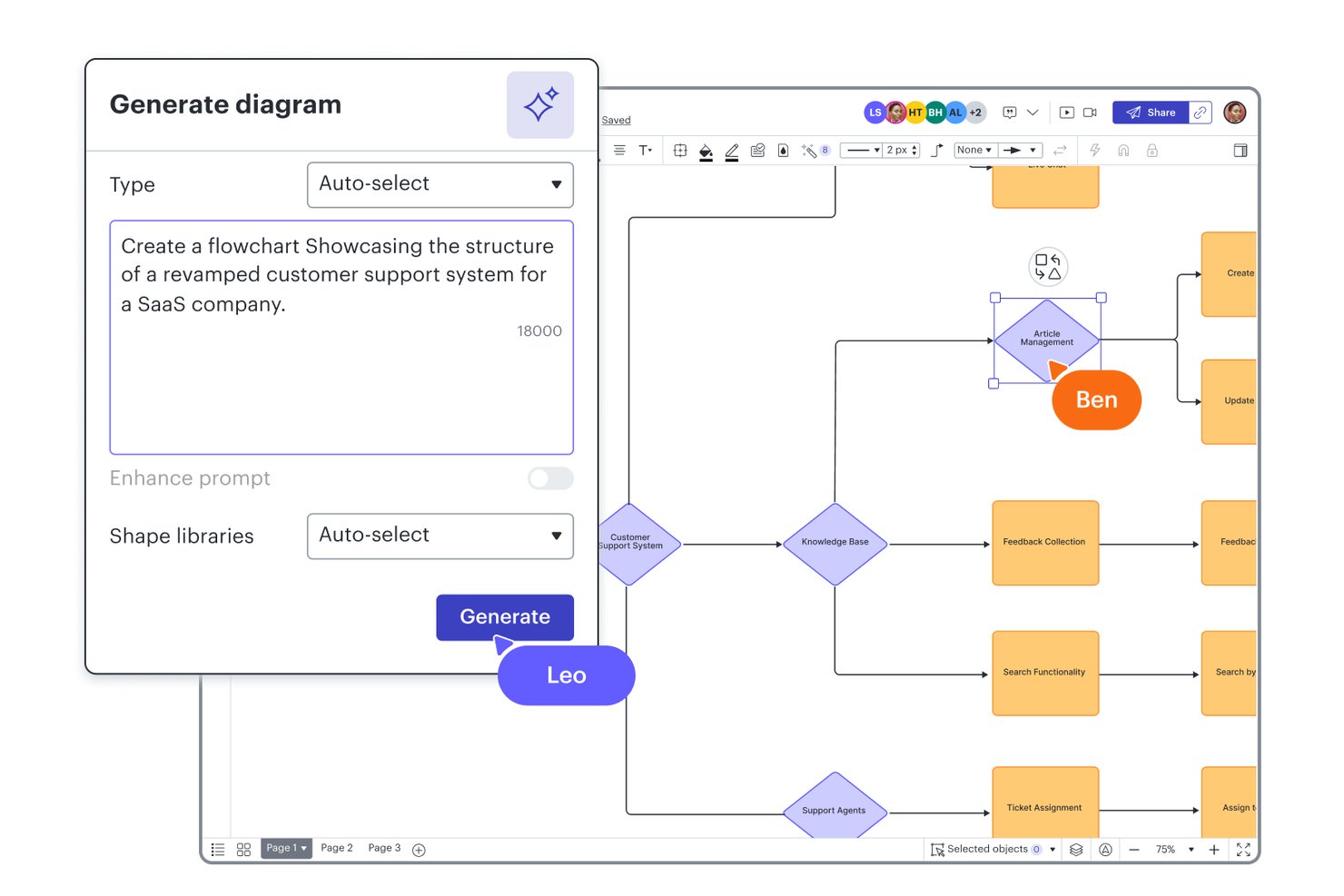
Lucidchart is a modern workflow diagram software that helps teams map, visualize, and improve complex processes on an intuitive, browser-based canvas. You’re likely here because your current diagramming tools can’t keep up with today’s cross-functional workflows, or you’re tired of hitting collaboration or integration roadblocks. While certain tools have been industry staples for years, Lucidchart stands out when you need real-time collaboration, flexible integrations, and the freedom to work anywhere your projects take you.
If you’re weighing your options, here’s why teams wanting speed and adaptability consistently pick Lucidchart over slower, more traditional competitors.
Lucidchart Evaluation Summary
- From $9/month (billed annually)
- Free plan + 7-day free trial available
Perché fidarsi dei nostri consigli sui software
Il nostro team testa e recensisce software dal 2012. In quanto project manager noi stessi, sappiamo quanto sia difficile — e importante — scegliere il software giusto.
Per questa guida, abbiamo valutato gli strumenti attraverso test pratici e ricerche indipendenti, assegnando un punteggio agli strumenti in base ai nostri criteri di selezione. Ci basiamo inoltre sulle competenze di leader di pensiero del settore e di professionisti attivi nella gestione dei progetti.
Le nostre recensioni riflettono il nostro giudizio editoriale umano, non un discorso di vendita.
Revisori esperti:
Lucidchart Overview
Among the diagramming and collaboration tools I've used, Lucidchart consistently stands out for its easy onboarding, clean interface, and strong collaboration features. I find its integrations with project management and cloud storage platforms a deciding factor for teams working across apps, and the pricing is fair for the value—especially if you want scalable access. While it's not the lowest cost solution and some advanced data features are reserved for the Enterprise plan, I'd choose Lucidchart for teams who need quick setup and real-time sharing rather than heavyweight customization. If your environment values speed, modern UX, and smooth collaboration, Lucidchart is probably the right call.
pros
-
Real-time collaboration works smoothly across distributed teams
-
Extensive template library speeds up diagram creation
-
Browser-based editor requires no software installation
cons
-
Offline editing options are extremely limited
-
More advanced data features require an Enterprise plan
-
Accessing the full toolset can mean switching between Lucidchart and Lucidspark
-

Celoxis
Visit WebsiteThis rating combines scores from multiple user review sites to reflect overall customer sentiment about the product.4.5 -
Smartsheet
Visit WebsiteThis rating combines scores from multiple user review sites to reflect overall customer sentiment about the product.4.5 -
Accelo
Visit WebsiteThis rating combines scores from multiple user review sites to reflect overall customer sentiment about the product.4.4



La nostra metodologia di recensione
Come testiamo e valutiamo gli strumenti
Abbiamo passato anni a costruire, perfezionare e migliorare il nostro sistema di test e valutazione dei software. Il nostro schema è progettato per cogliere tutte le sfumature della scelta di un software e ciò che rende uno strumento efficace, ponendo l’accento sugli aspetti critici del processo decisionale. Qui sotto puoi vedere esattamente come funziona il nostro test e la nostra valutazione su sette criteri. Questo ci consente di offrire una valutazione imparziale del software basata su funzionalità fondamentali, caratteristiche distintive, facilità d’uso, onboarding, assistenza clienti, integrazioni, recensioni dei clienti e rapporto qualità-prezzo.
Funzionalità principali (25% della valutazione finale)
Il punto di partenza della nostra valutazione è sempre la funzionalità principale dello strumento. Ha le funzioni e le caratteristiche di base che un utente si aspetterebbe di trovare? Alcune di queste funzionalità sono limitate ai piani premium? In sostanza, ci aspettiamo che uno strumento sia all’altezza delle capacità di base dei suoi concorrenti.
Caratteristiche distintive (25% della valutazione finale)
Successivamente valutiamo le funzioni distintive, non comuni, che vanno oltre la semplice funzionalità di base normalmente presente in strumenti simili. Un punteggio elevato riflette funzionalità specializzate o uniche che rendono il prodotto più rapido, efficiente o che offrono un valore aggiunto all’utente. Valutiamo anche la facilità d’integrazione con altri strumenti comunemente presenti nel tech stack per ampliare la funzionalità e l’utilità del software. Gli strumenti che offrono molte integrazioni native, connessioni di terze parti e accesso API per creare integrazioni personalizzate ottengono il punteggio più alto.
Facilità d’uso (10% della valutazione finale)
Consideriamo quanto sia semplice e rapido eseguire le attività definite dalla funzionalità principale tramite lo strumento. Gli strumenti con un punteggio elevato sono ben progettati, intuitivi, offrono app mobili, propongono modelli e rendono semplici anche le attività più complesse.
Onboarding (10% della valutazione finale)
Sappiamo quanto sia importante che il team adotti rapidamente una nuova piattaforma, quindi valutiamo quanto sia facile imparare e utilizzare uno strumento con poca formazione. Valutiamo quanto velocemente un membro del team possa iniziare a utilizzare lo strumento senza esperienza. Le soluzioni con un punteggio alto indicano che è richiesto poco o nessun supporto.
Supporto clienti (10% della valutazione finale)
Recensiamo la rapidità e semplicità nel trovare aiuto tramite telefono, chat live o knowledge base. Gli strumenti e le aziende che forniscono supporto in tempo reale ottengono i punteggi migliori, mentre i chatbot i più bassi.
Recensioni dei clienti (10% della valutazione finale)
Oltre ai nostri test e valutazioni, consideriamo il net promoter score dei clienti attuali e passati. Valutiamo la loro probabilità, qualora fosse possibile, di scegliere nuovamente lo strumento per le sue funzionalità di base. Un software con un punteggio elevato riflette un alto net promoter score da clienti attuali o passati.
Rapporto qualità-prezzo (10% della valutazione finale)
Infine, prendendo in considerazione tutti gli altri criteri, analizziamo il prezzo medio dei piani base confrontandolo con le funzionalità principali e valutando il valore degli altri criteri. I software che offrono di più, spendendo meno, ottengono punteggi più alti.
Core Features
Drag-and-Drop Diagramming
Quickly build workflows by dragging shapes onto the canvas and connecting them. This saves teams time mapping processes and ensures layouts stay clean.
Real-Time Collaboration
Multiple users can edit the same document at once with instant updates. You’ll see others’ changes live, making group workflows much smoother.
Extensive Template Library
Start diagrams fast with workflow, flowchart, and process templates, or save your own custom templates to standardize recurring work. Templates help new users skip setup and get to diagramming right away.
Revision History
You can view and restore earlier diagram versions any time. This feature helps you track project changes, especially with large or complex workflows.
Commenting and In-Context Feedback
Users can leave comments directly on shapes or diagram sections. This supports focused feedback and reduces back-and-forth over email.
Conditional Formatting
Shapes and lines automatically change style based on set rules or data. This lets you flag bottlenecks or highlight process steps visually for your team, and Lucid AI can even write the formatting rules.
Ease of Use
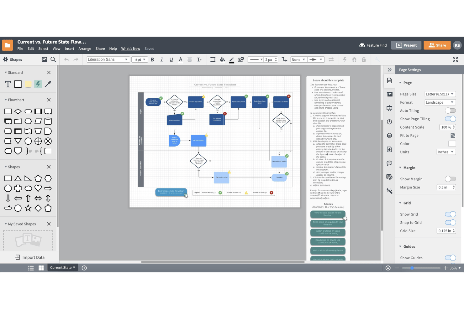
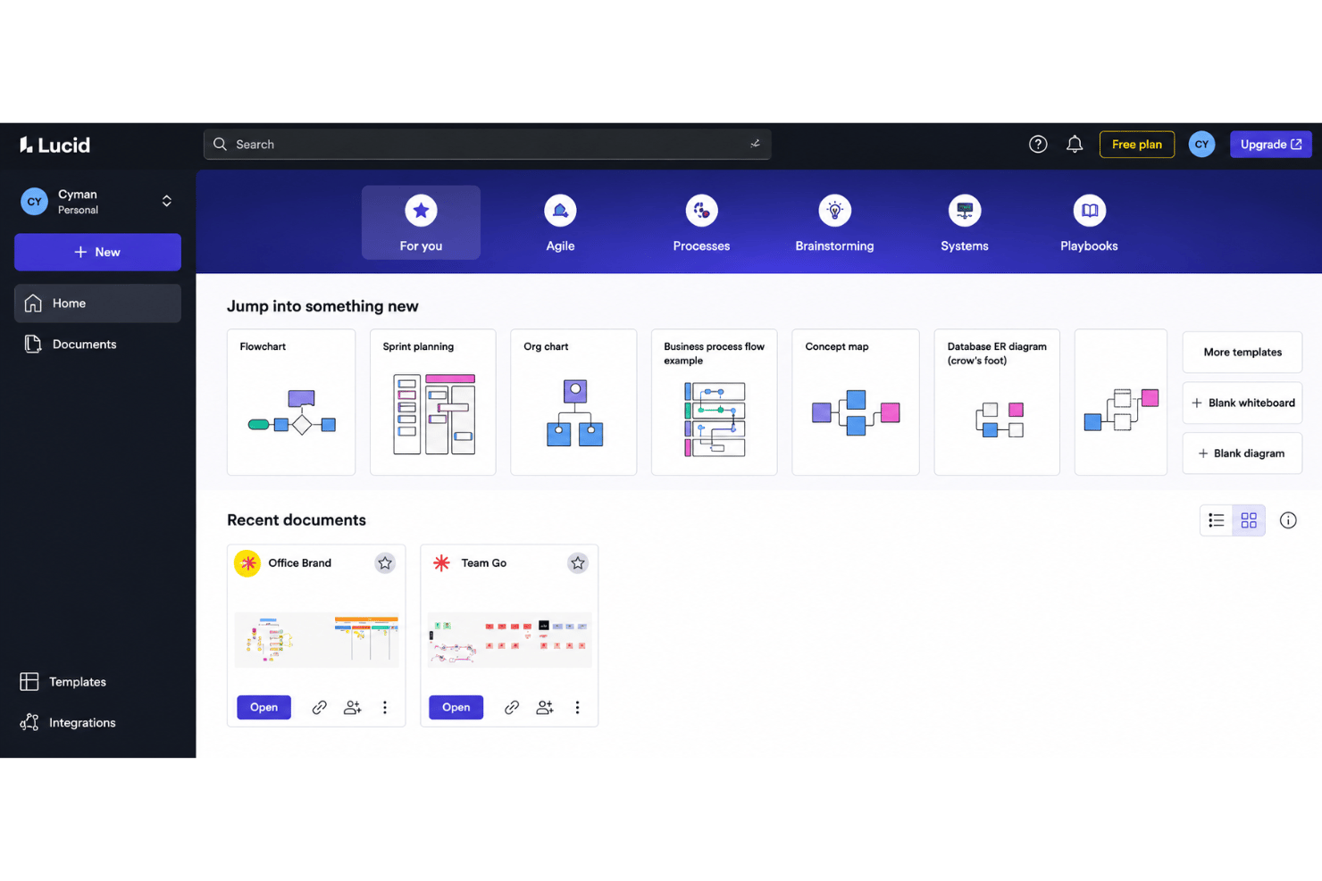
Lucidchart feels genuinely intuitive, with drag-and-drop tools, a clean user interface, searchable templates, and clear onboarding cues that help users start diagramming fast. I think most teams find navigation simple, and reviews often mention how easy it is to work together in real time. Even users with limited diagramming experience can create tidy, professional workflows without much training.
Integrations
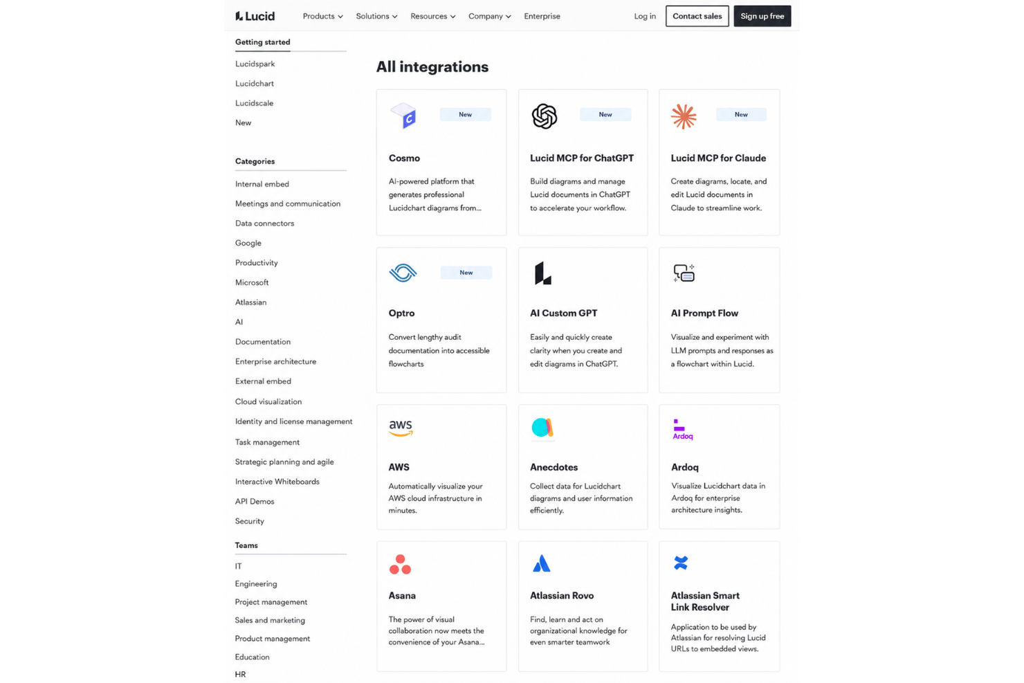
Lucidchart integrates with Google Workspace, Microsoft 365, Notion, Jira, Slack, Confluence, Ardoq, and AWS, among others.
Lucid also offers a REST API and connects with third-party integration tools like Zapier.
Lucidchart Specs
- Data Visualization
- Multi-User
- Pixel Graphics
- Third-Party Plugins/Add-Ons
- Vector File Support
Lucidchart FAQs
Can I restrict access to sensitive diagrams or folders in Lucidchart?
How does Lucidchart handle data security and compliance?
What happens if my team needs to work offline?
Does Lucidchart support versioning for workflow process diagrams?
Can I import existing diagrams from other tools?
Is it easy to collaborate with external partners or clients?
What limits or quotas exist on the free plan?
How quickly can my team get started with Lucidchart?
Can I use Lucidchart for personal projects?
E ora?
Vuoi connetterti con altri project manager digitali per condividere risorse e le migliori pratiche? Unisciti alla nostra community e ottieni l’accesso a oltre 100 template, esempi e modelli, e connettiti con centinaia di altri project manager digitali su Slack.