12 Best Power BI Alternatives Reviewed in 2026

Best Power BI Alternatives Shortlist
Here’s my shortlist of Power BI alternatives:


A strong Power BI alternative offers flexible data visualization, broad integration options, and reliable analytics features that fit your team’s workflow. If you’re searching for Power BI alternatives, you’re likely weighing tools that can handle complex data, support collaboration, offer advanced features, and adapt to changing business needs while offering ease of use.
With so many analytics platforms available, it’s tough to know which ones deliver the right mix of usability, scalability, and security. This list will help you compare the top Power BI alternatives for 2026, so you can confidently choose a solution that matches your project requirements and organizational goals.
What is Power BI?
Power BI is a data visualization software from Microsoft that lets users connect, analyze, and visualize data from various data sources. It provides interactive dashboards, customizable reports, and real-time analytics to help teams make data-driven decisions.
Power BI is widely used by project managers, analysts, and business leaders who need to turn raw data into clear, actionable insights for their organizations.
Best Power BI Alternatives Summary
This comparison chart summarizes pricing details for my top Power BI alternatives selections to help you find the best one for your budget and business needs.
| Tool | Best For | Trial Info | Price | ||
|---|---|---|---|---|---|
| 1 | Best for interactive dashboard creation | Free demo + 14-day free trial available | From $15/user/month (+ $75/month per creator license) | Website | |
| 2 | Best for real-time data monitoring | Free trial available | Pricing upon request | Website | |
| 3 | Best for embedded analytics in workflows | Free trial available | Pricing upon request | Website | |
| 4 | Best for custom analytics with APIs | Free demo available + 7-day free trial | Pricing upon request | Website | |
| 5 | Best for integration with SAP business systems | 30-day free trial + free demo available | Pricing upon request | Website | |
| 6 | Best for scalability on AWS infrastructure | Free trial available | From $24/user/month | Website | |
| 7 | Best for AI-assisted data insights | 30-day free trial + free demo available | From $11.25/authorized user/month | Website | |
| 8 | Best with associative data exploration | 30-day free trial + free demo available | From $300/month (billed annually) | Website | |
| 9 | Best for open-source self-service reporting | Free plan available | From $100/month + $6/user/month | Website | |
| 10 | Best for enterprise-grade security features | Free demo available | Pricing upon request | Website |
Why You Can Trust Us
-

Insightful
Visit WebsiteThis is an aggregated rating for this tool including ratings from Crozdesk users and ratings from other sites.4.8 -
Accelo
Visit WebsiteThis is an aggregated rating for this tool including ratings from Crozdesk users and ratings from other sites.4.4 -
Wrike
Visit WebsiteThis is an aggregated rating for this tool including ratings from Crozdesk users and ratings from other sites.4.2


Power BI Alternatives Reviews
Below are my detailed summaries of the Power BI alternatives that made it onto my shortlist. My reviews offer a detailed look at the features, best use cases, user experience, and integrations of each platform to help you find the best one for you.
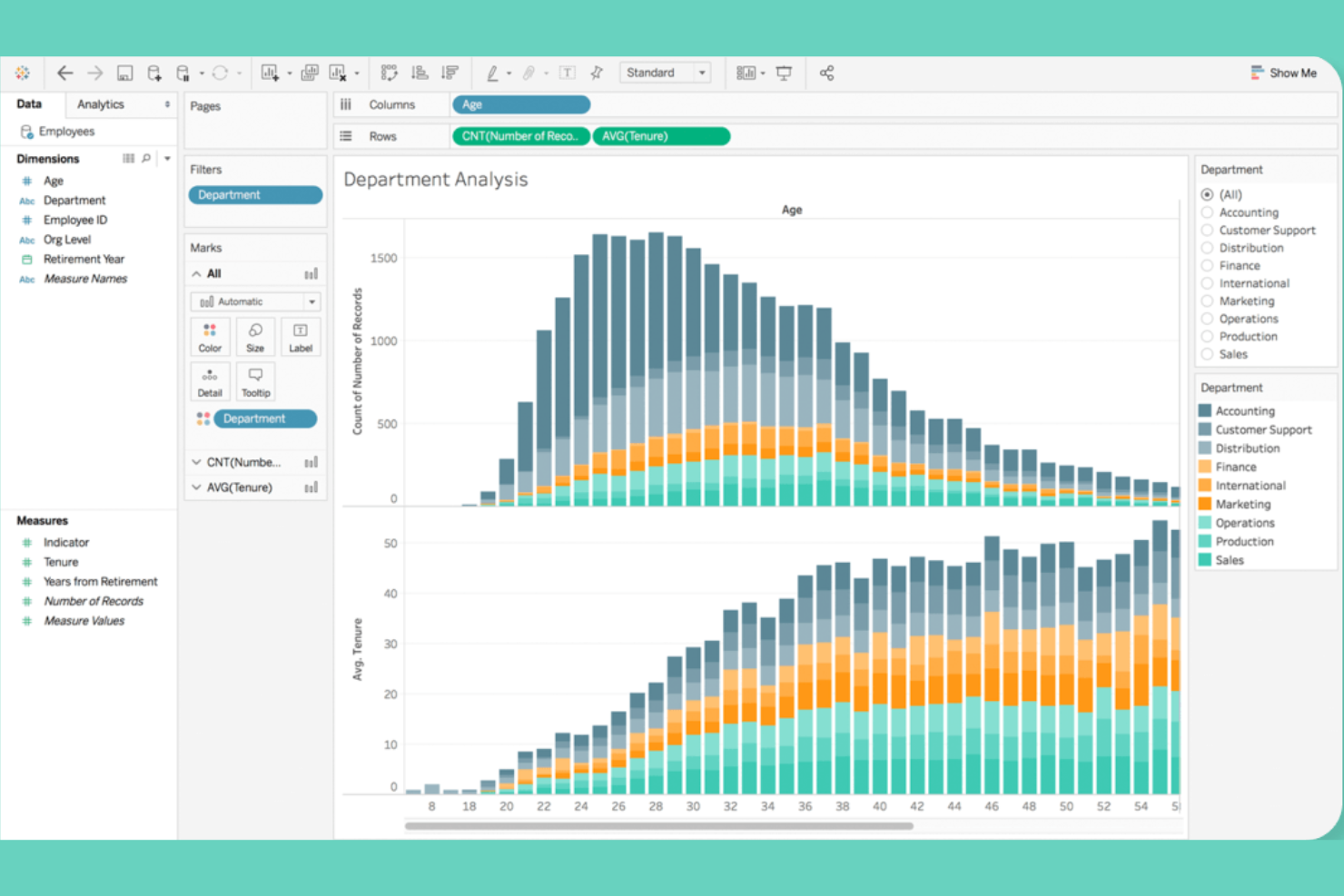
Tableau stands out for teams that need highly interactive dashboards and advanced visual exploration. It’s a strong fit for data analysts and business intelligence professionals who want to dig into complex datasets and share insights visually across departments.
Why It’s Good Power BI Alternative
Tableau’s strength in interactive dashboard creation makes it a top choice for teams that need to visualize and explore data in real time. I picked Tableau because its drag-and-drop dashboard builder lets you create highly customized, dynamic visualizations that update as your data changes.
The platform also supports advanced filtering and drill-down capabilities, so users can quickly uncover trends and outliers. If you want to build dashboards that encourage hands-on data exploration, Tableau offers more flexibility than most other tools.
Features
Some other Tableau features that may interest teams looking for data visualization software include:
- Data Blending: Combine data from multiple sources within a single visualization to create more comprehensive reports.
- Geospatial Mapping: Visualize geographic data with built-in map charts and location analytics.
- Scheduled Data Refresh: Automate data updates for dashboards and reports on a set schedule.
- Collaboration Tools: Share dashboards securely and add comments or annotations for team discussions.
Integrations
Integrations include Salesforce, Microsoft Excel, Google BigQuery, Amazon Athena, and Cloudera. Tableau also offers an API for custom integrations.
Pros and Cons
Pros:
- Enables secure sharing and collaboration
- Supports blending data from multiple sources
- Offers highly interactive dashboards
Cons:
- Limited advanced analytics features
- Requires separate license for the data preparation tool
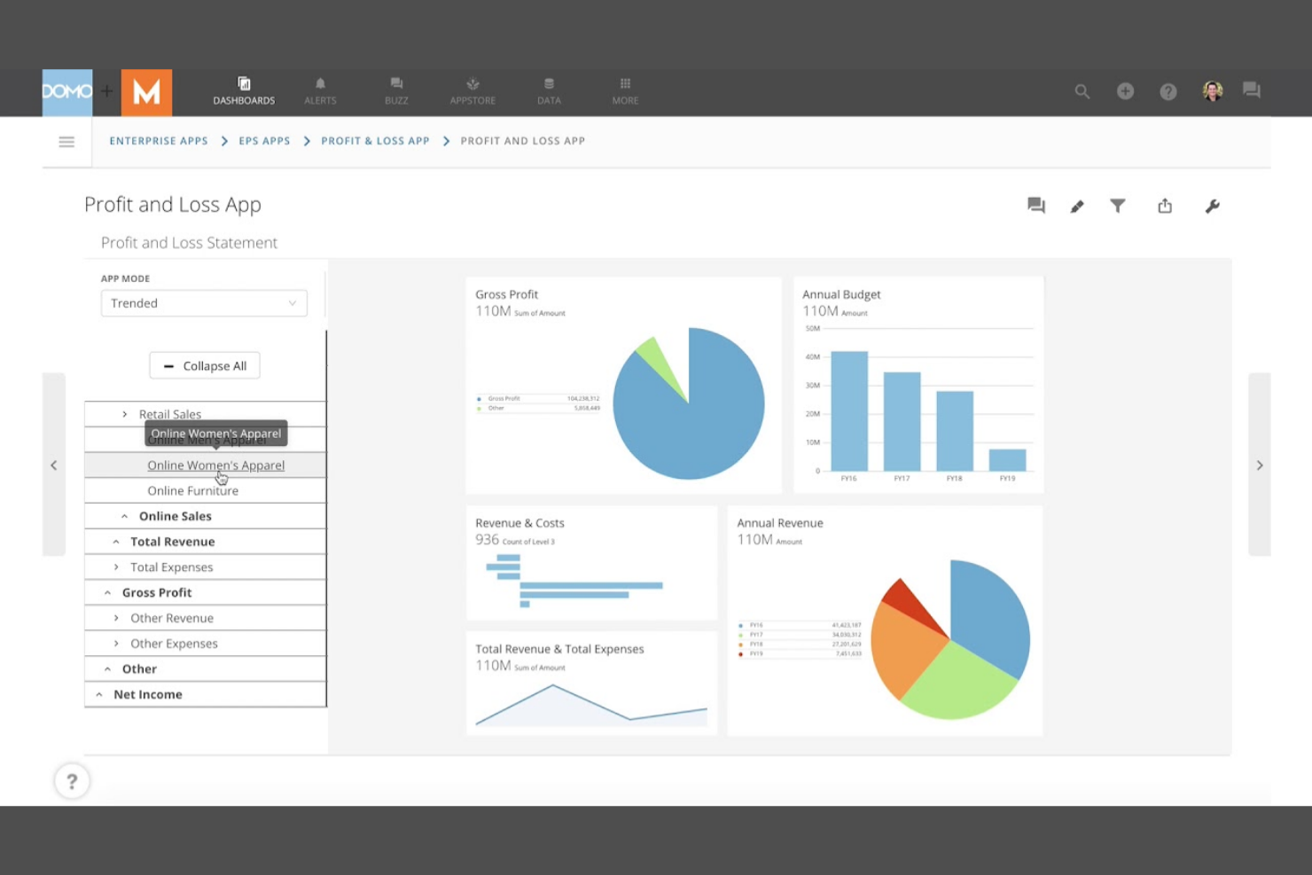
Domo stands out as a powerful business intelligence tool designed for professionals who need immediate insights into their business data. Ideal for operations teams, digital marketers, and executives, it consolidates live metrics from multiple sources into a single, always-on dashboard.
Its strength lies in real-time data monitoring and automated alerts, enabling business users to react swiftly to changes as they occur.
Why It’s Good Power BI Alternative
Domo stands out for teams that need to monitor data in real time, not just analyze it after the fact. I picked Domo because its dashboards update instantly as new data flows in, so you always have the latest numbers at your fingertips.
The platform also offers automated alerts and mobile access, making it easy to spot and act on changes from anywhere. For organizations where immediate insight and rapid response are priorities, Domo offers a different approach than Power BI.
Features
Some other Domo features that may be valuable for analytics teams include:
- App Studio: Build custom data apps and workflows directly within the platform.
- Magic ETL: Use a drag-and-drop interface to transform and prepare data for analysis.
- Data Governance Tools: Set permissions, monitor usage, and manage data access across your organization.
- Embedded Analytics: Integrate dashboards and visualizations into external websites or applications.
Integrations
Integrations include Salesforce, Google Analytics, Amazon Redshift, Microsoft Azure, and ServiceNow. Domo also offers an API for custom integrations.
Pros and Cons
Pros:
- Offers drag-and-drop data transformation
- Connects natively to cloud data sources
- Real-time dashboard updates for instant decision-making
Cons:
- Pricing is not transparent
- Performance is slow with large datasets
Looker is designed for teams that need to embed powerful analytics directly into their existing workflows and applications. It appeals to product managers, SaaS companies, and data teams looking to deliver interactive, customizable dashboards within their own platforms.
By leveraging its unique modeling layer and API-driven architecture, Looker helps users access insights seamlessly where they already work, setting it apart from traditional data visualization tools like Power BI.
Why It’s Good Power BI Alternative
Looker is a strong choice if you need analytics that fit directly into your team’s existing workflows. I picked Looker because its embedded analytics capabilities let you place interactive dashboards and reports inside your own applications, customer portals, or internal tools. The platform’s semantic modeling layer also helps maintain consistent business logic across all embedded content.
For organizations that want to deliver data insights where users already work, Looker offers a level of flexibility that Power BI doesn’t match.
Features
Some other Looker features that may be useful for data teams include:
- LookML Modeling Language: Define and manage data relationships and business logic using a dedicated modeling language.
- Scheduled Data Delivery: Automate the distribution of reports and dashboards to email or messaging platforms.
- Custom Visualizations: Build and integrate custom chart types using JavaScript and open-source libraries.
- Row-Level Security: Control data access by user or group to protect sensitive information.
Integrations
Integrations include Google BigQuery, Snowflake, Amazon Redshift, Microsoft Azure, and Zendesk. Looker also offers an API for custom integrations.
Pros and Cons
Pros:
- Supports granular row-level security
- LookML modeling enforces consistent business logic
- Embeds dashboards directly into custom web applications
Cons:
- Fewer visualization options than Power BI
- Scheduled report delivery less flexible
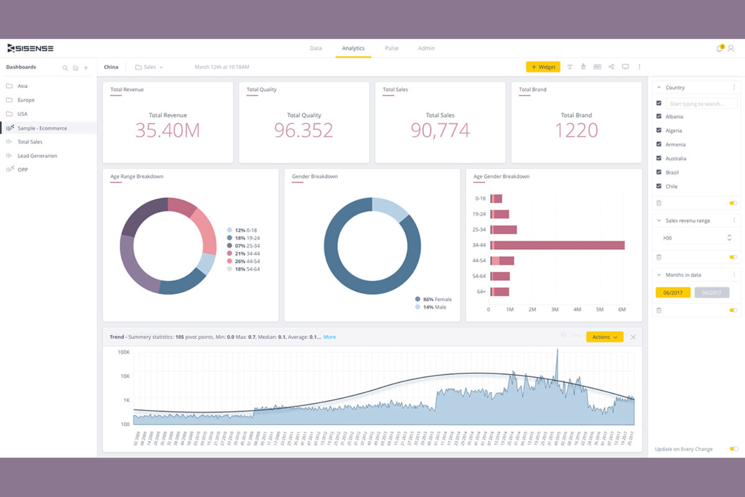
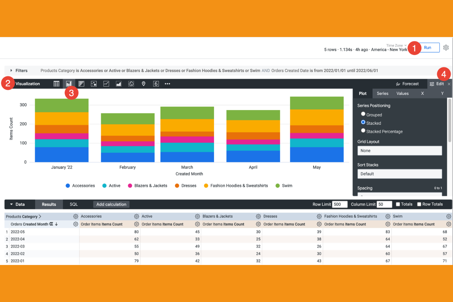
Sisense stands out for teams that need deeply customizable analytics embedded directly into their products or workflows. It’s ideal for product managers, SaaS developers, and data teams who require extensive API access to tailor dashboards and data models precisely to their needs. Unlike Power BI, Sisense offers granular control over data integration and visualization, enabling unique, developer-driven analytics experiences.
Why It’s Good Power BI Alternative
For teams that need to go beyond standard dashboards, Sisense stands out for its custom analytics capabilities through APIs. I picked Sisense because it lets you embed analytics directly into your own products and workflows, giving you more flexibility than Power BI’s out-of-the-box options.
The platform’s developer toolkit supports custom data modeling and visualization, so you can tailor analytics to fit your exact requirements. If you want to build unique, API-driven analytics experiences, Sisense offers a level of customization that’s hard to match.
Features
Some other Sisense features that may be valuable for data teams include:
- Elasticube Data Engine: Store, prepare, and analyze large datasets with in-memory processing.
- AI-Driven Insights: Surface automated data trends and anomalies using built-in machine learning.
- White Labeling: Customize the look and feel of dashboards to match your brand.
- Role-Based Access Controls: Manage user permissions and data access at a granular level.
Integrations
Integrations include Salesforce, Google Analytics, Snowflake, Microsoft Azure, Amazon Redshift, and Jira. Sisense also offers robust APIs for custom analytics integrations.
Pros and Cons
Pros:
- Supports in-memory data processing
- Embeds analytics directly into SaaS products
- Offers a full-featured API for custom data workflows
Cons:
- Documentation for developers can be inconsistent
- Dashboard design options less diverse than Power BI
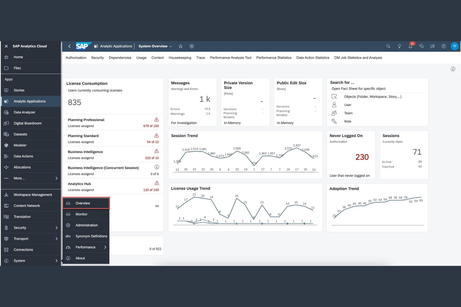
SAP Analytics Cloud is designed for enterprises deeply embedded in the SAP ecosystem seeking seamless data integration and advanced analytics. It appeals to finance teams and business analysts who require real-time insights directly from SAP ERP and S/4HANA systems.
By combining native SAP connectivity with predictive analytics and planning capabilities, it streamlines decision-making and maximizes the value of existing SAP data infrastructure.
Why SAP Analytics Cloud Is a Good Power BI Alternative
SAP Analytics Cloud is purpose-built to connect directly with your existing SAP data and workflows. I picked this tool because it offers native integration with SAP ERP, S/4HANA, and other SAP business applications, which Power BI can’t match out of the box.
The platform supports live data connections, so you can visualize and analyze up-to-date information without manual exports or syncs. For teams that need to unify planning, reporting, and analytics within the SAP ecosystem, SAP Analytics Cloud delivers a seamless experience.
Features
Some other SAP Analytics Cloud features that may be useful for analytics teams include:
- Smart Predict: Use automated machine learning to generate predictive insights from your data.
- Collaboration Tools: Share reports, comment on dashboards, and assign tasks within the platform.
- Data Wrangling: Cleanse, transform, and enrich data before building visualizations.
- Mobile Access: View and interact with dashboards on iOS and Android devices.
Integrations
Integrations include SAP S/4HANA, SAP BW/4HANA, SAP HANA, SAP SuccessFactors, SAP Ariba, and Amazon Redshift.
Pros and Cons
Pros:
- Provides strong data governance and security features
- Offers automated machine learning for predictive analytics
- Includes built-in planning and forecasting
Cons:
- Performance can lag with big data models
- Less flexible non-SAP data source integration
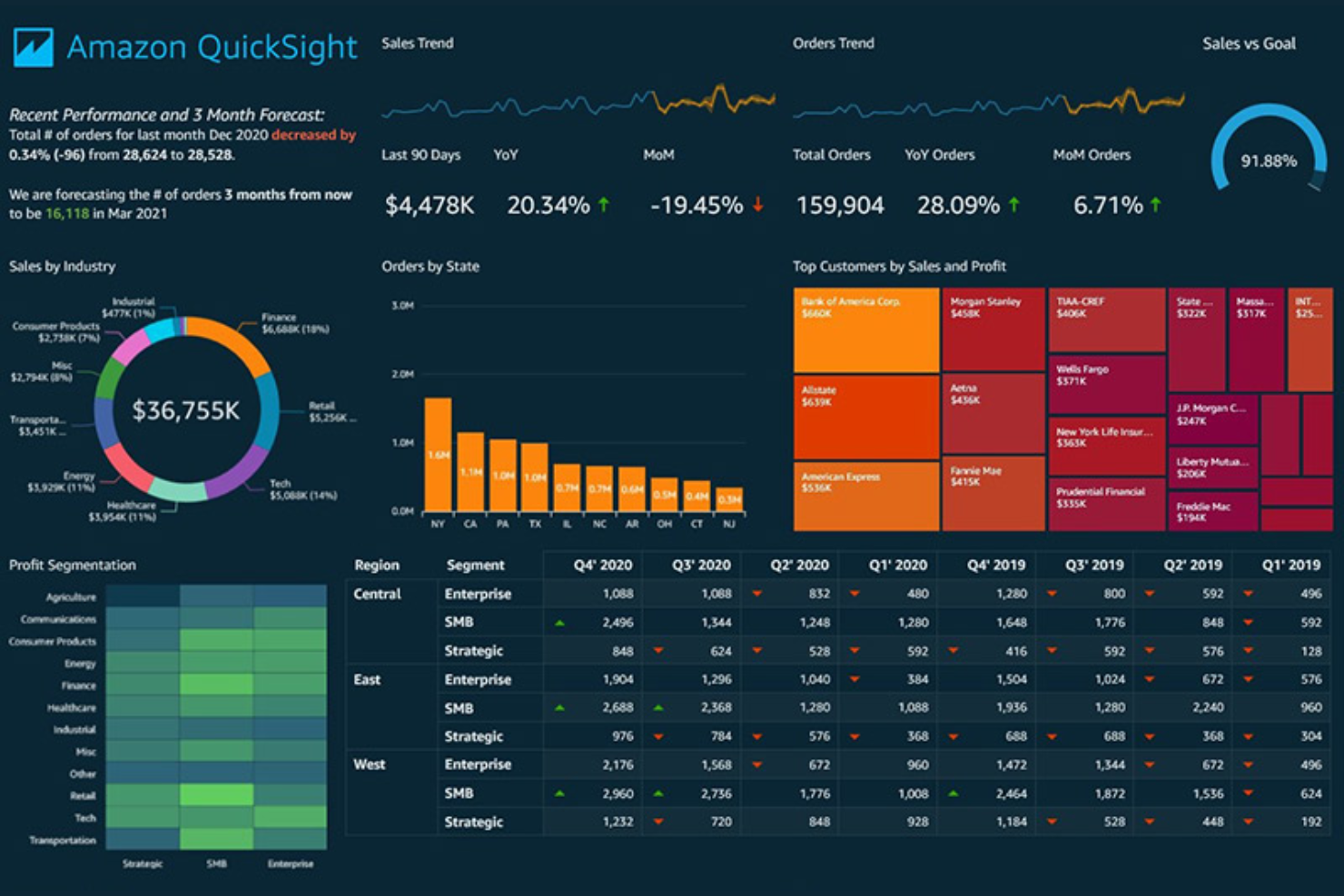
AWS QuickSight offers a serverless cloud-based analytics experience tailored for cloud-native environments. It is ideal for cloud architects, data engineers, and data analytics professionals who need to quickly scale and visualize large, distributed datasets without managing infrastructure.
QuickSight’s native integration with AWS services and automatic scaling capabilities make it a standout choice for organizations seeking efficient, scalable insights beyond traditional BI tools like Power BI.
Why It’s Good Power BI Alternative
When it comes to scaling analytics seamlessly within the AWS ecosystem, QuickSight excels as a powerful alternative to Power BI. I picked QuickSight because its serverless architecture automatically adjusts to handle large data volumes and fluctuating user demand without manual intervention.
Its tight integration with AWS services like Amazon Redshift and S3 enables real-time data visualization with minimal configuration. For organizations deeply invested in AWS, QuickSight’s scalability and native cloud capabilities provide a distinct advantage over Power BI.
Features
Some other features that make QuickSight useful for analytics teams include:
- SPICE In-Memory Engine: Analyze large datasets quickly using AWS’s in-memory calculation engine.
- Embedded Analytics: Integrate interactive dashboards and visualizations directly into your own applications.
- ML Insights: Access built-in machine learning features for anomaly detection and forecasting.
- Row-Level Security: Control data access at a granular level for different users and groups.
Integrations
Integrations include Amazon S3, Amazon Redshift, Amazon RDS, Amazon Athena, and ServiceNow.
Pros and Cons
Pros:
- Row-level security for control over data visibility
- Serverless architecture scales with data growth
- SPICE engine enables fast querying
Cons:
- Limited custom calculations
- Visualization options less extensive than Power BI
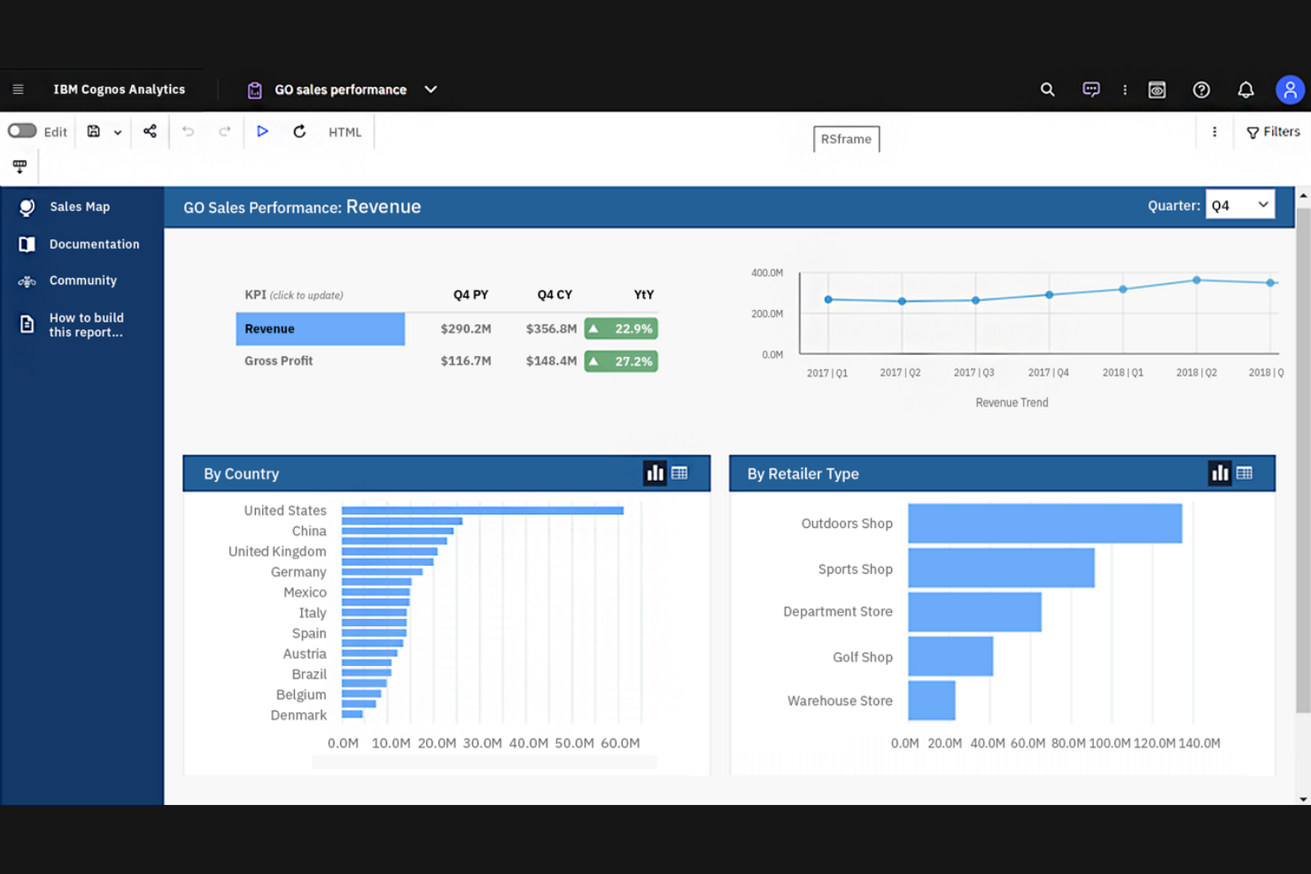
IBM Cognos Analytics stands out by integrating AI-driven data discovery and predictive analytics directly into its platform. It is ideal for enterprise analysts, finance professionals, and operations leaders who need automated insights and natural language querying to uncover trends quickly. Unlike Power BI, Cognos Analytics reduces manual data exploration, enabling users to make faster, more informed decisions.
Why It’s Good Power BI Alternative
IBM Cognos Analytics stands out for its strong emphasis on AI-assisted data insights, setting it apart from Power BI. The platform’s AI capabilities automatically generate data visualizations and highlight key drivers, making it easier to uncover meaningful patterns without manual effort.
Its natural language querying lets users ask questions in plain English and receive instant visual answers, simplifying data exploration. Additionally, Cognos Analytics offers automated discovery and predictive analytics features that surface deeper insights beyond what Power BI natively delivers..
Features
Some other features that make Cognos Analytics appealing for data teams include:
- Data Preparation Tools: Clean, join, and transform data directly within the platform.
- Custom Dashboard Templates: Use pre-built templates to quickly assemble interactive dashboards.
- Mobile App Access: View and interact with reports and dashboards from iOS and Android devices.
- Report Scheduling: Automate the distribution of reports to users on a recurring schedule.
Integrations
Integrations include Salesforce, Microsoft Excel, Microsoft Power BI, SAP, Oracle, Google Analytics, and IBM Db2.
Pros and Cons
Pros:
- Data preparation tools enable in-platform data cleaning
- Supports complex enterprise reporting
- AI-driven insights highlight anomalies in data
Cons:
- Small visualizations library
- Initial setup hard for non-technical users
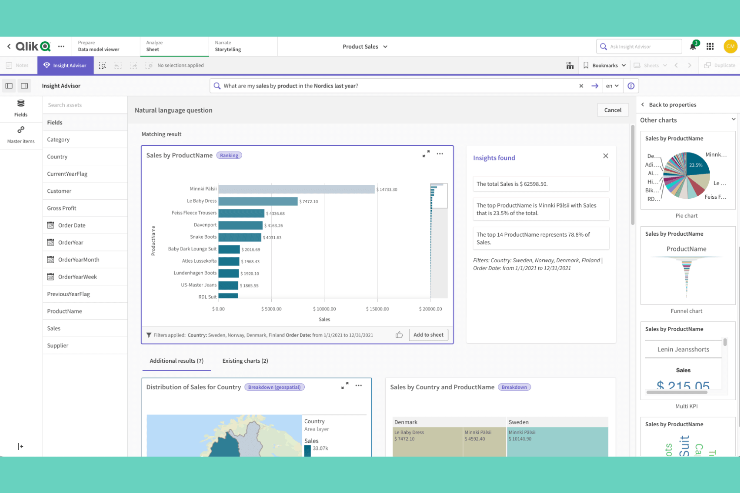
Qlik Sense offers a unique approach to data visualization with its powerful associative data engine, ideal for analysts and business teams seeking deeper insights. It appeals to users who need to explore complex data relationships without being confined to linear drill paths. This flexibility helps uncover hidden connections that traditional tools like Power BI might overlook.
Why It’s Good Power BI Alternative
Qlik Sense stands out for its associative data exploration, which lets you move beyond linear drill-downs and uncover relationships across your entire dataset. I picked Qlik Sense because its associative engine highlights both related and unrelated data points as you make selections, helping you spot patterns and outliers that might otherwise go unnoticed.
The platform also offers smart search capabilities, so you can quickly find connections between data fields without building complex queries. For teams that want to explore data from multiple angles and discover insights on the fly, Qlik Sense offers a unique approach compared to Power BI.
Features
Some other Qlik Sense features that may interest data teams include:
- Self-Service Data Preparation: Users can load, transform, and enrich data without relying on IT support.
- Responsive Design: Dashboards automatically adjust to different screen sizes and devices.
- Custom Visualization Extensions: Developers can build and integrate custom visualizations using open APIs.
- Data Alerts: Set up automated notifications based on specific data conditions or thresholds.
Integrations
Integrations include Salesforce, Microsoft Azure, SAP, Google BigQuery, Snowflake, and Tableau.
Pros and Cons
Pros:
- Offers advanced data preparation tools
- Handles large and complex datasets
- Associative engine enables flexible data exploration
Cons:
- Few out-of-the-box AI and machine learning features
- Requires technical expertise for advanced scripting

Metabase is an open-source data visualization platform designed for teams that want to democratize data access without heavy reliance on IT. It’s ideal for startups, data analysts, and product teams seeking an intuitive, code-free way to explore and share insights.
Unlike Power BI, Metabase emphasizes ease of customization and self-hosting flexibility, empowering users to tailor their analytics environment to their specific needs.
Why It’s Good Power BI Alternative
Metabase is a strong choice if you want open-source self-service reporting that puts data exploration directly in users’ hands. I picked Metabase because its visual query builder lets anyone create charts and dashboards without writing SQL, which is a big advantage for teams without dedicated data engineers.
The platform also supports custom deployments, so you can host it on your own infrastructure and tailor it to your organization’s needs. For teams that value transparency and control over their analytics stack, Metabase offers a level of flexibility that Power BI doesn’t match.
Features
Some other Metabase features that may interest data teams include:
- Scheduled Reporting: Automate the delivery of dashboards and reports to email or Slack on a set schedule.
- Data Model Editor: Define and manage metadata, relationships, and field descriptions for your datasets.
- Audit Logs: Track user activity and changes within the platform for compliance and security.
- White Labeling: Customize the interface with your organization’s branding and colors.
Integrations
Integrations include MySQL, PostgreSQL, MongoDB, Google BigQuery, Amazon Redshift, Snowflake, and SQLite. Metabase also offers an API for custom integrations.
Pros and Cons
Pros:
- White labeling customizes platform’s appearance
- Data model editor helps define relationships
- Supports scheduled report delivery to email
Cons:
- Few built-in visualization types
- Limited advanced analytics and AI features
Strategy (formerly MicroStrategy) stands out as a robust analytics platform designed for large enterprises that prioritize enterprise-grade security and governance. It appeals to regulated industries and IT leaders who require stringent data controls and compliance adherence. By offering advanced security features and centralized management, it addresses the challenges of managing sensitive data in complex environments.
Why It’s Good Power BI Alternative
When security and compliance are non-negotiable, Strategy offers capabilities that go beyond what Power BI provides. I picked Strategy because it delivers enterprise-grade security features like fine-grained access controls, multi-factor authentication, and centralized user management.
The platform also supports detailed auditing and governance tools, which help organizations meet strict regulatory requirements. If your team handles sensitive or regulated data, Strategy’s security framework is built to address those needs directly.
Features
Some other features that make Strategy valuable for analytics teams include:
- HyperIntelligence Cards: Surface contextual insights directly within web applications and business tools.
- Data Blending: Combine data from multiple sources for unified analysis and reporting.
- Mobile App Builder: Create and deploy custom analytics apps for iOS and Android devices.
- Library for Collaboration: Share, annotate, and discuss dashboards and reports within a centralized digital library.
Integrations
Integrations include Salesforce, SAP, Oracle, Hadoop, Teradata, Amazon Redshift, Google BigQuery, and IBM Db2.
Pros and Cons
Pros:
- Centralized library supports collaboration at scale
- Mobile app builder enables custom analytics
- Advanced security controls support strict compliance
Cons:
- Initial setup requires significant IT involvement
- Updates released less frequently than peers
Other Power BI Alternatives
Here are some additional Power BI alternatives options that didn’t make it onto my shortlist, but are still worth checking out:
- Klipfolio
For pre-built dashboard templates
- Apache Superset
For advanced SQL-based visualizations


Power BI Alternatives Selection Criteria
When selecting the best Power BI alternatives to include in this list, I considered common buyer needs and pain points related to data visualization software products, like handling complex data sources and meeting strict security requirements. I also used the following framework to keep my evaluation structured and fair:
Core Functionality (25% of total score) To be considered for inclusion in this list, each solution had to fulfill these common use cases:
- Create interactive dashboards and reports
- Connect to multiple data sources
- Visualize data with charts and graphs
- Share reports with team members
- Export data and visualizations
Additional Standout Features (25% of total score) To help further narrow down the competition, I also looked for unique features, such as:
- AI-powered data insights
- Embedded analytics capabilities
- Real-time data streaming
- Advanced data governance tools
- Customizable mobile analytics apps
Usability (10% of total score) To get a sense of the usability of each system, I considered the following:
- Intuitive drag-and-drop interface
- Clear navigation and menu structure
- Minimal clicks to create visualizations
- Responsive design for different devices
- Accessibility features for all users
Onboarding (10% of total score) To evaluate the onboarding experience for each platform, I considered the following:
- Step-by-step product tours
- Availability of training videos and documentation
- Pre-built dashboard templates
- Access to onboarding webinars
- In-app chatbots for quick help
Customer Support (10% of total score) To assess each software provider’s customer support services, I considered the following:
- 24/7 live chat or phone support
- Fast response times to inquiries
- Access to a knowledge base or help center
- Community forums for peer support
- Dedicated account managers for enterprise clients
Value For Money (10% of total score) To evaluate the value for money of each platform, I considered the following:
- Transparent pricing structure
- Flexible plans for different team sizes
- Free trial or demo availability
- Features included at each pricing tier
- Discounts for annual billing
Customer Reviews (10% of total score) To get a sense of overall customer satisfaction, I considered the following when reading customer reviews:
- Positive feedback on reliability and uptime
- User satisfaction with visualization options
- Comments on customer support quality
- Reports of performance with large datasets
- Feedback on integration capabilities
Why Look For a Power BI Alternative?
While Power BI is a good choice of data visualization software, there are a number of reasons why some users seek out alternative solutions. You might be looking for a Power BI alternative because…
- You need advanced security or compliance features
- Your team works outside the Microsoft ecosystem
- You require more flexible, cost-effective, or modern visualization options
- You need data analysis for very large or complex datasets
- Your organization is based in a region with limited Power BI availability
If any of these sound like you, you’ve come to the right place. My list contains several data visualization software options that are better suited for teams facing these challenges with Power BI and looking for alternative solutions.
Power BI Key Features
Here are some of the key features of Power BI, to help you contrast and compare what alternative solutions offer:
- Interactive dashboard and report creation
- Integration with Microsoft 365 and Azure services
- Data modeling with DAX formulas
- Scheduled data refresh and automatic updates
- Natural language query (Q&A) functionality
- Real-time data streaming and monitoring
- Custom visual marketplace for third-party visuals
- Row-level security for data access control
- Mobile app for on-the-go analytics
- Collaboration and sharing within Microsoft Teams
What’s Next:
If you're in the process of researching Power BI alternatives, connect with a SoftwareSelect advisor for free recommendations.
You fill out a form and have a quick chat where they get into the specifics of your needs. Then you'll get a shortlist of software to review. They'll even support you through the entire buying process, including price negotiations.