Ho testato 10 strumenti di reportistica: le mie scelte migliori per il 2026

10 Elenco Dei Migliori Strumenti Di Reporting


Esistono apparentemente innumerevoli strumenti di reporting disponibili, quindi capire quale sia il migliore per te non è semplice. Vuoi condividere i dati con il tuo team nel modo più accessibile e preciso possibile, ma devi identificare quale strumento si adatti meglio alle tue esigenze. Ci penso io!
In questo articolo ti semplifico la scelta, sfruttando la mia esperienza nell'utilizzo di diversi strumenti di reporting per la gestione di progetti – da grandi progetti fino alla crescita aziendale – per proporti questa lista dei migliori strumenti di reporting.
Table of Contents
- Migliori software: panoramica
- Perché fidarti di noi
- Confronta specifiche
- Recensioni
- Altri strumenti di reportistica
- Recensioni correlate
- Criteri di selezione
- Come scegliere
- Tendenze negli strumenti di reportistica
- Cosa sono gli strumenti di reportistica?
- Funzionalità
- Vantaggi
- Costi e prezzi
- Domande frequenti
Perché puoi fidarti di noi
Testiamo e recensiamo software di project management dal 2012. Come project manager, sappiamo quanto sia fondamentale (e difficile) fare la scelta giusta quando si seleziona un software. Investiamo molte risorse nella ricerca per aiutare la nostra audience a scegliere meglio. Abbiamo testato più di 2.000 strumenti per diversi casi d’uso e scritto oltre 1.000 recensioni dettagliate. Scopri come restiamo trasparenti & la nostra metodologia di recensione del software.
Confronta Le Specifiche Dei Software Fianco A Fianco
Ecco una tabella che puoi utilizzare per confrontare tutti gli strumenti di cui abbiamo appena parlato negli approfondimenti.
| Tool | Best For | Trial Info | Price | ||
|---|---|---|---|---|---|
| 1 | Ideale per insight unificati e cross-canale sul cliente | Prova gratuita + demo gratuita disponibile | Prezzo su richiesta | Website | |
| 2 | Miglior strumento di reporting per decisioni PPM basate sui dati | Prova gratuita + demo gratuita disponibili | Da $10/utente/mese (fatturato annualmente) | Website | |
| 3 | Ideale per integrare Google Sheets ed Excel | Piano gratuito disponibile | Da $49/mese (fatturato annualmente) | Website | |
| 4 | Miglior strumento di reporting per grafici facili da leggere | Prova gratuita di 15 giorni + piano gratuito + demo gratuita disponibili | Da $24/mese (fatturazione annuale) | Website | |
| 5 | Miglior strumento di reporting per integrare oltre 150 fonti dati | Prova gratuita di 14 giorni + demo gratuita disponibile | Da $44/mese (fatturati annualmente) | Website | |
| 6 | Ideale per report automatizzati senza analista | Piano gratuito disponibile | A partire da $29/mese | Website | |
| 7 | Il miglior software di reportistica per la contabilità delle piccole imprese | Prova gratuita di 30 giorni | Da $19/mese | Website | |
| 8 | Utenti, fonti di dati e integrazioni illimitati in tutti i piani. | Prova gratuita di 15 giorni | $39/mese per utenti illimitati | Website | |
| 9 | Miglior strumento di reportistica per team agili | 30 giorni di prova gratuita | A partire da $8.25/utente/mese | Website | |
| 10 | Il miglior software di reporting per analisi integrate | Prova gratuita di 14 giorni | Da $70/utente/mese | Website |

-

Accelo
Visit WebsiteThis is an aggregated rating for this tool including ratings from Crozdesk users and ratings from other sites.4.4 -
Celoxis
Visit WebsiteThis is an aggregated rating for this tool including ratings from Crozdesk users and ratings from other sites.4.4 -
Wrike
Visit WebsiteThis is an aggregated rating for this tool including ratings from Crozdesk users and ratings from other sites.4.3


Panoramica Dei Migliori Strumenti Di Reporting
u003cp class=u0022p1u0022u003eDi seguito trovi una descrizione di ciascuno strumento, di come gestisce la generazione dei report e del motivo per cui è stato inserito in questa lista. Ho aggiunto delle schermate dello strumento per darti un’idea di come appare dal punto di vista dell’utente.u003c/pu003e
Ideale per insight unificati e cross-canale sul cliente
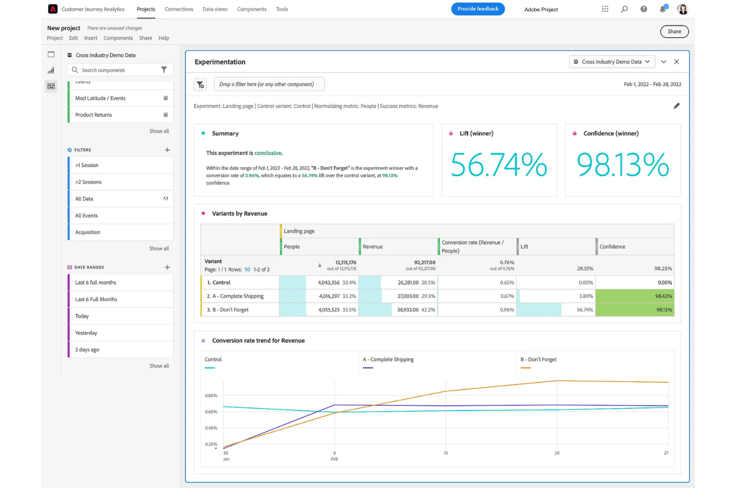
Adobe Customer Journey Analytics è una piattaforma di reportistica e analisi che consente di analizzare, visualizzare e riportare i percorsi dei clienti attraverso diversi canali utilizzando set di dati unificati e dashboard personalizzabili.
Per chi è Adobe Customer Journey Analytics?
Per i team di marketing e analisi nelle grandi aziende che devono analizzare dati complessi e multicanale sui clienti.
Perché ho scelto Adobe Customer Journey Analytics
Ho scelto Adobe Customer Journey Analytics come uno dei migliori perché posso unire dati provenienti da web, mobile, email e fonti offline in un unico ambiente di reportistica. Mi piace come la piattaforma permetta di creare dashboard unificate che visualizzano i percorsi dei clienti su ogni canale. Il mio team utilizza gli strumenti di attribuzione e segmentazione cross-canale per abbattere i silos e avere una visione completa del comportamento degli utenti.
Funzionalità principali di Adobe Customer Journey Analytics
- Workspace per query sui dati: Crea query personalizzate e analizza grandi set di dati con un'interfaccia drag-and-drop.
- Report programmati: Automatizza la consegna di report ricorrenti agli stakeholder secondo una pianificazione prestabilita.
- Filtri avanzati: Applica filtri granulari per concentrarti su segmenti o comportamenti specifici nei tuoi report.
- Strumenti di collaborazione: Condividi dashboard e insight con i membri del team direttamente all'interno della piattaforma.
Integrazioni di Adobe Customer Journey Analytics
Adobe Customer Journey Analytics offre integrazioni native con Adobe Experience Platform, Adobe Analytics, Adobe Target, Adobe Audience Manager e Adobe Campaign. Fornisce anche un'API per integrazioni personalizzate e supporta le connessioni a cloud data warehouse come Google BigQuery, Amazon Redshift e Microsoft Azure Synapse Analytics.
Pros and Cons
Pros:
- Controlli integrati per privacy e governance
- Modellazione avanzata dell'attribuzione sui customer journey
- Dashboard in tempo reale per il monitoraggio delle prestazioni live
Cons:
- Processo di configurazione e setup complesso
- Integrazioni native limitate al di fuori dell'ecosistema Adobe
Celoxis
Miglior strumento di reporting per decisioni PPM basate sui dati
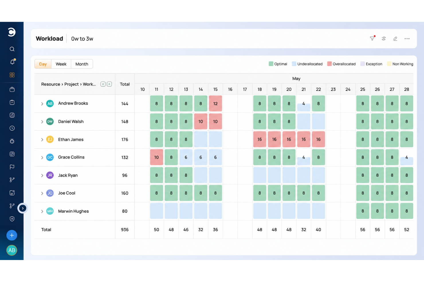
Celoxis è una soluzione per la gestione di progetti e portafogli, dotata di strumenti di reporting che trasformano i dati in informazioni utili all'azione. Grazie alle sue funzionalità di reporting potenziate dall'IA e al comando semplice e intuitivo, Celoxis migliora il modo in cui i team accedono e analizzano le metriche critiche dei progetti. Gli utenti possono aprire istantaneamente dashboard o generare report dettagliati semplicemente digitando comandi come, 'Mostra dashboard stato progetto' o 'Genera report utilizzo risorse'. Questo elimina la navigazione complessa, offrendo una visibilità immediata sulle metriche più rilevanti.
Le analisi guidate dall'intelligenza artificiale della piattaforma forniscono informazioni predittive analizzando dati in tempo reale e storici per individuare tendenze, segnalare rischi e raccomandare soluzioni prima che sorgano problemi. Che si tratti di prevedere possibili ritardi nelle tempistiche, conflitti di risorse o sforamenti di budget, Celoxis offre ai project manager l'intelligenza necessaria per agire in modo proattivo. Oltre alla previsione, le capacità di automazione semplificano le attività di reporting di routine, come la pianificazione della consegna dei report e l'aggiornamento delle dashboard.
I dashboard e gli strumenti di reporting personalizzabili di Celoxis forniscono aggiornamenti in tempo reale su KPI, stato dei progetti e prestazioni del portafoglio. Grazie a funzionalità avanzate come filtri dinamici, raggruppamenti multilivello e possibilità di approfondimento, gli utenti possono analizzare facilmente i dati in profondità. Un'ampia gamma di opzioni di visualizzazione—grafici a barre, a linee, a ciambella e Gantt—assicura che le informazioni complesse siano presentate in modo chiaro e intuitivo, rendendo la soluzione adatta sia per analisi dettagliate che per revisioni esecutive di alto livello.
La piattaforma offre anche funzionalità avanzate come l'analisi del valore guadagnato (EVA) per misurare le prestazioni di costo e tempi, proiezioni delle schedulazioni per prevedere scostamenti e avvisi automatizzati per mantenere gli stakeholder allineati.
Celoxis si integra con Zapier, Microsoft Teams, Slack, Excel, Google Drive, Microsoft Project, QuickBooks Online, Outlook, Salesforce, JIRA, Slack, Trello e altro ancora.
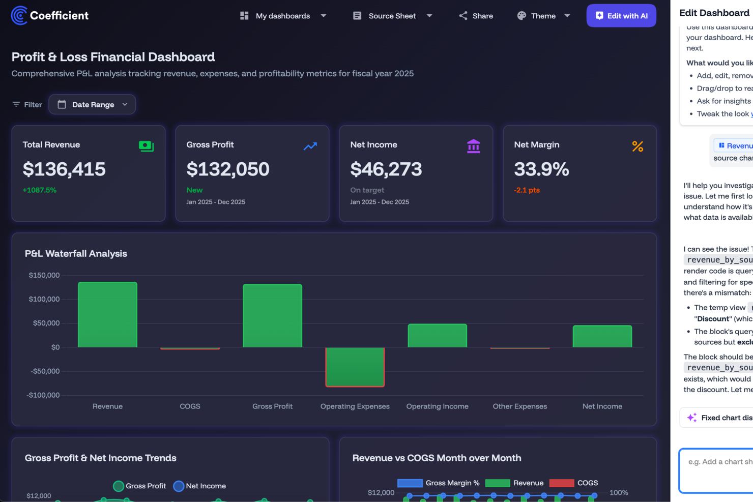
Coefficient collega le tue fonti dati direttamente a Google Sheets o Excel, offrendo un modo semplice per creare dashboard e analisi in tempo reale senza necessità di programmazione. Questo strumento è particolarmente interessante per i professionisti in ambito operations dei ricavi, marketing, finanza e business intelligence che desiderano migliorare il processo decisionale e automatizzare l'integrazione dei dati. Fornendo strumenti basati sull'intelligenza artificiale e risorse preconfigurate, Coefficient affronta le sfide della gestione di grandi quantità di dati, rendendo più semplice generare report approfonditi.
Perché ho scelto Coefficient
Ho scelto Coefficient per la sua capacità d'integrare Google Sheets ed Excel con oltre 100 fonti dati, caratteristica fondamentale per realizzare report dinamici. La modellizzazione basata su intelligenza artificiale dello strumento permette di effettuare previsioni direttamente dai fogli di calcolo, potenziando le capacità analitiche. Inoltre, gli avvisi personalizzabili via Slack o e-mail di Coefficient ti assicurano che tu e il tuo team siate sempre aggiornati sui cambiamenti critici dei dati. Queste funzionalità rispondono alle principali esigenze degli utenti di strumenti di reportistica, rendendo Coefficient una scelta vincente.
Principali funzionalità di Coefficient
Oltre alle capacità di integrazione e modellizzazione AI, ho trovato utili per la reportistica anche queste funzioni:
- Agente di importazione: Collega i fogli di calcolo a oltre 100 sistemi con importazioni dati con un solo clic.
- Agente API: Crea connettori personalizzati per un'integrazione dati flessibile.
- Aggiornamento automatico programmato: Mantieni report e dashboard sempre aggiornati automaticamente.
- Dashboard live condivisibili: Trasforma i report dei fogli di calcolo in dashboard supportate dall'IA per gli stakeholder.
Integrazioni di Coefficient
Le integrazioni includono Salesforce, HubSpot, QuickBooks, Snowflake, BigQuery, Google Sheets ed Excel, con ulteriori connessioni disponibili tramite integrazioni API personalizzate. Coefficient supporta anche la connessione a qualsiasi sistema dotato di API, offrendo flessibilità oltre ai cataloghi fissi di connettori.
Pros and Cons
Pros:
- Consente modellizzazione e previsione avanzate dei dati
- Crea dashboard personalizzate senza codice
- Sincronizzazione dati bidirezionale
Cons:
- Dipendenza da Google Sheets ed Excel
- La sincronizzazione avanzata richiede piani di livello superiore
Miglior strumento di reporting per grafici facili da leggere
Zoho Analytics è uno strumento di analisi e reporting che ti aiuta a trasformare dati aziendali grezzi in report e dashboard completi. Puoi utilizzarlo per raccogliere, arricchire e filtrare i dati al fine di facilitarne l'analisi. Dispone di una funzione assistente AI per aiutarti a generare informazioni, individuare schemi e prevedere tendenze. Zoho Analytics è disponibile anche come app mobile per iOS e Android.
Zoho Analytics ti permette di utilizzare grafici, widget e tabelle pivot, assicurando che i dati possano essere presentati nel modo migliore possibile. Zoho Analytics consente di collaborare con altri utenti per creare e condividere report e dashboard personalizzati. Le impostazioni dei permessi utente ti consentono di controllare chi può visualizzare e modificare i tuoi dati secondo necessità e/o autorità.
Il costo di Zoho Analytics parte da $24/mese/fino a 2 utenti. È disponibile una prova gratuita di 15 giorni.
Miglior strumento di reporting per integrare oltre 150 fonti dati
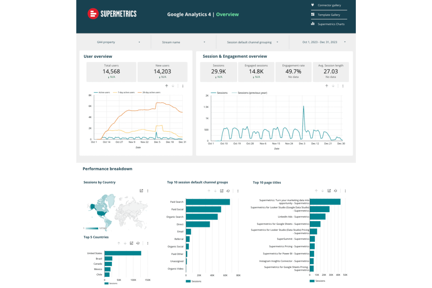
Supermetrics è uno strumento di reporting completo che semplifica il processo di raccolta, integrazione e analisi dei dati di marketing da oltre 150 fonti dati. Consente alle aziende di ottimizzare i flussi di lavoro dei dati aggregando informazioni provenienti da più fonti in un'unica destinazione, rendendo più semplice la creazione di report coerenti e informativi.
Una delle caratteristiche principali che rendono Supermetrics un eccellente strumento di reporting è la sua capacità di automatizzare i trasferimenti di dati, riducendo il tempo e lo sforzo necessari per la raccolta manuale. Gli utenti possono impostare aggiornamenti automatici dei dati, assicurando che i propri report siano sempre aggiornati con le informazioni più recenti. Questa automazione si estende anche alla pianificazione di importazioni regolari dei dati, permettendo alle aziende di mantenere una reportistica costante senza interventi manuali.
Inoltre, Supermetrics offre potenti funzionalità di trasformazione dei dati, consentendo agli utenti di personalizzare i dati in base alle specifiche esigenze di reporting. Lo strumento permette di filtrare, combinare e modificare i dati prima che raggiungano la destinazione finale.
La sua compatibilità con diverse piattaforme di reporting come Google Data Studio e Power BI consente agli utenti di creare report dettagliati e visivamente accattivanti che forniscono approfondimenti ulteriori sulle performance di marketing.
Le integrazioni includono Google Analytics, Google Ads, Facebook Ads, Instagram Insights, LinkedIn Ads, Twitter Ads, Microsoft Advertising, HubSpot, Mailchimp, Shopify, YouTube, Bing Ads, Reddit Ads, Snapchat Ads, Pinterest Ads, Salesforce, Snowflake e Amazon Ads.
Signara è uno strumento di reportistica analitica basato sull’intelligenza artificiale per team di marketing che genera automaticamente dashboard interattive e report PPTX—completi di calcoli KPI, analisi dei driver e narrazioni scritte dall’AI—direttamente dalle fonti dati collegate.
Per chi è più adatto Signara?
Signara è ideale per analisti di marketing e team di performance che necessitano di report automatizzati pronti per la presentazione senza dover gestire manualmente i dati.
Perché ho scelto Signara
Ho incluso Signara tra le mie scelte migliori perché le sue dashboard interattive permettono di visualizzare qualsiasi set di KPI di marketing in un formato davvero pronto da condividere pubblicamente. Posso configurare quali metriche mostrare, come raggruppare i canali e in che modo visualizzare i confronti tra periodi, così ogni dashboard riflette esattamente la storia dei dati che voglio raccontare. Le narrazioni generate dall’AI aggiungono anche automaticamente contesto, spiegando cosa è cambiato e perché—così le dashboard rivolte all’esterno non mostrano solo numeri.
Funzionalità principali di Signara
- Esportazione report in PPTX: Genera un PowerPoint già formattato e pronto per la presentazione direttamente dalla tua dashboard con un solo clic.
- Analisi dei driver: Il livello agente di Signara identifica cosa è cambiato, il motivo e di quanto tra i tuoi canali di marketing prima ancora che il report sia creato.
- Motore KPI deterministico: Ogni metrica viene calcolata tramite formule bloccate e verificabili nel codice, così nessun KPI è mai stimato o approssimato.
- Raccomandazioni generate dall’AI: Oltre ai riepiloghi narrativi, Signara suggerisce le prossime azioni prioritarie, come aumentare il budget di un canale o indagare su un picco di CPM.
Integrazioni di Signara
Signara offre integrazioni native con HubSpot, Snowflake, BigQuery, Databricks, PostgreSQL, MySQL, Google Sheets e Google Analytics (GA4), e supporta anche il caricamento tramite drag-and-drop di file Excel e CSV. È disponibile un’API per collegare ulteriori fonti dati.
Pros and Cons
Pros:
- Le narrazioni AI spiegano cosa è cambiato e perché
- Nessun dato grezzo salvato sulla piattaforma
- I report si generano senza il coinvolgimento di un analista
Cons:
- Limitato a casi d’uso in marketing e finanza
- Nessuna app mobile per accesso in mobilità
Il miglior software di reportistica per la contabilità delle piccole imprese
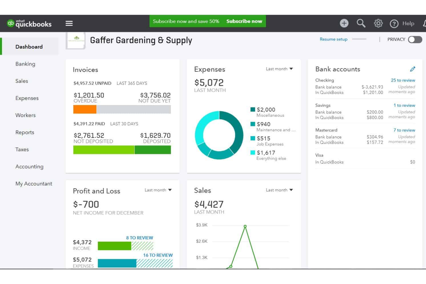
QuickBooks è una soluzione di contabilità che aiuta le piccole imprese a tenere traccia delle spese, gestire la fatturazione e redigere i report finanziari. Il software registra i dettagli delle transazioni, aiutandoti a mantenere registri accurati. In base alle finanze che monitori nel sistema, puoi visualizzare dal pannello di controllo quanto spendi in ciascuna categoria di spesa.
La piattaforma offre una soluzione semplice e a basso costo per la rendicontazione delle spese di piccole e medie imprese. Le ricevute vengono ordinate automaticamente e puoi riclassificare le transazioni in blocco. Puoi anche generare fatture e persino impostare fatture ricorrenti per clienti abituali o ricorrenti.
QuickBooks Online si integra con oltre 450 app aziendali come Square, Stripe, Paychex, Insightly CRM, Mailchimp, Shopify, eBay, BigCommerce, Magento, Squarespace, Etsy, Katana e ProjectWorks. I prezzi partono da $30 al mese ed è disponibile una prova gratuita di 30 giorni.
New Product Updates from QuickBooks Online

QuickBooks Adds AI Bank Feeds, Payroll Tools, and Built-In Time Tracking
QuickBooks has added AI bank feed updates, payroll tools, and built-in time tracking to improve accounting workflows. These updates help users review transactions, manage payroll, and track employee time faster. For more information, visit QuickBooks’ official site.
DashThis
Utenti, fonti di dati e integrazioni illimitati in tutti i piani.
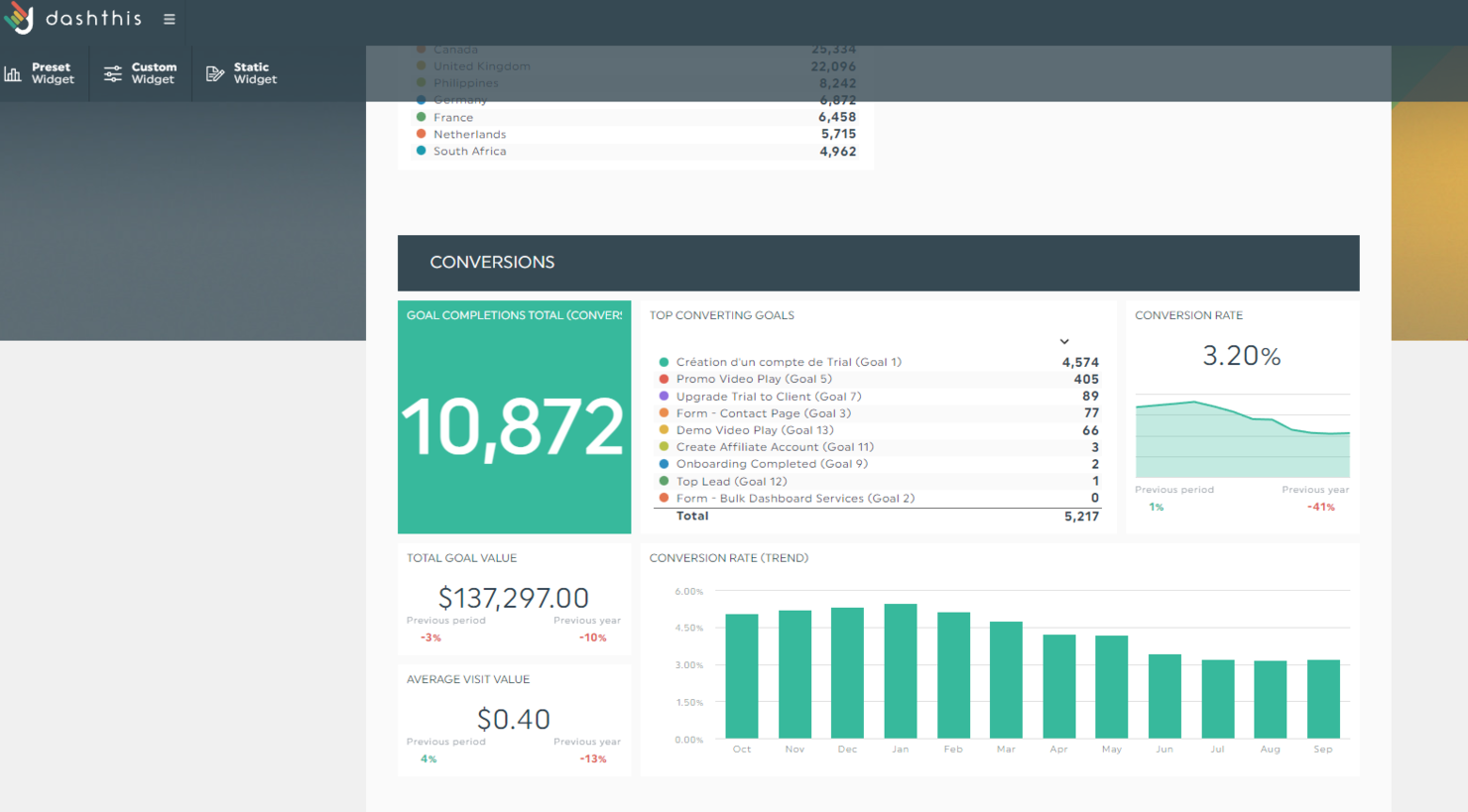
DashThis è uno strumento automatizzato di reportistica di marketing che consente di riunire più piattaforme in un'unica soluzione, co-creare dashboard potenti e automatizzarne la consegna. Le funzionalità incluse nel prodotto possono essere utili a chiunque, dai liberi professionisti alle agenzie di fama mondiale come DDB.
La prima cosa che mi è piaciuta subito di questo prodotto è che tutti i piani prevedono utenti illimitati, fonti di dati illimitate e integrazioni illimitate. La differenza sta nel numero di dashboard che puoi creare e nel livello di personalizzazione dei report con white-label.
Poiché la reportistica può essere una delle nostre attività più dispendiose in termini di tempo, DashThis ha predisposto una serie di modelli che ti aiutano a iniziare immediatamente. Basta selezionare il modello che preferisci, collegare i tuoi dati e generare il report nei periodi di tempo che desideri. Una volta trovato il report ideale, puoi clonarlo, esportarlo o generarlo e condividerlo automaticamente via email ogni mese con i tuoi clienti.
DashThis offre oltre 34 integrazioni utili che ti aiuteranno a portare tutti i dati di marketing in un unico posto ed estrarre report completi. Queste integrazioni includono piattaforme di social media, Google Analytics, SEMrush, Mailchimp, Perfect Audience, TikTok Ads e molte altre.
DashThis parte da $38/mese (pagamento annuale) per 3 dashboard e offre una prova gratuita di 15 giorni (10 dashboard).
New Product Updates from DashThis

DashThis Launches Shopify Integration in Beta
DashThis’s Shopify integration is now available to all users in beta, adding Shopify metrics, dimensions, and preset widgets to report on ecommerce performance alongside other marketing channels. For more information, visit DashThis's official site.
 .
.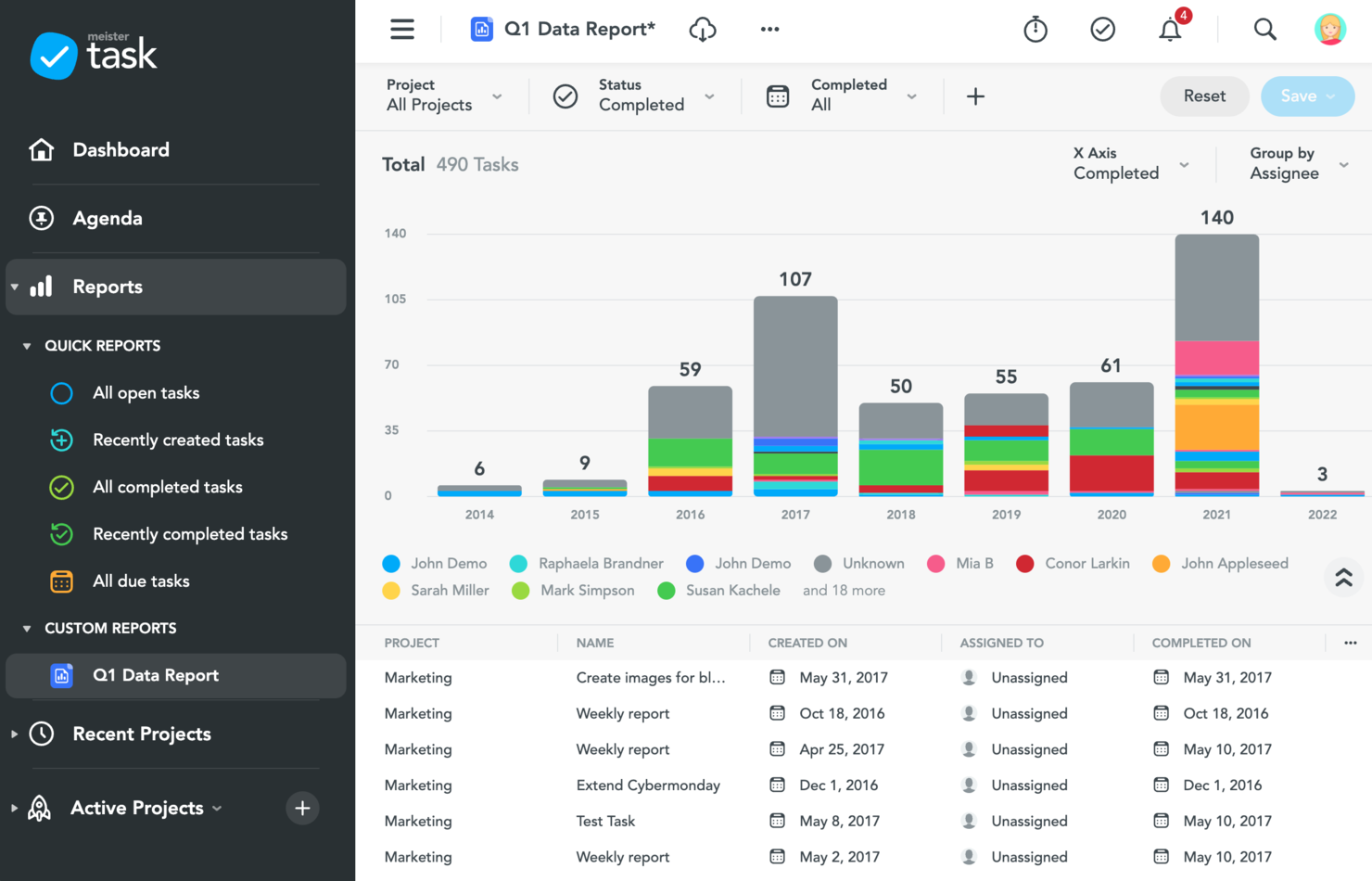
MeisterTask è uno strumento di gestione delle attività e dei progetti progettato principalmente per i team agili. L'applicazione offre una varietà di funzionalità di reportistica per monitorare la produttività del team, oltre a dashboard personalizzate e alla possibilità per i membri del team di creare agende personali organizzate secondo il loro modo di lavorare. MeisterTask è intuitivo e semplice da usare, con un'interfaccia pulita
Gli utenti possono visualizzare report sull'avanzamento, sui tempi e sulla sicurezza. È possibile visualizzare e scaricare report che mostrano le attività completate, in ritardo o in scadenza. I project manager e i team leader possono anche ottenere report su quanto tempo viene tracciato dai membri del team, così come report relativi alla sicurezza dei dati, alla privacy e alla conformità.
MeisterTask si integra con il software gemello MindMeister così come con Gmail, Outlook, Slack, Microsoft Teams, GitHub, Zendesk, Google Drive e altri.
MeisterTask ha un costo a partire da $8.25/utente/mese. Offre anche un piano freemium.
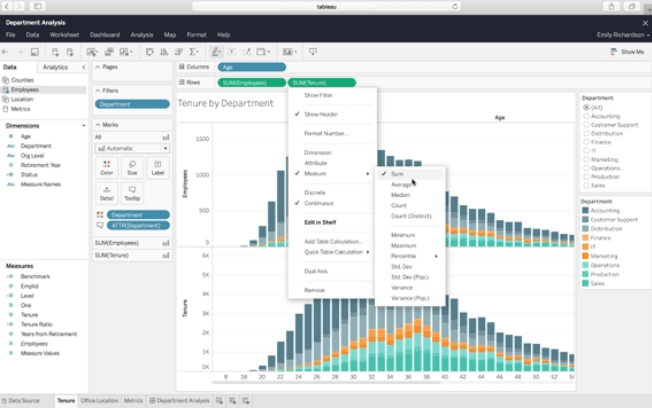
Tableau è una piattaforma di analisi visiva per l'esplorazione, la comprensione e la gestione dei dati aziendali. Utilizza un metodo drag and drop per creare report sfruttando le visualizzazioni dei dati e i widget disponibili. Tableau utilizza visualizzazioni interattive dei dati, consentendo così di creare report visivamente accattivanti che i visualizzatori possono esplorare cliccando sugli elementi.
Se hai bisogno di costruire dashboard potenti in modo rapido, Tableau è il miglior strumento di reporting per te grazie alle sue funzionalità di analytics incorporate. Gli analytics integrati sono personalizzabili tramite API, così puoi inserire funzionalità di raccolta dati e reporting nel tuo flusso di lavoro già esistente. Questo può anche aiutarti a personalizzare l’esperienza dati dei tuoi clienti.
Tableau si integra con altri strumenti aziendali, tra cui Google Cloud, Microsoft SQL Server, Google Sheets, Hive e SAP.
I prezzi di Tableau partono da $70/utente/mese, ed è disponibile una prova gratuita di 14 giorni.
Altri Strumenti Di Reporting e Dashboard
Ecco altri strumenti di auto-reporting che non sono entrati nella lista principale. Se ti servono ulteriori suggerimenti per strumenti di reportistica ad hoc, dai un’occhiata a queste opzioni.
- Reportei
Ideale per generare rapidamente dashboard e report di marketing digitale
- Adverity
Ideale per integrazione con strumenti BI
- Whatagraph
Il miglior strumento di reportistica per agenzie di marketing
- Xero
Ideale per la reportistica su preventivi di progetto, tempi e dati finanziari
- Jira
Il miglior strumento di reportistica per team agili
- Office Timeline
Ideale per report facili in PowerPoint
- Google Data Studio
Ideale per condivisione e collaborazione
- Power BI for Office 365
La migliore piattaforma di reportistica per organizzazioni in crescita
- ThoughtSpot
Miglior strumento di reportistica per principianti
- SegMetrics
Il miglior strumento di reportistica per team di marketing e vendita
- Octoboard
Miglior software di reportistica per la creazione automatica di report
- FanRuan Software
Miglior software di reportistica per aziende
- Rippling Spend
Ideale per la gestione dei report di spesa
- ClickUp
Le migliori dashboard di reportistica che favoriscono la collaborazione
- Hive
Miglior strumento di reportistica con dashboard interattive
- Wrike
Ideale per la collaborazione sui report di progetto
- Bonsai Agency Software
Ideale per la reportistica in tempo reale sulle performance delle agenzie


Come Valuto gli Strumenti di Reporting
Divido la mia valutazione in criteri di base che ogni strumento deve soddisfare—come la connettività a più fonti e la consegna programmata—e fattori differenzianti che distinguono una buona soluzione da quella ideale per il tuo team.
Funzionalità di Base (Requisiti Minimi per Questa Lista)
Queste capacità fondamentali servono come criteri di accettazione per l'inclusione nella mia lista di strumenti di reporting:
- Connettività a Più Fonti di Dati: Verifico se uno strumento si connette nativamente ai database, data warehouse e applicazioni SaaS in cui risiedono effettivamente i tuoi dati, come Snowflake, Google Sheets o Salesforce.
- Creazione e Progettazione di Report: Che si tratti di un builder drag-and-drop o di un'interfaccia guidata da SQL, cerco un controllo flessibile del layout e modelli riutilizzabili per le consegne ricorrenti.
- Dashboard Interattive e Visualizzazioni: Valuto la varietà di grafici, il cross-filtering e la profondità di esplorazione, come ad esempio cliccare su una barra dei ricavi per vedere le offerte che la compongono.
- Distribuzione Programmata e Automatica: Cerco la possibilità di programmare i report e inviarli agli stakeholder tramite email, Slack o link condivisi senza intervento manuale.
- Trasformazione dei Dati e Calcoli: Campi calcolati, join e metriche personalizzate sono importanti. Verifico se è possibile combinare fonti e definire formule direttamente nel livello di reporting.
- Opzioni di Esportazione e Condivisione: Valuto il supporto dei formati (PDF, Excel, CSV), i controlli dei permessi e se sia possibile condividere i report anche con clienti o leadership esterna.
Attribuisco a ciascun fornitore un punteggio da 0 (non offre la funzionalità) a 5 (eccelle in quest'area) per ogni criterio.
I fornitori devono raggiungere un punteggio medio minimo per essere presi in considerazione nella mia lista. Da lì, considero cosa distingue ogni piattaforma.
Fattori Differenzianti (Cosa Distingue i Fornitori)
Dopo aver creato la mia lista, ecco come confronto i vari fornitori nel settore degli strumenti di reporting:
Funzionalità Distintive
Cerco funzionalità basate su AI che consentano agli utenti di individuare tendenze o generare approfondimenti narrativi direttamente dai dati—particolarmente utili per i riepiloghi destinati ai dirigenti. L'analisi embedded è un altro elemento chiave, poiché alcuni team devono condividere dashboard nei portali clienti o nei sistemi dei partner tramite incorporamento sicuro. Per i team con esigenze significative di conformità, presto attenzione al supporto del semantic layer e agli strumenti di data governance, assicurandomi che i report siano sempre allineati a definizioni e metriche certificate.
Oltre le Funzionalità
L'ecosistema di integrazione è molto importante: verifico se uno strumento si collega nativamente ai data warehouse e alle app aziendali su cui il tuo team già fa affidamento, come Snowflake, Salesforce o NetSuite. Anche la struttura dei prezzi è fondamentale, in particolare come il fornitore gestisce le licenze tra creatori e visualizzatori, poiché gli strumenti di reporting spesso servono a un piccolo gruppo di sviluppatori e a una platea molto più ampia di utenti finali. Valuto inoltre la sicurezza, cercando la certificazione SOC 2 Type II, la sicurezza a livello di riga e il supporto SSO—requisiti fondamentali per qualsiasi team che gestisce dati sensibili di carattere finanziario o operativo.
Come Scegliere Gli Strumenti Di Reporting
È facile perdersi tra lunghe liste di funzionalità e strutture di prezzo complesse. Per aiutarti a rimanere concentrato durante il tuo percorso di selezione del software, ecco una checklist di fattori da tenere a mente:
| Fattore | Cosa Considerare |
| Scalabilità | Assicurati che lo strumento possa crescere insieme alla tua azienda. Scegli soluzioni in grado di gestire volumi di dati e utenti sempre maggiori senza rallentamenti. |
| Integrazioni | Verifica che lo strumento si integri senza problemi con i sistemi esistenti come CRM, ERP o software di project management. |
| Personalizzazione | Valuta quanto puoi personalizzare report, dashboard e metriche per adattarli ai flussi di lavoro e ai KPI specifici del tuo team. |
| Facilità d'Uso | Cerca un'interfaccia intuitiva che consenta al tuo team di ottenere rapidamente insight senza formazione approfondita o supporto tecnico. |
| Budget | Confronta le strutture di prezzo con il tuo budget. Fai attenzione a costi nascosti, come addebiti extra per più utenti, storage dei dati o funzionalità avanzate. |
| Sicurezza | Assicurati che lo strumento preveda crittografia, controlli degli accessi e conformità a normative come il GDPR per proteggere i dati sensibili. |
| Assistenza | Valuta il livello di supporto clienti offerto, ad esempio assistenza 24/7 o account manager dedicati per risoluzione problemi e formazione. |
| Visualizzazione Dati | Cerca opzioni di visualizzazione come grafici, diagrammi e dashboard che rendano i dati facili da interpretare e utilizzabili dal tuo team. |
Trend Negli Strumenti Di Reporting Per 2026
Nella mia ricerca, ho consultato innumerevoli aggiornamenti di prodotto, comunicati stampa e changelog dei vari fornitori di strumenti di reporting. Ecco alcuni dei trend emergenti che sto monitorando:
- Approfondimenti basati sull'IA: Gli strumenti utilizzano l'intelligenza artificiale per analizzare i modelli di dati e suggerire spunti utili, risparmiando tempo agli utenti e aiutandoli a prendere decisioni più informate. Ad esempio, alcuni strumenti evidenziano anomalie nei report finanziari o raccomandano metriche da monitorare sulla base dei dati storici.
- Query in linguaggio naturale: Ora gli utenti possono porre domande in linguaggio naturale per generare report. Ciò rende il reporting accessibile anche ai membri del team non tecnici. Un utente, ad esempio, potrebbe digitare “Quali sono state le vendite dell’ultimo trimestre?” e ricevere subito una risposta sotto forma di grafico.
- Analisi integrate: Sempre più strumenti offrono analisi integrate, così le aziende possono inserire i report direttamente all'interno dei propri software o portali per i clienti. Questo è utile per le aziende SaaS che forniscono funzionalità analitiche ai loro clienti.
- Funzionalità di data storytelling: Gli strumenti stanno aggiungendo funzionalità per trasformare i dati grezzi in narrazioni, con didascalie e punti salienti generati automaticamente. Questo aiuta i team a condividere i risultati in modo più efficace durante presentazioni o aggiornamenti.
- Miglioramenti della privacy dei dati: I fornitori stanno implementando più controlli sulla privacy per soddisfare regolamentazioni più severe come GDPR e CCPA. Ad esempio, alcuni strumenti ora offrono l’anonimizzazione dei dati o limitano l’accesso a metriche sensibili in base ai ruoli degli utenti.
Queste tendenze non si limitano alle sole piattaforme di reporting: molte stanno arrivando anche in altre categorie di software. Ad esempio, i software di gestione progetti visuale integrano sempre più funzioni avanzate di reportistica come dashboard in tempo reale, approfondimenti generati dall’IA e visualizzazioni dati personalizzabili per aiutare i team a monitorare le performance dei progetti in modo più intuitivo.
Cosa sono gli strumenti di reporting?
Gli strumenti di reporting sono software che aiutano le aziende a raccogliere, elaborare e presentare dati in un formato organizzato e facilmente comprensibile. Estraggono dati da diverse fonti, come database e fogli di calcolo, trasformandoli in report che mostrano tendenze, modelli e spunti di analisi. Questi report possono essere presentati sotto forma di tabelle, grafici, diagrammi e dashboard, rendendo la lettura di dati complessi più immediata.
I software di reporting sono preziosi per il processo decisionale, poiché forniscono a manager e stakeholder le informazioni necessarie per comprendere le performance, identificare aree di miglioramento e pianificare le azioni future, il che può tradursi in strategie più informate, operazioni più efficienti e risultati finanziari migliori.
Caratteristiche degli strumenti di reporting
Quando selezioni strumenti di reporting, fai attenzione alle seguenti funzionalità chiave:
- Dashboard personalizzabili: Ti permettono di organizzare e visualizzare i dati più rilevanti per il tuo team nel formato più adatto al tuo flusso di lavoro. Per una personalizzazione con brand e poco codice, scopri gli strumenti per dashboard white label.
- Report in tempo reale: Aggiorna automaticamente i report all’arrivo di nuovi dati, aiutandoti a prendere decisioni basate sulle informazioni più recenti.
- Opzioni di visualizzazione dei dati: Offre grafici, diagrammi e heatmap per facilitare l’interpretazione e la condivisione dei dati complessi con gli stakeholder.
- Report programmati: Permette di automatizzare la generazione e la consegna dei report, risparmiando tempo e garantendo aggiornamenti regolari per il team.
- Controlli di accesso basati sui ruoli: Limita l’accesso a report o dati sensibili in base ai ruoli degli utenti per migliorare la sicurezza e la conformità.
- Funzionalità di drill-down: Consente di cliccare su metriche specifiche per ottenere informazioni più dettagliate, aiutando a capire cosa influenza i risultati.
- Integrazione multi-sorgente: Combina dati da diverse piattaforme e strumenti in un unico report per una visione più completa.
- Opzioni di esportazione: Permette di esportare i report in diversi formati come PDF, Excel o CSV per una facile condivisione e ulteriori analisi.
- Strumenti per l’analisi delle tendenze: Evidenzia i modelli nei dati nel tempo, aiutando a prevedere risultati futuri e pianificare di conseguenza.
- Strumenti di annotazione: Consente agli utenti di aggiungere commenti o note direttamente sui report per una migliore collaborazione e condivisione del contesto.
Vantaggi degli strumenti di reporting
L’implementazione di strumenti di reporting offre diversi vantaggi per il tuo team e la tua azienda. Ecco alcuni benefici a cui puoi aspirare:
- Miglioramento del processo decisionale: Fornisce al tuo team approfondimenti in tempo reale e visualizzazioni chiare per prendere decisioni basate su dati precisi e aggiornati.
- Risparmio di tempo: Automatizza la generazione di report e l’aggiornamento dei dati, liberando tempo per altre attività importanti.
- Migliore collaborazione: Consente ai team di condividere dashboard e aggiungere commenti direttamente sui report, facilitando l’allineamento sui principali insight.
- Maggiore accuratezza dei dati: Riduce l’inserimento manuale dei dati e gli errori di calcolo prelevando le informazioni direttamente dai sistemi integrati.
- Responsabilità migliorata: Tiene traccia degli indicatori chiave di performance e assegna responsabilità con metriche facili da monitorare e riportare.
- Identificazione più rapida delle tendenze: Analizza i modelli nei tuoi dati per aiutarti a individuare tempestivamente opportunità e sfide.
- Reportistica scalabile: Si adatta alle tue esigenze in crescita, permettendoti di gestire set di dati più ampi e analisi più complesse nel tempo.
Costi e Prezzi degli Strumenti di Reportistica
La scelta degli strumenti di reportistica richiede la comprensione dei vari modelli di prezzo e piani disponibili. I costi variano in base alle funzionalità, alla dimensione del team, agli add-on e altro ancora. La tabella seguente riassume i piani più comuni, i relativi prezzi medi e le caratteristiche tipiche incluse nelle soluzioni di strumenti di reportistica:
Tabella di Confronto dei Piani per Strumenti di Reportistica
| Tipo di Piano | Prezzo Medio | Caratteristiche Comuni |
| Piano Gratuito | $0 | Report di base, dashboard limitate, esportazione dati in CSV e accesso per singolo utente. |
| Piano Personale | $5-$25/user/month | Dashboard avanzate, modelli personalizzabili, report via email e supporto prioritario. |
| Piano Business | $30-$75/user/month | Accesso multiutente, autorizzazioni basate sui ruoli, integrazioni con strumenti popolari e analisi delle tendenze. |
| Piano Enterprise | $100+/user/month | Utenti illimitati, analisi avanzate, accesso API, branding personalizzato e supporto dedicato. |
Domande Frequenti sugli Strumenti di Reportistica
Trova le risposte alle domande più comuni che altre persone pongono su questo argomento.
Quali sono i tipi di strumenti di reportistica?
Esistono molti tipi di strumenti di reportistica, come il u003ca href=u0022https://thedigitalprojectmanager.com/tools/project-dashboard-software/u0022 rel=u0022nofollowu0022u003esoftware per dashboardu003c/au003e, software di visualizzazione dei dati, strumenti di scorecard e generatori di report ad-hoc.rnrnu003c!u002du002d /wp:paragraph u002du002du003e u003c!u002du002d wp:paragraph u002du002du003ernrnIl software per dashboard ti permette di avere sempre sotto controllo i report che ti interessano di più. Il software di visualizzazione dei dati trasforma i dati in qualcosa di visivamente comprensibile e facilmente leggibile per gli utenti.rnrnu003c!u002du002d /wp:paragraph u002du002du003e u003c!u002du002d wp:paragraph u002du002du003ernrnGli strumenti di scorecard sono invece focalizzati sui dati di performance: così puoi sapere chi sono i tuoi migliori collaboratori. Infine, i generatori di report ad-hoc creano diversi tipi di report sul momento per aziende con esigenze in continuo cambiamento.
Cos’è un software di business intelligence?
u003cp class=u0022p1u0022u003eIl software BI è uno strumento fondamentale per raccogliere dati grezzi, analizzarli e presentarli in modo intuitivo per supportare decisioni informate. Il software BI aggrega ed elabora dati provenienti da diverse fonti, offrendo ai project manager una visione completa e coerente delle performance di progetto. Consente di individuare tendenze, monitorare gli indicatori chiave di performance (KPI) e prendere decisioni basate sui dati che contribuiscono al successo dei progetti.u003c/pu003ernu0026nbsp;
Non stai cercando un software di reportistica al momento?
u003cp id=u0022criteria-reporting-toolsu0022u003eDai un’occhiata alle nostre altre liste di strumenti di project management che potresti trovare utili:u003c/pu003ernu003c!u002du002d /wp:paragraph u002du002du003e u003c!u002du002d wp:paragraph u002du002du003ernu003culu003ern tu003cliu003eGuarda u003ca href=u0022https://thedigitalprojectmanager.com/tools/ppm-tools/u0022 rel=u0022nofollowu0022u003egli strumenti per la gestione del portafoglio progettiu003c/au003e. Ti possono aiutare a creare e condividere report a un livello superiore e tra vari progetti.u003c!u002du002d /wp:paragraph u002du002du003e u003c!u002du002d wp:paragraph u002du002du003eu003c/liu003ern tu003cliu003eComunicazione, comunicazione, comunicazione. Se non hai ancora risolto questo aspetto, non puoi davvero iniziare nient’altro. Prova questi u003ca href=u0022https://thedigitalprojectmanager.com/best-communication-tools/u0022 rel=u0022nofollowu0022u003e10 migliori strumenti e software per la comunicazioneu003c/au003e.u003c!u002du002d /wp:paragraph u002du002du003e u003c!u002du002d wp:paragraph u002du002du003eu003c/liu003ern tu003cliu003eTrova uno strumento di reportistica all’interno di altri software, come nella mia lista dei migliori software per la gestione dei progetti di marketing.u003c/liu003ernu003c/ulu003e
E ora?
Se sei alla ricerca di strumenti di reportistica, connettiti con un consulente SoftwareSelect per ricevere gratuitamente raccomandazioni personalizzate.
Compila un modulo e partecipa a una breve conversazione in cui ti verranno richiesti dettagli sulle tue necessità. In seguito riceverai una lista ristretta di software da valutare. Riceverai anche supporto durante l'intero processo di acquisto, comprese le trattative sui prezzi.