20 Mejores Alternativas a Cyfe en 2026

Mejores alternativas a Cyfe: selección destacada


Las mejores alternativas a Cyfe ofrecen paneles de gestión de proyectos que realmente se adaptan a tu estilo de reportes, fuentes de datos y necesidades del proyecto. Si buscas alternativas a Cyfe, probablemente necesitas paneles que faciliten la recopilación, visualización y el compartir los datos de tu proyecto con tu equipo—sin sacrificar personalización ni generar complicaciones de integración.
Con tantas herramientas de paneles en el mercado, saber cuáles mantienen a tu equipo enfocado, informado y alineado puede marcar una gran diferencia en la entrega de proyectos. Esta lista te brinda una visión clara de los principales competidores de Cyfe para que puedas comparar rápidamente las opciones y encontrar el software de paneles que apoya tu flujo de trabajo.
¿Qué es Cyfe?
Cyfe es una plataforma de software de paneles que te ayuda a monitorizar y visualizar datos de múltiples fuentes en un solo lugar. Los equipos utilizan Cyfe para crear y personalizar paneles de gestión de proyectos, hacer seguimiento de KPIs y compartir información relevante con las partes interesadas.
Sus integraciones y widgets permiten reportes en tiempo real en ventas, marketing, redes sociales y operaciones, facilitando la gestión de proyectos y datos de rendimiento sin tener que cambiar entre herramientas. Cyfe es ampliamente utilizado para centralizar análisis de proyectos y métricas de desempeño de equipos.
Resumen de las mejores alternativas a Cyfe
Esta tabla comparativa resume los detalles de precios de mis principales alternativas seleccionadas a Cyfe para ayudarte a encontrar la mejor opción según tu presupuesto y necesidades de negocio.rn
| Tool | Best For | Trial Info | Price | ||
|---|---|---|---|---|---|
| 1 | Ideal para modelado de datos personalizado | Prueba gratuita de 14 días | Desde $120/mes (facturado anualmente) | Website | |
| 2 | Mejor para la exploración visual de datos complejos | Plan gratuito disponible | Desde $15/usuario/mes (facturado anualmente) | Website | |
| 3 | Ideal para pantallas de oficina con datos en vivo | Prueba gratuita de 14 días | Desde $119/mes (facturado anualmente) | Website | |
| 4 | Ideal para informes visuales multicanal | Plan gratuito disponible | Desde $229/mes (facturación anual) | Website | |
| 5 | Ideal para la limpieza automatizada de datos de marketing | Demo gratuita disponible | Precios bajo solicitud | Website | |
| 6 | La mejor opción para monitorizar KPIs desde el móvil | Plan gratuito + prueba gratis + demo gratis disponible | Desde $64/mes (facturado anualmente) | Website | |
| 7 | Mejor para agilidad de datos a escala empresarial | Prueba gratuita de 30 días + demo gratis disponible | Precios bajo consulta | Website | |
| 8 | Ideal para análisis incrustados de marca blanca | Prueba gratuita de 7 días + demo gratis disponible | Precio bajo consulta | Website | |
| 9 | Mejor para informes nativos gratuitos de Google | Plan gratuito disponible | Desde $9/usuario/proyecto/mes | Website | |
| 10 | Ideal para la automatización de marketing omnicanal | Demo gratuita disponible | Precios disponibles bajo solicitud | Website |
Por qué puedes confiar en nosotros
Llevamos probando y evaluando software de gestión de proyectos desde 2012. Como gestores de proyectos, sabemos lo crítico y difícil que es tomar la mejor decisión al seleccionar software.
Invertimos en una investigación profunda para ayudar a nuestra audiencia a tomar decisiones de compra más informadas. Hemos probado más de 2,000 herramientas para diferentes escenarios de gestión de proyectos y redactado más de 1,000 reseñas detalladas. Conoce cómo mantenemos la transparencia y nuestra metodología de revisión de software.
-

Celoxis
Visit WebsiteThis is an aggregated rating for this tool including ratings from Crozdesk users and ratings from other sites.4.4 -
Smartsheet
Visit WebsiteThis is an aggregated rating for this tool including ratings from Crozdesk users and ratings from other sites.4.5 -
Accelo
Visit WebsiteThis is an aggregated rating for this tool including ratings from Crozdesk users and ratings from other sites.4.4


Reseñas de alternativas a Cyfe
A continuación presento mis resúmenes detallados de las mejores alternativas a Cyfe que fueron seleccionadas en mi lista. Mis análisis ofrecen una mirada profunda de las funciones, integraciones y casos de uso ideales de cada plataforma para ayudarte a elegir la mejor opción para ti.

Klipfolio es una plataforma de paneles diseñada para equipos que necesitan visualización y generación de informes de datos altamente personalizables desde diversas fuentes. Creo que las empresas con necesidades analíticas complejas o seguimiento de métricas únicas la encontrarán especialmente útil para crear paneles a medida que ofrezcan información precisa sobre los proyectos.
¿Para quién es mejor Klipfolio?
Analistas de datos y equipos de operaciones en empresas medianas que necesitan modelos de datos personalizados y opciones avanzadas de visualización.
Por qué Klipfolio es una buena alternativa a Cyfe
Elegí Klipfolio porque ofrece a los equipos un nivel de control sobre sus datos que la mayoría de las herramientas de paneles simplemente no ofrecen. El editor de Klips me permite escribir fórmulas y transformaciones personalizadas directamente sobre los datos entrantes, así puedo crear métricas que no existen de forma nativa en ningún sistema de origen.
También me gusta que Klipfolio admita consultas SQL, conexiones por REST API y fuentes de datos basadas en archivos; esto significa que puedo extraer información prácticamente de cualquier lugar y moldear los datos exactamente como los necesito antes de que lleguen al panel. Para equipos que gestionan informes complejos y de múltiples fuentes, donde las métricas prediseñadas nunca encajan del todo, esa flexibilidad es difícil de igualar.
Características clave de Klipfolio
- Actualización automática de datos: Programa la actualización de los flujos de datos para que los paneles reflejen siempre los últimos números sin necesidad de actualizaciones manuales.
- Más de 30 tipos de visualización: Elige entre una biblioteca de opciones de gráficos y diagramas, como indicadores, gráficos de balas y diagramas de dispersión, para que elijas la visualización adecuada para tus datos.
- Etiquetado blanco y personalización de temas: Aplica colores, logotipos y marcas personalizadas a los paneles, lo que resulta especialmente útil para agencias que crean informes orientados a clientes.
- Soporte para exploración en profundidad: Haz clic en un gráfico para examinar los datos subyacentes de forma más detallada sin salir de la vista del panel.
Integraciones de Klipfolio
Klipfolio ofrece más de 100 integraciones nativas, incluidas Google Analytics, Salesforce, HubSpot, Google Sheets, QuickBooks, Shopify, Xero, Intercom y más. También dispone de una API para integraciones personalizadas.
Pros and Cons
Pros:
- Permite métricas calculadas con fórmulas personalizadas
- Se conecta a datos vía REST, SQL y archivos
- Ofrece opciones extensivas de marca blanca
Cons:
- La transmisión de datos en tiempo real no está disponible
- Carece de widgets de seguimiento de objetivos integrados
Tableau es un software líder de inteligencia empresarial diseñado para equipos que dependen de visualizaciones profundas e interactivas para comprender datos complejos de proyectos. Probablemente apreciarás su capacidad para descubrir patrones e información que los paneles estándar no pueden ofrecer.
¿Para quién es mejor Tableau?
Analistas de proyectos y equipos de inteligencia empresarial en grandes organizaciones que necesitan la máxima flexibilidad y profundidad al visualizar datos de proyectos.
Por qué Tableau es una buena alternativa a Cyfe
Elegí Tableau porque ninguna otra herramienta en este sector iguala su profundidad en la exploración visual de datos. El generador visual de consultas de arrastrar y soltar me permite construir vistas complejas y multidimensionales sin escribir una sola línea de SQL: puedo segmentar los datos del proyecto por equipo, cronograma, presupuesto y estado, todo en una sola vista.
También valoro los campos calculados de Tableau, que me permiten definir métricas personalizadas directamente dentro de una visualización. Para los equipos en los que los widgets sencillos de Cyfe no son suficientes, Tableau te brinda la profundidad analítica para realmente interrogar tus datos.
Características clave de Tableau
- Extensiones de visualización: Agrega componentes personalizados basados en la web directamente dentro de un panel para ampliar los tipos de visualización más allá de la biblioteca incluida de Tableau.
- Tableau Prep: Combina, estructura y limpia datos visualmente antes del análisis usando una interfaz dedicada para la preparación de datos.
- Aceleradores de paneles: Accede a plantillas de paneles pre-construidas, específicas de la industria, a través de Tableau Exchange para reducir el tiempo de configuración.
- Análisis sin conexión: Conéctate a los datos, crea visualizaciones y explora información sin conexión a internet usando Tableau Desktop.
Integraciones de Tableau
Tableau ofrece integraciones nativas con Salesforce, Google Analytics, Snowflake, Amazon Redshift, Google BigQuery, Microsoft SQL Server, Oracle, ServiceNow y Dropbox. Hay una API disponible para integraciones personalizadas.
Pros and Cons
Pros:
- Maneja grandes conjuntos de datos con un alto rendimiento
- Admite análisis geográficos y espaciales avanzados
- Permite control total sobre el diseño de paneles hasta el último píxel
Cons:
- Requiere software de escritorio para la edición de paneles
- Altos requerimientos de recursos para implementación empresarial

Geckoboard es una plataforma de paneles de control empresariales diseñada para equipos que necesitan mantener los datos de rendimiento visibles, actualizados y accesibles en espacios compartidos. Es una excelente opción para empresas que desean mostrar datos en vivo de múltiples fuentes para fomentar la transparencia y la toma de decisiones basada en datos.
¿Para quién es mejor Geckoboard?
Equipos de operaciones y gerentes de oficina que necesitan difundir datos en tiempo real en espacios de trabajo compartidos.
Por qué Geckoboard es una buena alternativa a Cyfe
Elegí Geckoboard específicamente para los equipos que desean convertir una pantalla en un panel de rendimiento en vivo sin configuración técnica. El modo TV es la característica más destacada aquí: puedo enviar un panel a cualquier pantalla mediante un enlace compartible, y se actualiza automáticamente de manera continua sin intervención.
También me gusta que Geckoboard me permite establecer objetivos e indicadores de estado directamente en los widgets del panel, por lo que una pantalla montada en la pared muestra instantáneamente si el equipo está en camino o rezagado. En entornos de oficina donde la visibilidad impulsa la responsabilidad, ese tipo de contexto siempre visible es difícil de replicar con otras herramientas.
Características clave de Geckoboard
- Constructor de paneles con arrastrar y soltar: Crea paneles con una interfaz intuitiva sin necesidad de programar, utilizando un editor visual para mover, cambiar el tamaño y agrupar visualizaciones.
- Temas y logotipos personalizados: Aplica los colores y el logotipo de tu marca a los paneles, manteniendo presentaciones coherentes entre equipos y partes interesadas.
- Capturas programadas: Envía automáticamente capturas de pantalla de los paneles por correo electrónico, Slack o Microsoft Teams en un horario establecido, ya sea diario, semanal o mensual.
- Paneles incrustados: Inserta paneles en vivo en herramientas como Notion, Microsoft Teams, Miro o Zendesk usando un fragmento de código sencillo.
Integraciones de Geckoboard
Geckoboard ofrece más de 90 integraciones, incluyendo Google Sheets, Salesforce, Zendesk, Freshdesk, HubSpot, Intercom, Xero, Shopify, Trello y Google Analytics. Hay una API disponible para integraciones personalizadas.
Pros and Cons
Pros:
- Paneles en vivo con actualización automática para datos en tiempo real
- Compatibilidad nativa para compartir paneles en televisores
- Widgets de puntuación para seguimiento visual de KPIs
Cons:
- No hay programación de exportación de reportes o CSV
- No permite mezclar datos entre varios paneles

Whatagraph es una plataforma de generación de informes de datos diseñada para equipos y agencias de marketing que necesitan presentar visualmente el rendimiento de campañas multicanal. Puedes automatizar la generación de informes para clientes de marketing digital y transformar rápidamente datos complejos de múltiples plataformas en paneles visualmente atractivos sin necesidad de manipulación manual de datos.
¿Para quién es ideal Whatagraph?
Whatagraph está dirigido a agencias de marketing y equipos internos que necesitan visualizar y agregar datos de rendimiento de varios canales para informes a clientes o partes interesadas.
Por qué Whatagraph es una buena alternativa a Cyfe
Elegí Whatagraph específicamente por sus informes visuales multicanal porque gestiona la combinación de datos entre plataformas de una manera que Cyfe simplemente no hace. La función Source Blends me permite combinar datos de Google Ads y Meta Ads en una sola tabla unificada, para que las partes interesadas vean una imagen coherente en lugar de cambiar entre vistas de canales.
También dependo mucho de los más de 20 tipos de widgets: mezclar mosaicos de métricas, tablas comparativas y gráficos de tendencia en el mismo informe ofrece a los clientes una narrativa visual difícil de replicar en otros lados.
Funciones clave de Whatagraph
- Compartir informes: Comparte informes en vivo con clientes mediante un enlace único o programa el envío automático por correo electrónico.
- Marca personalizada: Añade tu logotipo, colores y dominio personalizado a los informes para una experiencia de marca blanca para el cliente.
- Plantillas predefinidas: Elige entre una biblioteca de plantillas de informes listas para usar, organizadas por canal y caso de uso.
- Paneles multisource: Extrae datos de múltiples plataformas en un solo panel sin exportaciones manuales.
Integraciones de Whatagraph
Whatagraph ofrece más de 45 integraciones nativas, incluyendo Google Analytics, Meta Ads, LinkedIn Ads, Google Sheets, HubSpot, Mailchimp, Shopify, Semrush, YouTube y Google Search Console, además de una API para integraciones personalizadas.
Pros and Cons
Pros:
- Automatización de informes programados reduce el esfuerzo manual
- Marca blanca permite personalización para cada cliente
- Widgets personalizados para KPIs de marketing de nicho
Cons:
- Solo se enfoca en datos de marketing y analítica
- Los diseños de panel no pueden mostrar diagramas de Gantt

Improvado es una plataforma de análisis de marketing diseñada para agencias y equipos internos que necesitan centralizar y preparar datos de cientos de canales. Puedes usarla para recopilar, sincronizar y transformar datos de rendimiento entre canales para mejorar la generación de informes y la gestión de campañas.
¿Para quién es mejor Improvado?
Equipos de operaciones y análisis de marketing en organizaciones medianas y grandes que gestionan grandes volúmenes de datos de campañas a través de múltiples canales.
Por qué Improvado es una buena alternativa a Cyfe
Elegí Improvado específicamente por sus capacidades automatizadas de limpieza de datos, que resuelven una de las partes más complicadas de los informes de marketing multicanal. Cuando recopilas datos de docenas de plataformas publicitarias, las inconsistencias en los nombres de los campos por sí solas pueden romper la lógica de tus informes.
Improvado soluciona esto mediante la transformación y normalización automática de los datos, mapeando más de 40,000 campos únicos de más de 500 fuentes en una estructura coherente. También me gustan los modelos de datos preconstruidos que permiten omitir el trabajo manual de transformación y obtener datos limpios, listos para el análisis, sin necesidad de programar.
Características clave de Improvado
- Constructor de reglas sin código: Crea reglas personalizadas de gobernanza de datos utilizando lenguaje natural, sin necesidad de programar.
- Seguimiento de presupuesto: Controla el gasto diario y el ROAS en todas las plataformas desde una sola vista.
- Informes en múltiples monedas: Convierte automáticamente monedas para estandarizar los indicadores en campañas globales.
- Agente de IA: Consulta los datos de marketing usando lenguaje natural y obtén respuestas en segundos, con resultados mostrados en gráficos, tablas o cuadros.
Integraciones de Improvado
Improvado ofrece integraciones nativas con Google Ads, Google Analytics, HubSpot, Salesforce, Shopify, LinkedIn Ads, Amazon Ads y Twitter Ads, y proporciona una API para integraciones personalizadas.
Pros and Cons
Pros:
- Control granular sobre las integraciones de canales de marketing
- Gestiona eficientemente la extracción de grandes volúmenes de datos
- Esquemas preconstruidos para la normalización de datos de marketing
Cons:
- Requiere configuración manual para necesidades de mapeo complejas
- La integración con almacenes de datos puede ser técnica

Databox es una herramienta de análisis de datos diseñada para equipos y agencias que necesitan monitorizar los KPIs empresariales y compartir el progreso desde cualquier lugar. Destaca entre el software de paneles de gestión de proyectos por su acceso móvil, seguimiento de objetivos y alertas automáticas de rendimiento.
¿Para quién es mejor Databox?
Gestores de proyectos y equipos de marketing que necesiten monitorizar KPIs en movimiento.
Por qué Databox es una buena alternativa a Cyfe
Elegí Databox para la monitorización móvil de KPIs porque es una de las pocas herramientas de paneles que está construida con una aplicación móvil nativa realmente funcional, no solo una vista reducida. Me gusta cómo Scorecards permite a mi equipo establecer objetivos y hacer seguimiento del progreso directamente en el panel, así los desajustes de rendimiento son visibles de un vistazo.
La función Datawall me permite mostrar paneles de KPI en vivo en una pantalla de TV en la oficina sin necesidad de actualizaciones manuales. Para los equipos que necesitan visibilidad de los KPIs, estén o no en su escritorio, Databox lo ofrece de forma constante.
Funciones clave de Databox
- Analista Genie AI: Realiza preguntas en lenguaje natural sobre tus datos y obtén respuestas generadas por IA, análisis de tendencias y recomendaciones directamente en Databox.
- Detección de anomalías: Databox señala automáticamente cuando una métrica se desvía de su comportamiento habitual, para que puedas detectar problemas de rendimiento sin revisar los paneles manualmente.
- Predicción de rendimiento: Visualiza el rendimiento proyectado de los indicadores con modelos de mejor y peor escenario incorporados en la vista detallada de cada métrica.
- Data Stories: Añade elementos dinámicos como valores de métricas en vivo, periodos de tiempo y cambios porcentuales directamente en el texto del informe para aportar contexto junto a los números.
Integraciones de Databox
Databox ofrece más de 100 integraciones nativas, incluyendo Google Analytics, HubSpot, Salesforce, Shopify, Google Sheets, QuickBooks, Mailchimp, LinkedIn, Intercom y Zapier. Hay una API disponible para integraciones personalizadas.
Pros and Cons
Pros:
- La app móvil ofrece toda la funcionalidad de los paneles
- Alertas en tiempo real por anomalías en los KPIs
- Seguimiento de objetivos con Scorecard dentro de los paneles
Cons:
- Las visualizaciones personalizadas son limitadas
- Los permisos avanzados requieren planes de nivel superior

Domo es una plataforma empresarial de gestión y análisis de datos creada para empresas que necesitan unificar datos e informes a gran escala con la flexibilidad de la nube. Los equipos que buscan una conectividad amplia y un intercambio de datos rápido y seguro entre departamentos encontrarán en Domo un valor especial.
¿Para Quién es Mejor Domo?
Grandes empresas u organizaciones intensivas en datos que necesitan paneles unificados y acceso rápido a datos entre departamentos.
Por Qué Domo es una Buena Alternativa a Cyfe
Elegí Domo porque es una de las pocas plataformas de inteligencia empresarial que integra integración de datos, transformación y paneles en vivo en un solo entorno en la nube. Mientras que Cyfe depende de widgets que extraen datos preformateados, Domo me permite conectarme a más de 1,000 fuentes y reestructurar datos sin procesar antes de que lleguen al panel usando Magic ETL, un constructor visual de flujos de datos mediante arrastrar y soltar.
También valoro Beast Mode, la capa de fórmulas de Domo que me permite definir cálculos personalizados directamente en una tarjeta sin tocar el conjunto de datos subyacente. Para equipos empresariales que gestionan docenas de fuentes de datos entre departamentos, esa combinación de conectividad en vivo y transformación dentro de la plataforma es difícil de igualar.
Características Clave de Domo
- Domo Everywhere: Inserta paneles en vivo y con marca directamente en sitios web externos, portales o aplicaciones orientadas al cliente sin tener que reconstruir visualizaciones.
- Workspaces: Organiza paneles, conjuntos de datos, aplicaciones y flujos de datos en carpetas compartidas de proyectos o departamentos dentro de un único entorno colaborativo.
- Report Builder: Crea y programa la entrega de informes con marca optimizados para móviles a audiencias específicas, con vistas personalizadas y enlaces interactivos.
- Domo Buzz: Mantén conversaciones contextuales de datos directamente sobre paneles y tarjetas, manteniendo la discusión y las decisiones atadas a los datos subyacentes.
Integraciones de Domo
Domo ofrece más de 1,000 integraciones nativas con herramientas como Salesforce, Google Analytics, HubSpot, Adobe Analytics, Zendesk, Box, Snowflake, Google BigQuery, Microsoft SQL Server y Amazon Redshift. Hay una API disponible para integraciones personalizadas.
Pros and Cons
Pros:
- Conecta con más de 1,000 fuentes de datos
- Maneja conjuntos de datos masivos sin perder rendimiento
- Permite analítica embebida y personalizada para clientes
Cons:
- Requiere una planificación y configuración significativa
- Los precios no son transparentes

Sisense es una plataforma de análisis de datos que te permite crear e incrustar paneles de control personalizables directamente en tus aplicaciones y flujos de trabajo. Creo que es ideal para equipos que desean ofrecer funciones avanzadas de informes o inteligencia de negocios a sus propios usuarios sin tener que desarrollarlas desde cero.
¿Para quién es mejor Sisense?
Equipos de producto y desarrollo en empresas SaaS que quieren incrustar análisis de datos directamente en plataformas orientadas al cliente.
Por qué Sisense es una buena alternativa a Cyfe
Elegí Sisense específicamente por sus análisis incrustados de marca blanca, que van mucho más allá de lo que ofrece Cyfe. Usando Compose SDK, puedo insertar paneles totalmente personalizados directamente en un producto o aplicación cliente con control total del estilo, sin ningún rastro de la marca Sisense.
También valoro Sisense.JS, una biblioteca JavaScript que me permite incrustar widgets y filtros individuales manteniendo toda la interactividad. Para los equipos SaaS que necesitan ofrecer análisis como parte de su propio producto, ese nivel de control es lo que diferencia a Sisense.
Funciones clave de Sisense
- Perspectivas: Crea submodelos que heredan de un modelo de datos central, ofreciendo a diferentes grupos de usuarios vistas de datos personalizadas sin duplicar lógica ni datos.
- Motor ElastiCube: Almacena en caché y consulta grandes volúmenes de datos a alta velocidad usando la base de datos analítica propia de Sisense, diseñada para conjuntos de datos complejos y a gran escala.
- Jupyter Notebooks integrados: Ejecuta SQL, Python y R directamente en Sisense para realizar preparación y modelado de datos avanzado sin salir de la plataforma.
- Conectividad del servidor MCP: Conecta herramientas externas de IA como ChatGPT o Claude a modelos de datos gobernados en Sisense para obtener información estructurada y confiable a través de interfaces de IA.
Integraciones de Sisense
Sisense ofrece integraciones nativas con Salesforce, Google BigQuery, Amazon Redshift, Snowflake, Microsoft SQL Server, Google Sheets y AWS S3. Hay una API disponible para integraciones personalizadas.
Pros and Cons
Pros:
- Permite roles granulares y permisos a nivel de fila
- Ofrece API y SDKs para incrustación personalizada en apps
- Maneja grandes volúmenes de datos complejos a escala
Cons:
- Requiere recursos técnicos para una implementación completa
- Las visualizaciones personalizadas son limitadas de entrada
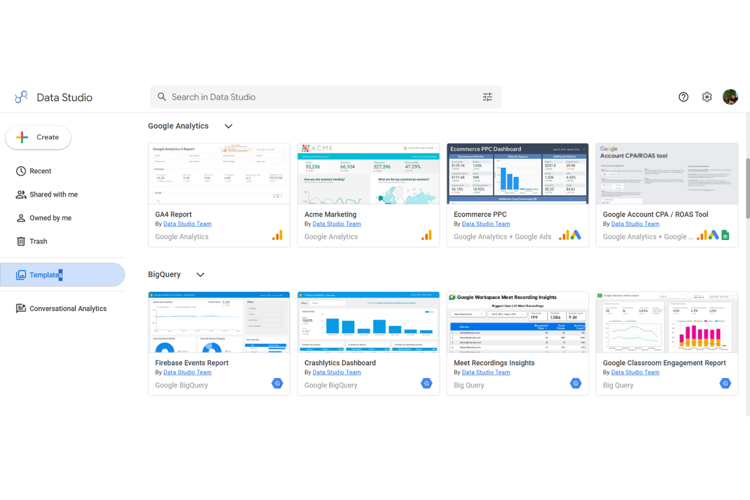
Google Looker Studio (ahora conocido como Google Data Studio) es una herramienta de informes de datos basada en la nube, diseñada para equipos que ya utilizan herramientas de Google Workspace. Los gestores de proyectos pueden crear paneles interactivos que reúnen datos de Google Analytics, Sheets y BigQuery para facilitar el seguimiento de proyectos y la elaboración de informes ejecutivos.
¿Para quién es mejor Looker Studio?
Elegí Looker Studio porque es la única herramienta de esta lista que es completamente gratuita para la mayoría de los equipos, sin costes por usuario para el producto principal. Me gusta cómo la conexión nativa con Google Analytics y Google Sheets permite a mi equipo extraer datos en tiempo real de campañas y proyectos en un solo panel, sin necesidad de preparación de datos.
El editor de informes con función de arrastrar y soltar, fácil de usar, hace que los miembros del equipo sin conocimientos técnicos puedan crear y compartir informes profesionales con facilidad. Para los equipos que ya trabajan en Google Workspace, el proceso de ir de los datos al panel es realmente rápido.
Características clave de Looker Studio
- Constructor de informes con varias pestañas: Crea informes de autoservicio con múltiples páginas y pestañas, cada una mostrando diferentes vistas de datos o métricas de proyectos en un solo documento compartible.
- Conectores de la comunidad: Accede a más de 1.300 conectores creados por la comunidad para extraer datos de bases de datos populares y aplicaciones de terceros en tus paneles.
- Inserción de informes: Inserta informes en vivo de Data Studio en cualquier página web o intranet interna para que los interesados accedan a ellos sin iniciar sesión.
- Analítica conversacional: Haz preguntas sobre tus datos de BigQuery en lenguaje natural directamente dentro de Data Studio usando agentes de inteligencia artificial incluidos en BigQuery.
Integraciones de Looker Studio
Google Data Studio ofrece integraciones nativas con Google Sheets, Google Analytics, Google Ads, BigQuery, Campaign Manager 360, Display & Video 360, Search Console, MySQL y YouTube Analytics, y proporciona una API para integraciones personalizadas.
Pros and Cons
Pros:
- Paneles ilimitados gratuitos para cualquier usuario
- Conectores nativos con productos de Google
- Actualización de datos en tiempo real desde fuentes de Google
Cons:
- No tiene integración directa con Slack o Microsoft Teams
- Personalización limitada de la interactividad de gráficos

TapClicks es una plataforma unificada de operaciones de marketing creada para agencias y equipos de marketing empresariales que desean una gestión centralizada de campañas y análisis. Si necesitas un panel que reúna datos de marketing agregados y automatización de flujos de trabajo, TapClicks ayuda a simplificar los informes a clientes y las operaciones diarias.
¿Para quién es TapClicks?
TapClicks es ideal para agencias de marketing medianas a grandes y equipos empresariales que gestionan campañas complejas y multicanal, además de informes para clientes.
Por qué TapClicks es una buena alternativa a Cyfe
Lo que distingue a TapClicks para mí es el motor automatizado de cumplimiento de campañas de TapWorkflow. Cuando un pedido de campaña entra a través de TapOrders, TapWorkflow enruta automáticamente las tareas a los miembros adecuados del equipo según las reglas que he configurado —sin transferencias manuales, sin tener que perseguir actualizaciones de estado.
También confío en los Agentes Inteligentes de SmartSuite, que supervisan en tiempo real el rendimiento de campañas en todos los canales y envían alertas de anomalías a HubSpot o por correo electrónico antes de que los clientes noten cualquier caída.
Funciones clave de TapClicks
- Creador de presentaciones SmartSlides: Convierte los datos de rendimiento de campañas en diapositivas personalizadas y listas para presentar con un solo clic.
- Monitoreo de estado de carga de datos: Muestra una vista general en tiempo real de todas las sincronizaciones de datos activas para detectar y solucionar problemas de inmediato.
- SmartConnector™: Crea conexiones personalizadas con cualquier fuente de datos que no esté cubierta por los más de 250 conectores nativos, sin necesidad de soporte de ingeniería.
- Control de acceso basado en roles: Restringe la visibilidad de los datos a nivel de usuario, para que clientes y miembros del equipo solo vean la información relevante para ellos.
Integraciones de TapClicks
TapClicks ofrece integraciones nativas con Google Analytics, Snowflake, Google Ads, LinkedIn Ads, HubSpot, Mailchimp, Shopify y Amazon Ads. Hay una API disponible para integraciones personalizadas.
Pros and Cons
Pros:
- Flujos de trabajo automatizados integran datos en múltiples plataformas
- Informes programados para varias cuentas de clientes
- Widgets personalizados para seguimiento de KPI de nicho
Cons:
- Los intervalos de actualización de datos no son en tiempo real
- Características limitadas de comunicación interna del equipo
Otras alternativas a Cyfe
Aquí tienes algunas opciones adicionales de alternativas a Cyfe que no llegaron a mi selección, pero que igual valen la pena revisar:rn
- Microsoft Power BI
Mejor para integración en el ecosistema Microsoft
- DashThis
Mejor para informes mensuales automatizados
- Datapad
Mejor para la creación de paneles impulsados por IA


Criterios de selección de alternativas a Cyfe
Al seleccionar las mejores alternativas a Cyfe para incluir en esta lista, tuve en cuenta las necesidades más comunes de los compradores y los puntos de dolor relacionados con el software de paneles para gestión de proyectos, como la visualización de métricas de proyectos multicanal y la automatización de reportes periódicos. También utilicé el siguiente marco para mantener mi evaluación estructurada y objetiva:
Funcionalidad principal (25% de la puntuación total)
Para ser considerada en esta lista, cada solución debía cubrir los siguientes casos de uso habituales:
- Hacer seguimiento y monitorizar el avance de los proyectos
- Visualizar métricas y KPIs clave de proyectos
- Compartir paneles y reportes con los responsables
- Soportar múltiples fuentes de datos e integraciones
- Configurar alertas o notificaciones personalizadas
Funciones destacadas adicionales (25% de la puntuación total)
Para ayudar a afinar la competencia, también busqué características únicas como:
- Opciones de paneles y reportes con marca blanca
- Actualización automática de datos y detección de anomalías
- Recomendaciones e insights potenciados por IA
- Herramientas interactivas de exploración de datos
- Controles de acceso según roles para datos sensibles
Usabilidad (10% de la puntuación total)
Para valorar la usabilidad de cada sistema, consideré lo siguiente:
- Interfaz de panel limpia e intuitiva
- Navegación coherente en todos los módulos
- Widgets y diseños personalizables
- Configuración manual mínima y facilidad de uso
- Rendimiento ágil con conjuntos de datos grandes
Incorporación (10% del puntaje total)
Para evaluar la experiencia de incorporación en cada plataforma, consideré lo siguiente:
- Guías de incorporación paso a paso o listas de verificación
- Disponibilidad de tutoriales en video y seminarios web
- Plantillas prediseñadas para una configuración rápida
- Tours de producto o recorridos interactivos
- Acceso a la base de conocimientos y a chatbot
Atención al cliente (10% del puntaje total)
Para evaluar los servicios de atención al cliente de cada proveedor de software, consideré lo siguiente:
- Rapidez de respuesta por chat en vivo y correo electrónico
- Acceso a representantes de soporte experimentados
- Vías claras de escalamiento para problemas complejos
- Disponibilidad de foros comunitarios de usuarios
- Documentación y recursos de resolución de problemas
Relación calidad-precio (10% del puntaje total)
Para evaluar el valor por el dinero de cada plataforma, consideré lo siguiente:
- Precios transparentes sin costos ocultos
- Variedad de funciones incluidas en cada nivel
- Planes flexibles para diferentes tamaños de empresas
- Retorno de inversión claro gracias a funciones de automatización e informes
- Opciones de prueba gratuita o garantía de devolución de dinero
Opiniones de clientes (10% del puntaje total)
Para obtener una idea de la satisfacción general de los clientes, tuve en cuenta lo siguiente al leer las reseñas de clientes:
- Comentarios positivos constantes sobre el conjunto de funciones
- Excelentes calificaciones en confiabilidad y tiempo en línea
- Satisfacción con las opciones de integración y personalización
- Elogios a las experiencias de soporte al cliente
- Gestión transparente de actualizaciones o incidencias del producto
¿Por Qué Buscar Una Alternativa a Cyfe?
Aunque Cyfe es una buena opción de software para paneles de gestión de proyectos, existen diversas razones por las que algunos usuarios buscan soluciones alternativas. Puede que estés buscando una alternativa a Cyfe porque…
- Necesitas integraciones más profundas de marketing o inteligencia empresarial
- Deseas una automatización más avanzada de los flujos de datos
- Requieres informes personalizados para múltiples clientes o marcas
- Has superado las limitaciones de visualización o de widgets de Cyfe
- Buscas mejores opciones de marca blanca o personalización
- Necesitas controles de permisos de usuario más sólidos
Si te identificas con alguna de estas situaciones, estás en el lugar indicado. Mi lista contiene varias opciones de software para paneles de gestión de proyectos que son más adecuadas para equipos que enfrentan estos desafíos con Cyfe y buscan soluciones alternativas.
Principales Características de Cyfe
Aquí tienes algunas de las principales características de Cyfe para que puedas comparar y contrastar lo que ofrecen las alternativas:
- Panel todo en uno: Reúne datos de marketing, ventas, análisis web y finanzas en una sola interfaz donde puedes ver, analizar e informar sobre la actividad entre departamentos.
- Widgets preconstruidos: Te permite seleccionar entre docenas de widgets listos para usar de fuentes como Google Analytics, Facebook, Salesforce y más, facilitando la conexión rápida de canales populares y visualizando los datos al instante.
- Fuentes de datos personalizadas: Permite incorporar datos de herramientas especializadas o bases de datos internas mediante widgets personalizados o integraciones API, otorgando más flexibilidad sobre los datos que sigues y muestras.
- Informes programados: Automatiza el envío de capturas de los paneles por correo electrónico a tu equipo o clientes a intervalos regulares, ayudando a mantener alineados a los interesados sin actualizaciones manuales.
- Seguimiento de datos históricos: Almacena y muestra métricas históricas, permitiendo identificar patrones y realizar análisis de tendencias durante semanas, meses o años sin tener que crear informes personalizados desde cero.
- Soporte para múltiples paneles: Permite configurar paneles únicos para equipos, clientes u objetivos, de modo que cada vista se simplifica para una audiencia o uso específico.
- Gestión de usuarios y permisos: Te permite establecer roles de usuario y niveles de acceso, lo que significa que puedes restringir quién ve o edita determinados paneles y widgets dentro de tu organización.
- Paneles incrustados: Te da la capacidad de incrustar paneles de Cyfe directamente en portales de clientes, intranets de equipos o tu sitio web, compartiendo datos en tiempo real con audiencias externas de forma controlada.
- Alertas de KPI: Permite configurar alertas inteligentes para métricas clave, para que tu equipo reciba notificaciones inmediatamente cuando los números alcancen umbrales críticos para tus proyectos o negocio.
- Opciones de exportación de datos: Admite la exportación de datos de panel en formatos CSV, PDF o imágenes, permitiendo compartir la información de manera puntual o realizar análisis adicionales fuera de Cyfe.