12 migliori alternative a Power BI recensite nel 2026

Migliori Alternative a Power BI - Sintesi


Una valida alternativa a Power BI offre una visualizzazione dati flessibile, ampie opzioni di integrazione e funzionalità analitiche affidabili che si adattano al flusso di lavoro del tuo team. Se stai cercando alternative a Power BI, probabilmente stai valutando strumenti in grado di gestire dati complessi, supportare la collaborazione, offrire funzionalità avanzate e adattarsi alle esigenze aziendali in evoluzione, il tutto mantenendo facilità d'uso.
Con così tante piattaforme di analisi dati disponibili, può essere difficile capire quali offrano il giusto mix di usabilità, scalabilità e sicurezza. Questa lista ti aiuterà a confrontare le migliori alternative a Power BI per il 2026, così potrai scegliere con sicurezza una soluzione in linea con le esigenze del tuo progetto e con gli obiettivi della tua organizzazione.
Cos'è Power BI?
Power BI è un software di visualizzazione dati di Microsoft che consente agli utenti di connettersi, analizzare e visualizzare dati provenienti da diverse fonti. Offre dashboard interattivi, report personalizzabili e analisi in tempo reale per aiutare i team a prendere decisioni basate sui dati.
Power BI è ampiamente utilizzato da project manager, analisti e responsabili aziendali che hanno bisogno di trasformare dati grezzi in insight chiari e azionabili per le loro organizzazioni.
Sintesi delle Migliori Alternative a Power BI
Questa tabella comparativa riassume i dettagli sui prezzi delle migliori alternative a Power BI da me selezionate, per aiutarti a trovare quella più adatta al tuo budget e alle esigenze della tua attività.rn
| Tool | Best For | Trial Info | Price | ||
|---|---|---|---|---|---|
| 1 | Ideale per la creazione di dashboard interattive | Piano gratuito disponibile | Da $15/utente/mese (fatturato annualmente) | Website | |
| 2 | Ideale per analisi integrate nei flussi di lavoro | Piano gratuito disponibile | Da $9/utente/progetto/mese | Website | |
| 3 | Ideale per il monitoraggio dei dati in tempo reale | Prova gratuita di 30 giorni + demo gratuita disponibile | Prezzo su richiesta | Website | |
| 4 | Ideale per analisi personalizzate tramite API | Prova gratuita di 7 giorni + demo gratuita disponibile | Prezzo su richiesta | Website | |
| 5 | Ideale per l'integrazione con i sistemi aziendali SAP | Demo gratuita disponibile | Prezzo su richiesta | Website | |
| 6 | Ideale per la scalabilità su infrastruttura AWS | Piano gratuito disponibile | Da $3/utente/mese | Website | |
| 7 | Ideale per funzionalità di sicurezza di livello enterprise | Prova gratuita di 14 giorni + demo gratuita disponibile | Da $13/utente/mese | Website | |
| 8 | Ideale per insight sui dati assistiti dall'IA | Prova gratuita di 30 giorni disponibile | Da $11.25/utente/mese | Website | |
| 9 | Ideale per l’esplorazione associativa dei dati | Prova gratuita disponibile | Da $300/10 utenti/mese (fatturato annualmente) | Website | |
| 10 | Ideale per reportistica self-service open-source | Piano gratuito disponibile | Da $100/mese (fatturazione mensile) + $6/utente/mese | Website |
Perché puoi fidarti di noi
Testiamo e recensiamo software di project management dal 2012. Come project manager, sappiamo quanto sia fondamentale (e difficile) fare la scelta giusta quando si seleziona un software. Investiamo molte risorse nella ricerca per aiutare la nostra audience a scegliere meglio. Abbiamo testato più di 2.000 strumenti per diversi casi d’uso e scritto oltre 1.000 recensioni dettagliate. Scopri come restiamo trasparenti & la nostra metodologia di recensione del software.
-

Accelo
Visit WebsiteThis is an aggregated rating for this tool including ratings from Crozdesk users and ratings from other sites.4.4 -
Celoxis
Visit WebsiteThis is an aggregated rating for this tool including ratings from Crozdesk users and ratings from other sites.4.4 -
Wrike
Visit WebsiteThis is an aggregated rating for this tool including ratings from Crozdesk users and ratings from other sites.4.3


Recensioni delle Alternative a Power BI
Qui sotto trovi i miei riepiloghi dettagliati delle alternative a Power BI che sono entrate nella mia selezione. Le mie recensioni offrono una panoramica delle funzionalità, dei migliori casi d’uso, dell’esperienza utente e delle integrazioni di ciascuna piattaforma per aiutarti a trovare quella più adatta a te.rn

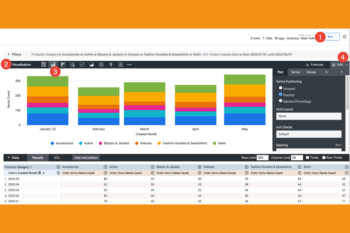
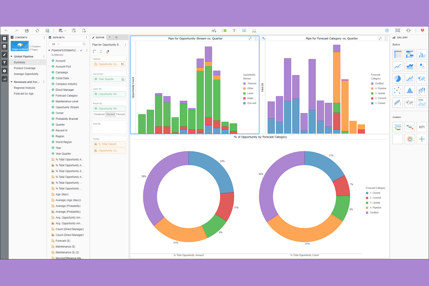
Tableau si distingue per i team che necessitano di dashboard altamente interattive ed esplorazione visiva avanzata. È una scelta eccellente per analisti dei dati e professionisti della business intelligence che desiderano approfondire set di dati complessi e condividere visualmente le informazioni tra i reparti.
Perché è una valida alternativa a Power BI
Il punto di forza di Tableau nella creazione di dashboard interattive lo rende una scelta top per i team che devono visualizzare ed esplorare i dati in tempo reale. Ho scelto Tableau perché il suo builder drag-and-drop permette di creare visualizzazioni dinamiche e altamente personalizzate che si aggiornano con le variazioni dei dati.
La piattaforma supporta anche filtri avanzati e funzionalità di 'drill-down', consentendo agli utenti di individuare rapidamente tendenze e anomalie. Se desideri creare dashboard che favoriscono un'esplorazione dati attiva, Tableau offre più flessibilità rispetto alla maggior parte degli altri strumenti.
Funzionalità
Altre funzionalità di Tableau di interesse per i team alla ricerca di software di data visualization includono:
- Data Blending: Combina dati provenienti da fonti multiple all'interno di una singola visualizzazione per creare report più completi.
- Mappatura Geospaziale: Visualizza dati geografici con mappe integrate e analisi delle posizioni.
- Aggiornamento Programmato dei Dati: Automatizza l'aggiornamento dei dati per dashboard e report secondo una pianificazione definita.
- Strumenti di Collaborazione: Condividi le dashboard in modo sicuro e aggiungi commenti o annotazioni per discussioni di team.
Integrazioni
Le integrazioni includono Salesforce, Microsoft Excel, Google BigQuery, Amazon Athena e Cloudera. Tableau offre anche un'API per integrazioni personalizzate.
Pros and Cons
Pros:
- Offre dashboard altamente interattive
- Supporta l'unione di dati da più fonti
- Consente condivisione protetta e collaborazione
Cons:
- Richiede una licenza separata per lo strumento di preparazione dei dati
- Funzionalità di analisi avanzata limitate
Looker è progettato per i team che necessitano di integrare potenti analisi direttamente nei loro flussi di lavoro e applicazioni esistenti. È pensato per product manager, aziende SaaS e team di data che desiderano offrire dashboard interattivi e personalizzabili all’interno delle proprie piattaforme.
Sfruttando il suo esclusivo livello di modellazione e un’architettura orientata alle API, Looker aiuta gli utenti ad accedere facilmente agli approfondimenti direttamente dove lavorano, distinguendosi così dagli strumenti tradizionali di visualizzazione dati come Power BI.
Perché è una buona alternativa a Power BI
Looker è una scelta solida se hai bisogno di analisi che si inseriscano direttamente nei flussi di lavoro già esistenti del tuo team. Ho scelto Looker perché le sue capacità di analytics integrato consentono di collocare dashboard e report interattivi all’interno di applicazioni, portali clienti o strumenti interni. Il livello semantico di modellazione della piattaforma, inoltre, contribuisce a mantenere una logica di business consistente su tutti i contenuti integrati.
Per le organizzazioni che vogliono offrire insight dove gli utenti già lavorano, Looker offre una flessibilità che Power BI non eguaglia.
Funzionalità
Altre funzionalità di Looker utili per i team di data includono:
- Linguaggio di modellazione LookML: Definisci e gestisci le relazioni tra i dati e la logica di business tramite un linguaggio di modellazione dedicato.
- Distribuzione programmata dei dati: Automatizza l’invio di report e dashboard via email o su piattaforme di messaggistica.
- Visualizzazioni personalizzate: Crea e integra tipi di grafici personalizzati usando JavaScript e librerie open source.
- Sicurezza a livello di riga: Controlla l’accesso ai dati per singolo utente o gruppo al fine di proteggere le informazioni sensibili.
Integrazioni
Le integrazioni includono Google BigQuery, Snowflake, Amazon Redshift, Microsoft Azure e Zendesk. Looker offre inoltre un’API per integrazioni personalizzate.
Pros and Cons
Pros:
- Incorpora dashboard direttamente nelle applicazioni web personalizzate
- La modellazione LookML garantisce coerenza nella logica di business
- Supporta la sicurezza granulare a livello di riga
Cons:
- La consegna programmata dei report è meno flessibile
- Meno opzioni di visualizzazione rispetto a Power BI
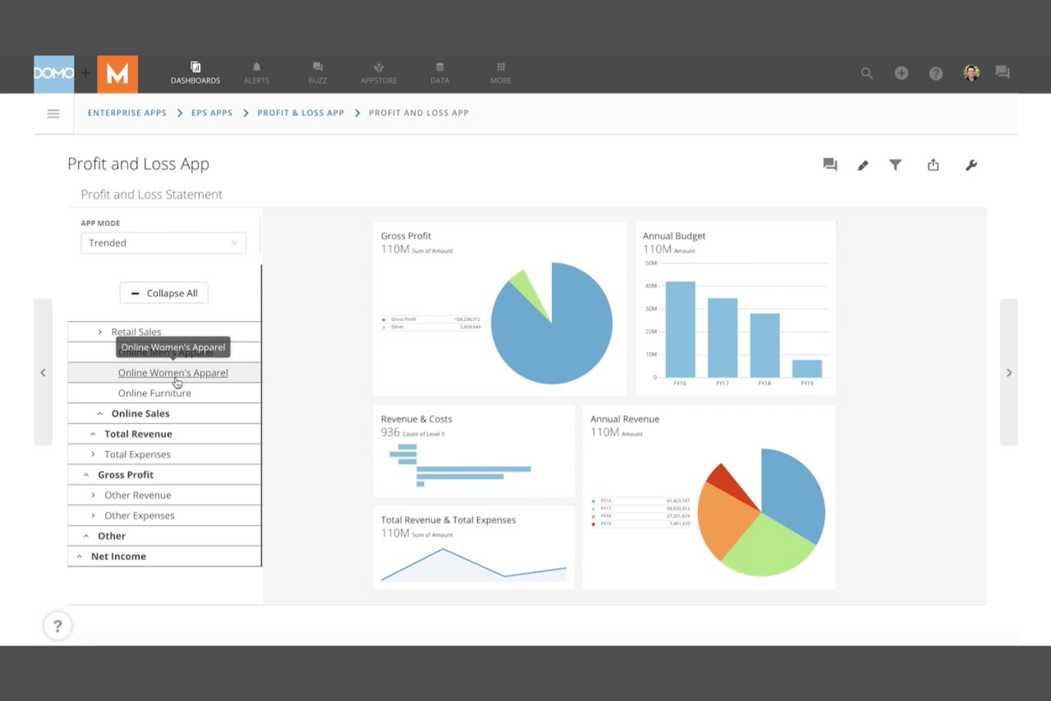
Domo si distingue come un potente strumento di business intelligence progettato per i professionisti che necessitano di informazioni immediate sui dati aziendali. Ideale per team operativi, digital marketer e dirigenti, consolida metriche in tempo reale da più fonti in un'unica dashboard sempre aggiornata.
Il suo punto di forza è il monitoraggio dei dati in tempo reale e gli avvisi automatici, che consentono agli utenti aziendali di reagire rapidamente ai cambiamenti non appena si verificano.
Perché è una valida alternativa a Power BI
Domo eccelle per i team che devono monitorare i dati in tempo reale, non solo analizzarli a posteriori. Ho scelto Domo perché le sue dashboard si aggiornano istantaneamente con l'arrivo di nuovi dati, così hai sempre gli ultimi numeri a portata di mano.
La piattaforma offre anche avvisi automatici e accesso mobile, facilitando l'individuazione e la gestione dei cambiamenti ovunque tu sia. Per le organizzazioni in cui insight immediati e reazione tempestiva sono una priorità, Domo offre un approccio diverso rispetto a Power BI.
Funzionalità
Altre funzionalità di Domo che possono essere utili per i team di analytics includono:
- App Studio: Crea app e flussi di lavoro personalizzati direttamente sulla piattaforma.
- Magic ETL: Utilizza un'interfaccia drag-and-drop per trasformare e preparare i dati per l'analisi.
- Strumenti di Data Governance: Imposta permessi, monitora l'utilizzo e gestisci l'accesso ai dati nell'organizzazione.
- Analisi Incorporata: Integra dashboard e visualizzazioni all'interno di siti web o applicazioni esterni.
Integrazioni
Le integrazioni includono Salesforce, Google Analytics, Amazon Redshift, Microsoft Azure e ServiceNow. Domo offre anche un'API per integrazioni personalizzate.
Pros and Cons
Pros:
- Aggiornamenti in tempo reale delle dashboard per decisioni immediate
- Si collega nativamente a fonti dati cloud
- Offre trasformazione dei dati drag-and-drop
Cons:
- Le prestazioni sono lente con grandi set di dati
- Trasparenza dei prezzi assente

Sisense si distingue per i team che necessitano di analisi profondamente personalizzabili integrate direttamente nei loro prodotti o flussi di lavoro. È ideale per product manager, sviluppatori SaaS e team di dati che richiedono un ampio accesso alle API per adattare dashboard e modelli di dati esattamente alle proprie esigenze. A differenza di Power BI, Sisense offre un controllo dettagliato su integrazione e visualizzazione dei dati, consentendo esperienze analitiche uniche guidate dagli sviluppatori.
Perché è una valida alternativa a Power BI
Per i team che devono andare oltre le dashboard standard, Sisense si distingue per le sue capacità di analisi personalizzate tramite API. Ho scelto Sisense perché permette di integrare l'analisi direttamente nei propri prodotti e flussi di lavoro, offrendo una flessibilità maggiore rispetto alle opzioni preconfezionate di Power BI.
Il toolkit per sviluppatori della piattaforma supporta la modellazione e la visualizzazione personalizzata dei dati, così puoi adattare le analisi alle tue esigenze specifiche. Se desideri creare esperienze analitiche uniche, guidate da API, Sisense offre un livello di personalizzazione difficile da uguagliare.
Funzionalità
Altre funzionalità di Sisense che possono essere utili ai team di dati includono:
- Motore dati Elasticube: archivia, prepara e analizza grandi insiemi di dati con elaborazione in-memory.
- Approfondimenti guidati dall'AI: individua automaticamente tendenze e anomalie nei dati tramite machine learning integrato.
- White Labeling: personalizza l'aspetto delle dashboard per rispecchiare il tuo brand.
- Controlli di accesso basati sui ruoli: gestisci autorizzazioni e accesso ai dati a livello dettagliato.
Integrazioni
Le integrazioni includono Salesforce, Google Analytics, Snowflake, Microsoft Azure, Amazon Redshift e Jira. Sisense offre anche API robuste per integrazioni analitiche personalizzate.
Pros and Cons
Pros:
- Offre API complete per flussi di lavoro dati personalizzati
- Integra analisi direttamente nei prodotti SaaS
- Supporta l'elaborazione dei dati in-memory
Cons:
- Le opzioni di design delle dashboard sono meno varie rispetto a Power BI
- La documentazione per gli sviluppatori può essere incoerente
Ideale per l'integrazione con i sistemi aziendali SAP
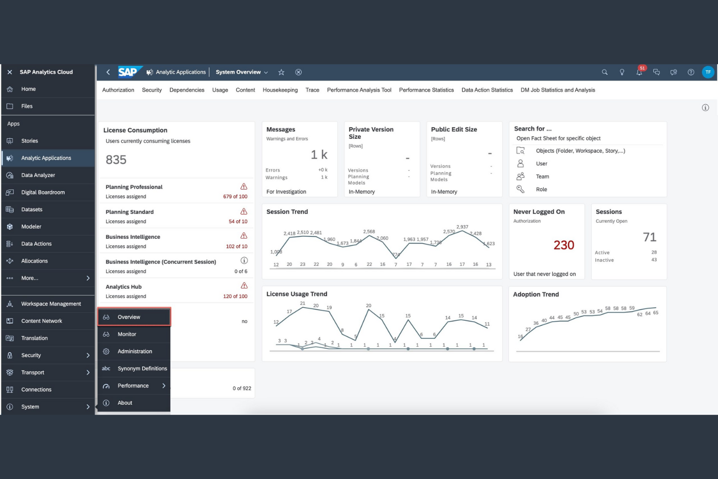
SAP Analytics Cloud è progettato per le aziende profondamente integrate nell'ecosistema SAP che cercano un'integrazione dati senza soluzione di continuità e analisi avanzate. Si rivolge ai team finanziari e agli analisti aziendali che necessitano di informazioni in tempo reale direttamente dai sistemi SAP ERP e S/4HANA.
Combinando la connettività nativa SAP con funzionalità di analisi predittiva e pianificazione, semplifica il processo decisionale e massimizza il valore dell'infrastruttura dati SAP esistente.
Perché SAP Analytics Cloud è una valida alternativa a Power BI
SAP Analytics Cloud è stato concepito per connettersi direttamente con i tuoi dati e flussi di lavoro SAP esistenti. Ho scelto questo strumento perché offre un'integrazione nativa con SAP ERP, S/4HANA e altre applicazioni aziendali SAP, cosa che Power BI non può offrire immediatamente.
La piattaforma supporta connessioni dati in tempo reale, così puoi visualizzare e analizzare informazioni aggiornate senza dover esportare o sincronizzare manualmente i dati. Per i team che devono unificare pianificazione, reportistica e analisi all'interno dell'ecosistema SAP, SAP Analytics Cloud garantisce un'esperienza senza interruzioni.
Funzionalità
Altre funzionalità di SAP Analytics Cloud che possono essere utili per i team di analisi includono:
- Smart Predict: Utilizza il machine learning automatizzato per generare approfondimenti predittivi dai tuoi dati.
- Strumenti di Collaborazione: Condividi report, commenta le dashboard e assegna attività all'interno della piattaforma.
- Data Wrangling: Pulisci, trasforma e arricchisci i dati prima di realizzare visualizzazioni.
- Accesso Mobile: Visualizza e interagisci con le dashboard su dispositivi iOS e Android.
Integrazioni
Le integrazioni includono SAP S/4HANA, SAP BW/4HANA, SAP HANA, SAP SuccessFactors, SAP Ariba e Amazon Redshift.
Pros and Cons
Pros:
- Include pianificazione e previsione integrate
- Offre machine learning automatizzato per analisi predittive
- Fornisce funzionalità di governance dei dati e sicurezza avanzate
Cons:
- Integrazione con sorgenti dati non-SAP meno flessibile
- Le prestazioni possono rallentare con modelli di dati di grandi dimensioni
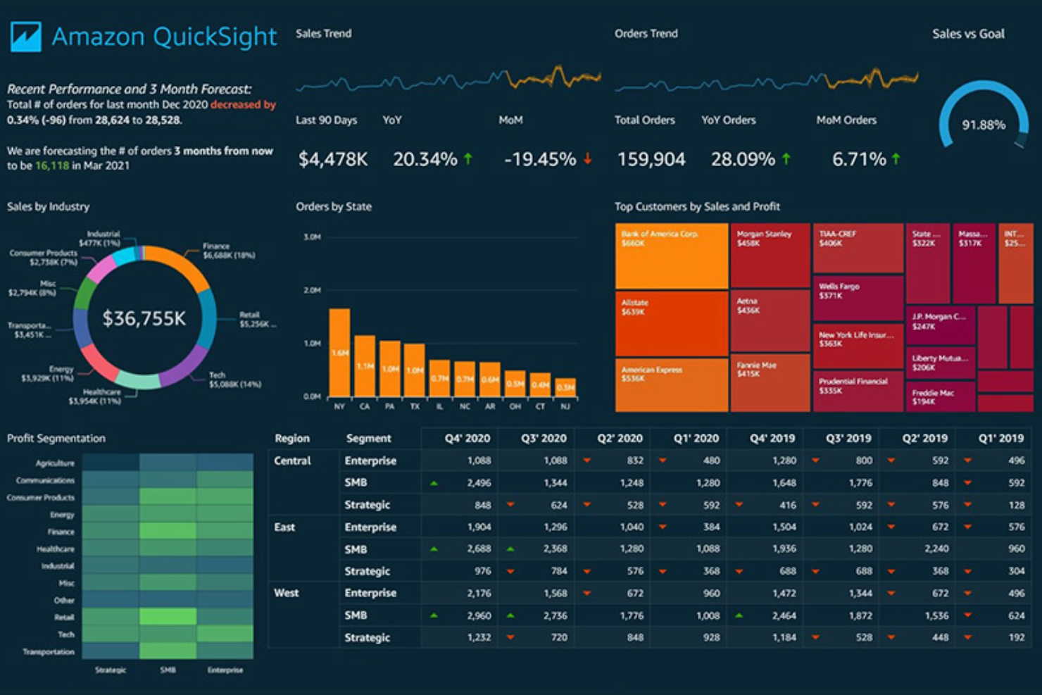
AWS QuickSight offre un'esperienza di analytics cloud serverless pensata per ambienti cloud-native. È ideale per architetti cloud, data engineer e professionisti di analytics che necessitano di scalare e visualizzare velocemente grandi dataset distribuiti senza dover gestire l’infrastruttura.
L’integrazione nativa di QuickSight con i servizi AWS e le capacità di scalabilità automatica lo rendono una scelta distintiva per le organizzazioni che cercano insight efficienti e scalabili, oltre i tradizionali strumenti BI come Power BI.
Perché è una valida alternativa a Power BI
Quando si tratta di scalare l’analisi dei dati con fluidità all’interno dell’ecosistema AWS, QuickSight si distingue come alternativa potente a Power BI. Ho scelto QuickSight perché la sua architettura serverless si adatta automaticamente per gestire grandi volumi di dati e fluttuazioni nella domanda degli utenti senza interventi manuali.
La stretta integrazione con servizi AWS come Amazon Redshift e S3 consente una visualizzazione dei dati in tempo reale con una configurazione minima. Per le organizzazioni fortemente investite in AWS, la scalabilità e le capacità cloud native di QuickSight offrono un vantaggio evidente rispetto a Power BI.
Caratteristiche
Altre funzionalità che rendono QuickSight utile per i team di analytics includono:
- Motore in-memory SPICE: Analizza grandi insiemi di dati rapidamente grazie al motore di calcolo in-memory di AWS.
- Analisi embedded: Integra dashboard e visualizzazioni interattive direttamente nelle tue applicazioni.
- ML Insights: Accedi a funzionalità di machine learning integrate per il rilevamento di anomalie e la previsione.
- Sicurezza a livello di riga: Controlla l’accesso ai dati a livello granulare per utenti e gruppi diversi.
Integrazioni
Le integrazioni includono Amazon S3, Amazon Redshift, Amazon RDS, Amazon Athena e ServiceNow.
Pros and Cons
Pros:
- Motore SPICE per interrogazioni rapide
- Architettura serverless che scala con la crescita dei dati
- Sicurezza a livello di riga per il controllo della visibilità dei dati
Cons:
- Opzioni di visualizzazione meno ampie rispetto a Power BI
- Calcoli personalizzati limitati
Strategy (precedentemente MicroStrategy) si distingue come una solida piattaforma di analisi progettata per grandi aziende che danno priorità alla sicurezza e alla governance di livello enterprise. È particolarmente adatta a settori regolamentati e responsabili IT che necessitano di rigorosi controlli sui dati e di rispetto delle normative. Offrendo funzionalità avanzate di sicurezza e gestione centralizzata, risponde alle sfide della gestione dei dati sensibili in ambienti complessi.
Perché è una buona alternativa a Power BI
Quando sicurezza e conformità non sono negoziabili, Strategy offre funzionalità che vanno oltre quelle disponibili in Power BI. Ho scelto Strategy perché offre funzionalità di sicurezza di livello enterprise come controlli di accesso dettagliati, autenticazione a più fattori e gestione centralizzata degli utenti.
La piattaforma supporta inoltre strumenti avanzati di auditing e governance, che aiutano le organizzazioni a rispettare severi requisiti normativi. Se il tuo team gestisce dati sensibili o regolamentati, il framework di sicurezza di Strategy è realizzato appositamente per soddisfare queste esigenze.
Funzionalità
Altre caratteristiche che rendono Strategy preziosa per i team di analisi includono:
- HyperIntelligence Cards: Visualizza approfondimenti contestuali direttamente all'interno di applicazioni web e strumenti aziendali.
- Data Blending: Combina dati da più fonti per un'analisi e reportistica unificate.
- Costruttore di App Mobile: Crea e distribuisci app di analisi personalizzate per dispositivi iOS e Android.
- Libreria per la Collaborazione: Condividi, annota e discuti dashboard e report all'interno di una libreria digitale centralizzata.
Integrazioni
Le integrazioni includono Salesforce, SAP, Oracle, Hadoop, Teradata, Amazon Redshift, Google BigQuery e IBM Db2.
Pros and Cons
Pros:
- Libreria centralizzata favorisce la collaborazione su larga scala
- Il costruttore di app mobile consente analisi personalizzate
- Controlli di sicurezza avanzati per il rispetto delle normative più severe
Cons:
- La configurazione iniziale richiede un significativo coinvolgimento dell'IT
- Gli aggiornamenti vengono rilasciati meno frequentemente rispetto ai concorrenti
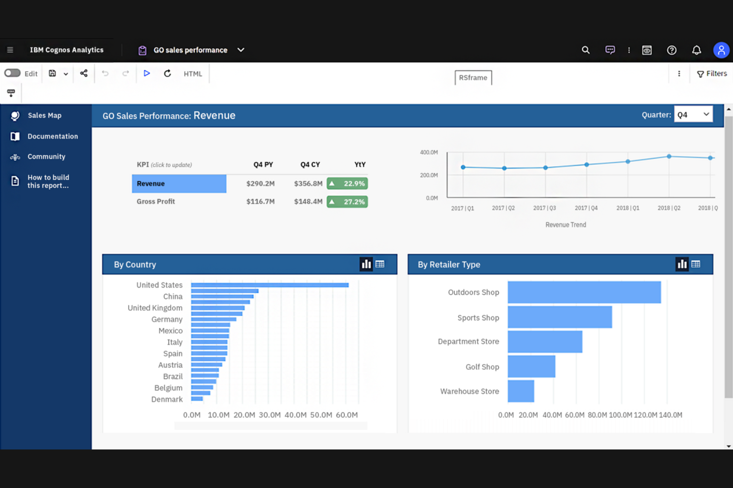
IBM Cognos Analytics si distingue integrando la scoperta dati guidata dall'IA e l'analisi predittiva direttamente nella sua piattaforma. È ideale per analisti aziendali, professionisti della finanza e responsabili delle operations che necessitano di insight automatici e interrogazioni in linguaggio naturale per individuare rapidamente le tendenze. A differenza di Power BI, Cognos Analytics riduce l'esplorazione manuale dei dati, consentendo agli utenti di prendere decisioni più rapide e informate.
Perché è una valida alternativa a Power BI
IBM Cognos Analytics si distingue per il forte focus sugli insight assistiti dall'IA, il che lo differenzia da Power BI. Le funzionalità di intelligenza artificiale della piattaforma generano automaticamente visualizzazioni dei dati e mettono in evidenza i fattori chiave, facilitando l'individuazione di schemi significativi senza sforzo manuale.
La funzione di query in linguaggio naturale consente agli utenti di porre domande in italiano corrente e ricevere risposte visive immediate, semplificando l'esplorazione dei dati. Inoltre, Cognos Analytics offre funzionalità di scoperta automatica e analisi predittiva che forniscono insight più profondi rispetto a quelli forniti nativamente da Power BI.
Caratteristiche
Altre caratteristiche che rendono Cognos Analytics interessante per i team dati includono:
- Strumenti di preparazione dei dati: Pulisci, unisci e trasforma i dati direttamente all'interno della piattaforma.
- Modelli di dashboard personalizzati: Usa template predefiniti per creare rapidamente dashboard interattive.
- Accesso tramite app mobile: Visualizza e interagisci con report e dashboard da dispositivi iOS e Android.
- Pianificazione dei report: Automatizza la distribuzione dei report agli utenti secondo una pianificazione ricorrente.
Integrazioni
Le integrazioni includono Salesforce, Microsoft Excel, Microsoft Power BI, SAP, Oracle, Google Analytics e IBM Db2.
Pros and Cons
Pros:
- Le analisi guidate dall'IA mettono in evidenza anomalie nei dati
- Supporta reportistica complessa per le aziende
- Gli strumenti di preparazione dei dati consentono la pulizia dei dati all'interno della piattaforma
Cons:
- Configurazione iniziale difficile per chi non è tecnico
- Libreria di visualizzazioni ridotta

Qlik Sense offre un approccio unico alla visualizzazione dei dati grazie al suo potente motore associativo, ideale per analisti e team aziendali che cercano approfondimenti più profondi. È particolarmente indicato per chi ha bisogno di esplorare relazioni complesse tra i dati senza essere vincolato a percorsi di analisi lineari. Questa flessibilità aiuta a scoprire connessioni nascoste che strumenti tradizionali come Power BI potrebbero trascurare.
Perché è una buona alternativa a Power BI
Qlik Sense si distingue per l’esplorazione associativa dei dati, che consente di andare oltre gli approfondimenti lineari e di individuare relazioni all’interno dell’intero set di dati. Ho scelto Qlik Sense perché il suo motore associativo mette in evidenza sia i punti dati correlati sia quelli non correlati durante la selezione, aiutandoti a individuare pattern e anomalie che altrimenti potrebbero passare inosservati.
La piattaforma offre anche funzionalità di ricerca intelligente, così puoi trovare rapidamente connessioni tra i campi dati senza creare query complesse. Per i team che desiderano analizzare i dati da più prospettive e scoprire rapidamente nuove intuizioni, Qlik Sense propone un approccio unico rispetto a Power BI.
Funzionalità
Altre funzionalità di Qlik Sense che possono interessare ai data team includono:
- Preparazione dei dati self-service: Gli utenti possono caricare, trasformare e arricchire i dati senza dipendere dal supporto IT.
- Design responsivo: I dashboard si adattano automaticamente a tutte le dimensioni di schermo e dispositivi.
- Estensioni di visualizzazione personalizzate: Gli sviluppatori possono creare e integrare visualizzazioni personalizzate tramite API aperte.
- Avvisi sui dati: Configura notifiche automatiche in base a determinate condizioni o soglie dei dati.
Integrazioni
Le integrazioni includono Salesforce, Microsoft Azure, SAP, Google BigQuery, Snowflake e Tableau.
Pros and Cons
Pros:
- Il motore associativo consente un’esplorazione flessibile dei dati
- Gestisce grandi quantità e set di dati complessi
- Offre strumenti avanzati di preparazione dei dati
Cons:
- Richiede competenze tecniche per scripting avanzato
- Poche funzionalità AI e di machine learning pronte all’uso
Metabase è una piattaforma open-source di visualizzazione dei dati pensata per i team che desiderano democratizzare l'accesso ai dati senza dipendere pesantemente dall'IT. È ideale per startup, analisti di dati e team di prodotto che cercano un modo intuitivo e senza codice per esplorare e condividere insight.
A differenza di Power BI, Metabase punta sulla facilità di personalizzazione e sulla flessibilità di self-hosting, consentendo agli utenti di adattare l'ambiente di analisi alle proprie esigenze specifiche.
Perché è una valida alternativa a Power BI
Metabase è una scelta solida se vuoi un reporting self-service open-source che metta l'esplorazione dei dati direttamente nelle mani degli utenti. Ho scelto Metabase perché il suo costruttore di query visuali permette a chiunque di creare grafici e dashboard senza scrivere SQL, un grande vantaggio per i team senza data engineer dedicati.
La piattaforma supporta anche implementazioni personalizzate, quindi puoi ospitarla sulla tua infrastruttura e adattarla alle esigenze della tua organizzazione. Per i team che danno valore a trasparenza e controllo sul proprio stack di analytics, Metabase offre un livello di flessibilità che Power BI non eguaglia.
Funzionalità
Altre funzionalità di Metabase che potrebbero interessare i team di dati includono:
- Report programmati: Automatizza la consegna di dashboard e report via email o Slack secondo una pianificazione prestabilita.
- Editor del modello dati: Definisci e gestisci metadati, relazioni e descrizioni dei campi per i tuoi dataset.
- Log di audit: Traccia l'attività degli utenti e le modifiche all'interno della piattaforma per compliance e sicurezza.
- White labeling: Personalizza l'interfaccia con il branding e i colori della tua organizzazione.
Integrazioni
Le integrazioni includono MySQL, PostgreSQL, MongoDB, Google BigQuery, Amazon Redshift, Snowflake e SQLite. Metabase offre anche un'API per integrazioni personalizzate.
Pros and Cons
Pros:
- Supporta la consegna programmata di report tramite email
- L'editor del modello dati aiuta a definire le relazioni
- Il white labeling consente di personalizzare l'aspetto della piattaforma
Cons:
- Funzionalità di analisi avanzate e AI limitate
- Pochi tipi di visualizzazione integrati
Altre Alternative a Power BI
Ecco alcune ulteriori opzioni di alternative a Power BI che non sono entrate nella mia selezione principale, ma che meritano comunque di essere considerate:rn
- Klipfolio
Ideale per modelli di dashboard preimpostati
- Apache Superset
Ideale per visualizzazioni avanzate basate su SQL


Criteri di Selezione delle Alternative a Power BI
Nella scelta delle migliori alternative a Power BI da includere in questa lista, ho considerato i bisogni comuni degli acquirenti e i principali punti dolenti relativi ai software di visualizzazione dati, come la gestione di fonti dati complesse e il rispetto di rigorosi requisiti di sicurezza. Ho inoltre utilizzato il seguente schema per mantenere una valutazione strutturata ed equa:
Funzionalità Core (25% del punteggio totale) Per essere incluse in questa lista, tutte le soluzioni dovevano soddisfare i seguenti casi d’uso comuni:
- Creare dashboard e report interattivi
- Collegarsi a più fonti di dati
- Visualizzare i dati tramite grafici e tabelle
- Condividere report con i membri del team
- Esportare dati e visualizzazioni
Funzionalità Distintive Aggiuntive (25% del punteggio totale) Per restringere ulteriormente la selezione, ho considerato anche caratteristiche uniche come:
- Insight sui dati basati su intelligenza artificiale
- Capacità di analisi incorporata
- Streaming dati in tempo reale
- Strumenti avanzati di governance dei dati
- App di analisi mobile personalizzabili
Usabilità (10% del punteggio totale) Per valutare l'usabilità di ciascun sistema, ho preso in considerazione i seguenti aspetti:
- Interfaccia intuitiva drag-and-drop
- Navigazione e struttura dei menu chiare
- Numero minimo di clic per creare visualizzazioni
- Design reattivo per dispositivi diversi
- Funzionalità di accessibilità per tutti gli utenti
Onboarding (10% del punteggio totale) Per valutare l'esperienza di onboarding di ciascuna piattaforma, ho considerato i seguenti elementi:
- Tour guidati passo-passo del prodotto
- Disponibilità di video formativi e documentazione
- Template di dashboard predefiniti
- Accesso a webinar di onboarding
- Chatbot in-app per assistenza rapida
Assistenza clienti (10% del punteggio totale) Per valutare il servizio di assistenza clienti di ciascun fornitore di software, ho analizzato i seguenti punti:
- Assistenza live chat o telefonica 24/7
- Tempi di risposta rapidi alle richieste
- Accesso a una knowledge base o centro assistenza
- Forum della community per supporto tra utenti
- Account manager dedicati per clienti aziendali
Rapporto qualità-prezzo (10% del punteggio totale) Per valutare il rapporto qualità-prezzo di ciascuna piattaforma, ho preso in esame i seguenti aspetti:
- Struttura dei prezzi trasparente
- Piani flessibili per team di dimensioni diverse
- Disponibilità di prova gratuita o demo
- Funzionalità incluse in ciascun livello di prezzo
- Sconti per fatturazione annuale
Recensioni dei clienti (10% del punteggio totale) Per avere un'idea della soddisfazione generale dei clienti, ho considerato i seguenti elementi nella lettura delle recensioni:
- Feedback positivo su affidabilità e disponibilità della piattaforma
- Soddisfazione degli utenti sulle opzioni di visualizzazione
- Commenti sulla qualità del supporto clienti
- Segnalazioni sulle prestazioni con grandi quantità di dati
- Feedback sulle capacità di integrazione
Perché Cercare un'Alternativa a Power BI?
Sebbene Power BI sia una buona soluzione per la visualizzazione dei dati, esistono diversi motivi per cui alcuni utenti cercano delle alternative. Potresti cercare un’alternativa a Power BI perché…
- Hai bisogno di funzionalità avanzate di sicurezza o conformità
- Il tuo team lavora al di fuori dell'ecosistema Microsoft
- Richiedi opzioni di visualizzazione più flessibili, moderne o convenienti
- Hai necessità di analisi dei dati su grandi dataset o dati complessi
- La tua organizzazione si trova in una regione dove Power BI è poco disponibile
Se ti riconosci in una di queste situazioni, sei nel posto giusto. Nel mio elenco trovi diverse soluzioni di software per la visualizzazione dei dati più adatte a team che affrontano queste sfide con Power BI e sono alla ricerca di alternative.
Caratteristiche Principali di Power BI
Ecco alcune delle principali funzionalità di Power BI, per aiutarti a confrontarle con le soluzioni alternative:
- Creazione interattiva di dashboard e report
- Integrazione con Microsoft 365 e servizi Azure
- Modellazione dati con formule DAX
- Aggiornamento programmato dei dati e aggiornamenti automatici
- Funzionalità di interrogazione in linguaggio naturale (Q&A)
- Streaming e monitoraggio dei dati in tempo reale
- Marketplace di visual personalizzate di terze parti
- Sicurezza a livello di riga per il controllo degli accessi ai dati
- App mobile per analisi ovunque ti trovi
- Collaborazione e condivisione all'interno di Microsoft Teams
Cosa Succede Dopo:
Se stai valutando delle alternative a Power BI, contatta gratuitamente un consulente SoftwareSelect per ricevere le raccomandazioni.
Compili un modulo e fai una breve chiacchierata: ti chiederanno le esigenze specifiche del tuo team. Ti verrà poi fornita una shortlist di software da valutare. Riceverai supporto durante tutto il processo di acquisto, incluse anche le negoziazioni sul prezzo.