Die 10 besten BI-Tools für bessere Entscheidungen im Jahr 2026

10 Beste BI-Tools Kurzliste


Business-Intelligence-Tools helfen Teams, Rohdaten in umsetzbare Erkenntnisse zu verwandeln, indem sie Informationen konsolidieren, Trends visualisieren und intelligentere Entscheidungen unterstützen. Egal, ob Sie KPIs verfolgen, das Kundenverhalten analysieren oder Umsätze prognostizieren – das richtige BI-Tool kann Muster aufdecken, die Wachstum fördern und die Leistung in Ihrer Organisation verbessern.
Um Ihnen die Auswahl der richtigen Plattform zu erleichtern, habe ich führende Business-Intelligence-Tools anhand ihrer Datenintegrationsfähigkeiten, Dashboard-Funktionen, Benutzerfreundlichkeit und Skalierbarkeit getestet und bewertet. Dieser Leitfaden stellt die besten BI-Tools im Jahr 2026 vor, sodass Sie eines finden können, das den Datenanforderungen Ihres Teams entspricht und die strategische Entscheidungsfindung unterstützt.
Was sind Business-Intelligence-Tools?
Business-Intelligence-Tools sind Softwareanwendungen, die Daten erfassen, analysieren und visualisieren, um Organisationen bei der datenbasierten Entscheidungsfindung zu unterstützen.
Sie bündeln Informationen aus Datenquellen wie Datenbanken, Tabellenkalkulationen und Cloud-Diensten in interaktiven Dashboards und Berichten. Mit Funktionen wie Echtzeit-Analysen, Datenvisualisierung und Reporting verwandeln BI-Tools Rohdaten in verwertbare Erkenntnisse für Teams in allen Abteilungen.
Darum können Sie uns vertrauen
Wir testen und bewerten Projektmanagement-Software seit 2012. Als Projektmanager wissen wir, wie kritisch und schwierig die richtige Auswahl von Software sein kann. Wir investieren in tiefgehende Recherche, um unseren Lesern bessere Entscheidungen beim Softwarekauf zu ermöglichen. Wir haben über 2.000 Tools für verschiedene Projektmanagement-Anwendungsfälle getestet und mehr als 1.000 umfassende Software-Reviews geschrieben. Erfahren Sie, wie wir Transparenz gewährleisten & unsere Software-Bewertungsmethodik.
Der große Vergleich der besten Business-Intelligence-Tools
Mit dieser Tabelle finden Sie das beste BI-Tool für Ihre Anforderungen:
| Tool | Best For | Trial Info | Price | ||
|---|---|---|---|---|---|
| 1 | Am besten geeignet für die kanalübergreifende Journey-Mapping in Echtzeit | Kostenloser Plan + kostenlose Demo verfügbar | Preis auf Anfrage | Website | |
| 2 | Bestes Business-Intelligence-Tool für kleine Unternehmen | 15 Tage kostenlos testen | Ab $22/Monat für 2 Benutzer | Website | |
| 3 | Am besten geeignet für die Integration von über 150 Datenquellen | 14-tägige kostenlose Testphase + kostenlose Demo verfügbar | Ab $44/Monat (jährliche Abrechnung) | Website | |
| 4 | Am besten für die Integration von Daten in Tabellenkalkulationen geeignet | Kostenloser Plan + kostenlose Demo verfügbar | Ab $49/Monat (jährliche Abrechnung) | Website | |
| 5 | Bestes Business-Intelligence-Tool für Unternehmen | 14 Tage kostenlose Testversion | Ab $70/User/Monat | Website | |
| 6 | Bestes Datenbank-BI-Berichtswerkzeug | Kostenlose Demo | Individuelle Preisgestaltung | Website | |
| 7 | Am besten geeignet für die Analysefreigabe über externe Lieferantenportale | 30-tägige kostenlose Testversion + kostenlose Demo verfügbar | Preise auf Anfrage verfügbar | Website | |
| 8 | Beste Business-Intelligence-API zur Integration von Analysen in Ihre Produkte und Tools | Kostenlose Testversion | Individuelle Preisgestaltung | Website | |
| 9 | Am besten geeignet zum Erstellen und Einbetten von Dashboards in Ihre Anwendungen | 5 Tage kostenlos testen | Ab $79/Nutzer/Monat | Website | |
| 10 | Bestes Tool für Jira-Integration & individuelle Ansichten | Kostenloser Tarif verfügbar | Ab $18 pro Nutzer und Monat | Website |
-

Smartsheet
Visit WebsiteThis is an aggregated rating for this tool including ratings from Crozdesk users and ratings from other sites.4.5 -
Accelo
Visit WebsiteThis is an aggregated rating for this tool including ratings from Crozdesk users and ratings from other sites.4.4 -
Celoxis
Visit WebsiteThis is an aggregated rating for this tool including ratings from Crozdesk users and ratings from other sites.4.4


Business-Intelligence-Tools im Überblick
Hier finden Sie einen Überblick über die derzeit besten BI-Tools auf dem Markt:
Am besten geeignet für die kanalübergreifende Journey-Mapping in Echtzeit

Adobe Customer Journey Analytics ist ein Business-Intelligence-Tool, mit dem Sie Kundenreisen über mehrere Kanäle hinweg mithilfe von Echtzeitdaten, individuell anpassbaren Dashboards und erweiterten Analysefunktionen analysieren und visualisieren können.
Für wen ist Adobe Customer Journey Analytics am besten geeignet?
Marketing- und Analyse-Teams in großen Unternehmen, die komplexe, kanalübergreifende Kundenreisen analysieren müssen.
Warum ich Adobe Customer Journey Analytics ausgewählt habe
Ich habe Adobe Customer Journey Analytics als eines der besten ausgewählt, weil ich damit Kundenreisen in Echtzeit über Web-, Mobile- und Offline-Kanäle abbilden kann. Ich nutze die visuelle Flussanalyse, um zu sehen, wie Nutzer zwischen Kontaktpunkten wechseln und sofort Abbruchstellen zu erkennen. Mein Team verlässt sich auf das einheitliche Datenmodell, um Daten aus verschiedenen Quellen zusammenzuführen, sodass wir stets einen vollständigen Überblick über die Customer Experience haben.
Wichtige Funktionen von Adobe Customer Journey Analytics
- Individuell anpassbare Dashboards: Erstellen Sie interaktive Dashboards, um wichtige Kennzahlen zu visualisieren und mit Ihrem Team zu teilen.
- Erweiterte Segmentierung: Erstellen Sie detaillierte Zielgruppensegmente auf Basis von Verhalten, Demografie oder eigenen Kriterien.
- Geplante Berichte: Automatisieren Sie die Zustellung von Berichten an Stakeholder nach einem festen Zeitplan.
- Datenkonnektoren: Importieren und vereinen Sie Daten aus CRM, E-Commerce und anderen externen Systemen.
Adobe Customer Journey Analytics Integrationen
Adobe Customer Journey Analytics bietet native Integrationen mit Adobe Experience Platform, Adobe Analytics, Adobe Target, Adobe Audience Manager und Adobe Campaign. Außerdem steht eine API für individuelle Integrationen zur Verfügung und Verbindungen zu externen Datenquellen werden über Adobe Experience Platform-Konnektoren unterstützt.
Pros and Cons
Pros:
- KI-gestützte Anomalieerkennung und Ursachenanalyse
- Tiefe Integration mit der Adobe Experience Platform
- Flexible berechnete Kennzahlen und benutzerdefinierte Datenansichten
Cons:
- Wenige native Integrationen außerhalb der Adobe-Produkte
- Für fortgeschrittene Funktionen sind möglicherweise technische Fachkenntnisse erforderlich
Bestes Business-Intelligence-Tool für kleine Unternehmen
Zoho Analytics ist ein großartiges Business-Intelligence-Tool für kleine Unternehmen, dank des umfangreichen Funktionsumfangs, der einfachen Benutzeroberfläche und der erschwinglichen Preise für eine geringe Nutzerzahl. Für einen Reiseveranstalter, der 17 mehrtägige Touren verwaltet, erwies sich Zoho Analytics als unverzichtbar: 'Ich habe Zoho Analytics genutzt, um die Leistung der Reiseleiter, Gästebewertungen und Logistik für all unsere 17 mehrtägigen Reisen zu überwachen. Zoho Analytics hat mir geholfen, Trends im Verhalten der Gäste und im Ablauf der Reisen in ländlichen Gebieten zu erkennen. So konnten wir Überstunden reduzieren, indem wir Ineffizienzen aufdeckten, die in Tabellenkalkulationen nicht sichtbar waren.'
Dieses Tool ermöglicht es Ihnen, Daten aus einer Vielzahl von Quellen zu ziehen und intuitive sowie funktionale Berichte zu erstellen, um die visualisierten Daten zu analysieren. Der KI-Assistent 'Zia' beantwortet gestellte Fragen im Abfragefeld mithilfe der gesammelten Daten, kombiniert mit Machine Learning und Verarbeitung natürlicher Sprache.
Zoho Analytics erhält von mir die Auszeichnung für die besten Funktionen und die größte Funktionalität. Während die meisten hier getesteten Softwarelösungen über ein solides BI-System verfügen, geht Zoho mit Features wie dem KI-Assistenten, der Betonung der einfachen Zusammenarbeit, zahlreichen Integrationsmöglichkeiten von Drittanbietern sowie Android- und iOS-Apps noch einen Schritt weiter.
Einige kleinere Nachteile von Zoho sind, dass die SQL-Tutorials ein wenig besser ausgebaut sein könnten. Außerdem würden die Pivot-Ansicht/Auswertungszusammenfassungen davon profitieren, wenn es einen „ODER'- oder „ENTHÄLT'-Befehl gäbe, um die benötigten Daten gezielter herausfiltern zu können.
Es gibt Integrationen mit Zoho Analytics, Salesforce CRM, Microsoft Dynamics CRM, Hubspot CRM, Mailchimp, Google Analytics, Bing Ads, Zoho Surveys, Survey Monkey, Facebook, Twitter, YouTube, QuickBooks, Xero, Shopify, Zendesk und vielen weiteren.
Zoho Analytics startet ab $24/Monat für 2 Benutzer und bietet eine kostenlose 15-tägige Testversion.
Am besten geeignet für die Integration von über 150 Datenquellen

Supermetrics ist ein leistungsstarkes Datenintegrationstool, das die Erfassung und Analyse von Marketingdaten vereinfacht und somit eine unverzichtbare Ressource für Business Intelligence (BI) darstellt. Indem es Nutzern ermöglicht, Daten aus über 150 verschiedenen Quellen – darunter große Plattformen wie Google Ads, Facebook Ads und LinkedIn Ads – zu aggregieren, sorgt Supermetrics dafür, dass Unternehmen umfassende Datensätze für fundiertere Entscheidungsfindung zusammenstellen können. So erläuterte Baris Zeren, CEO von Bookyourdata, wie wirkungsvoll die Plattform für sein Team war: „Supermetrics hat das Reporting erleichtert, da es automatisch die Daten zu Marketing und Vertrieb in ein Dashboard zieht. Es ist insofern einzigartig, als es dem Team pro Woche Stunden Arbeit gespart und uns eine einheitliche, konsistente Sicht auf den Erfolg unserer Kampagnen verschafft hat.“
Eine der herausragenden Funktionen von Supermetrics als BI-Tool ist die Automatisierung. Nutzer können automatisierte Datenübertragungen einrichten, sodass ihre Berichte stets ohne manuelles Eingreifen mit aktuellen Daten gefüllt werden. Diese Automatisierung erstreckt sich auch auf die zeitgesteuerte Durchführung regelmäßiger Datenimporte.
Supermetrics bietet zudem vielfältige Optionen zur Datenaufbereitung. Nutzer können Daten filtern, kombinieren und anpassen, bevor sie ihr endgültiges Ziel erreichen, sodass individuell zugeschnittene Berichte entstehen, die spezifische Geschäftsanforderungen erfüllen. Diese Transformationsmöglichkeiten sind für BI entscheidend, da Unternehmen so ihre Daten gezielt analysieren und detaillierte Erkenntnisse und Trends aufdecken können. Die Kompatibilität des Tools mit führenden BI-Plattformen wie Google Data Studio und Power BI erhöht zudem den Nutzen und ermöglicht anspruchsvolle Datenvisualisierung und -analyse.
Darüber hinaus unterstützt Supermetrics eine Vielzahl an Integrationen mit verschiedenen Marketing- und Vertriebsplattformen wie Google Analytics, HubSpot, Shopify und Salesforce, sodass alle relevanten Daten in einer zentralen Quelle zusammengeführt werden können.
Am besten für die Integration von Daten in Tabellenkalkulationen geeignet
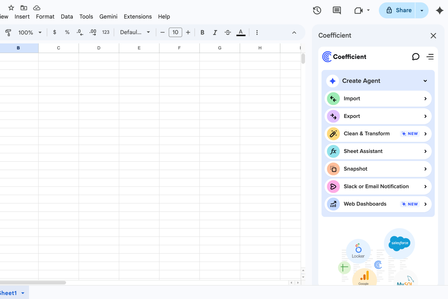
Für Unternehmen, die die Kraft von Daten nutzen möchten, ohne sich mit der Komplexität traditioneller Business-Intelligence-Tools auseinanderzusetzen, bietet Coefficient eine erfrischende Alternative. Entwickelt für die einfache Integration mit Plattformen wie Google Sheets und Excel, spricht es Fachkräfte aus Bereichen wie Revenue Operations, Marketing, Finanzen und Analytik an. Durch die Vereinfachung von Datenerhebung und Berichterstattung mittels KI-gestützter Funktionen macht Coefficient datenbasierte Entscheidungen für alle, unabhängig vom technischen Wissen, zugänglich.
Warum ich Coefficient ausgewählt habe
Ich habe Coefficient gewählt, weil es die Art und Weise verändert, wie Sie mit Daten interagieren, indem es über 100 Datenquellen direkt in Tabellenkalkulationen integriert. Diese einzigartige Fähigkeit ermöglicht es Ihnen, Live-Dashboards zu erstellen und Erkenntnisse zu gewinnen, ohne umfassende technische Kenntnisse zu benötigen. Funktionen wie der SQL-Abfrage-Builder und vorgefertigte Dashboards erlauben es Ihrem Team zudem, Daten in Echtzeit zu visualisieren und dadurch fundierte Entscheidungen einfacher zu treffen. Durch die Automatisierung der Datenanreicherung und Berichterstattung reduziert Coefficient effektiv den Zeitaufwand für manuelle Datentätigkeiten, sodass Sie sich auf strategische Initiativen konzentrieren können.
Coefficient Hauptfunktionen
Neben den beeindruckenden Integrationen habe ich weitere Funktionen entdeckt, die Coefficient besonders machen:
- Import-Agent: Mit dieser Funktion können Sie verschiedene Datenquellen verbinden und Live-Daten ohne manuelle Eingabe in Ihre Tabellen bringen.
- API-Agent: Sie können eigene Konnektoren erstellen, um mit individuellen Datenquellen zu integrieren und so auf Ihre spezifischen Geschäftsanforderungen einzugehen.
- Browser-Agent: Dieses Tool ermöglicht Web Scraping direkt aus Ihrem Browser, sodass Sie kinderleicht Daten aus dem Internet sammeln und analysieren können.
- Automatisierte Benachrichtigungen: Bleiben Sie mit Echtzeit-Updates via Slack oder E-Mail informiert, sodass Ihr Team jederzeit über wichtige Datenänderungen im Bilde ist.
Coefficient Integrationen
Zu den Integrationen zählen Salesforce, QuickBooks, Snowflake, HubSpot, MySQL, Redshift, NetSuite und weitere. Für individuelle Integrationen steht zudem eine API zur Verfügung.
Pros and Cons
Pros:
- Echtzeit-Datensynchronisation
- No-Code-Oberfläche für nicht-technische Anwender
- Natives Tabellenkalkulations-Umfeld
Cons:
- Begrenzt auf tabellenbasierte Visualisierung
- Eingeschränkte Offline-Funktionalität

Tableau ist eine leistungsstarke, skalierbare Analyseplattform mit Desktop-, Cloud- oder Vor-Ort-Optionen. Sie zeichnet sich durch einen interaktiven, visuellen Analyseansatz aus und ermöglicht es Ihnen, auf Ihre Daten sicher über den Browser, Desktop, das Mobilgerät oder eingebettet in jede Anwendung zuzugreifen. Es stehen über 900 Lernressourcen zur Verfügung, darunter über 100 Schulungsvideos. Für Gianluca Ferruggia, General Manager bei DesignRush, war der Einfluss von Tableau sofort spürbar: 'Tableau verwandelte unsere unbearbeiteten Daten in grafische Geschichten, seine Drag-and-Drop-Dashboards waren bahnbrechend, da wir so Trends entdecken konnten, die in unseren Tabellenkalkulationen verborgen waren.'
Tableau überzeugt besonders in einem Bereich der Bewertungsmaßstäbe für Funktionen: Flexibilität. Es ist leicht skalierbar; erhältlich als Server-, Desktop- und/oder Cloud-Lösung; verfügbar auf allen Gerätetypen, egal ob PC oder Smartphone; und bietet kostenlose Analyse-Ressourcen für Studierende, Lehrende und kleinere gemeinnützige Organisationen. Ganz gleich, welche Nische Sie bedienen, hier werden Sie sicher fündig.
Tableau kann mit Datensammlungssystemen wie ServiceNow, Splunk und Google Analytics verbunden werden. Weitere Integrationen, oder wie sie es nennen, 'Technologiepartner', umfassen 0xdata, AIMMS, Aircloak, AllSight, Amazon Web Services, Astera, Axiomatics, Birst, Datawatch,
Element Analytics, Google Cloud Platform, IBM, Microsoft und viele, viele mehr.
Der Einstiegspreis ist relativ hoch und die Kosten steigen nach Ablauf des einjährigen Vertrags an. Mehrjährige Verträge sind nicht verfügbar, weshalb sie in unserem Bereich für Preis-Leistungs-Verhältnis aufgrund des hohen und schwankenden Preismodells, das als ausbeuterisch empfunden werden kann, Abzüge hinnehmen mussten.
Tableau startet ab $70/User/Monat und bietet eine kostenlose 14-Tage-Testversion.

Erstellen Sie leicht verständliche Berichte und visuell orientierte, interaktive Dashboards, die datengestützte, umsetzbare Einblicke zur Definition von Geschäftskennzahlen, zur Identifizierung von Mehrwert und zur Entdeckung von Zusammenhängen zwischen Tabellen bieten. Zu den Ressourcen und Funktionen gehören benutzerdefinierte Anwendungen, eingebettete Visualisierungen, Data-Science-Workflows, die Möglichkeit, auf Public Clouds (wie AWS und GCP) zu hosten, und mehr. Für Amit Chandak, Chief Analytics Officer bei Kanerika Inc, erwies sich Looker als leistungsstarke Lösung für Kundendaten-Herausforderungen: 'Wir haben Looker eingesetzt, um einem Kunden mit fragmentierten Daten Echtzeit- und zuverlässige Erkenntnisse zu liefern—nach der Implementierung verbesserte sich die Berichtsgeschwindigkeit um 50% und die Entscheidungsfindung beschleunigte sich dank klarer, umsetzbarer Dashboards erheblich.'
Sie bieten einen kostenlosen interaktiven Trainingskurs sowie viele weitere tutorialartige Ressourcen an, weshalb ich sie im Bedienbarkeitsbereich der Bewertungskriterien so hoch bewerten konnte. Unter dem Tab 'Erste Schritte' fällt auf, dass sie zahlreiche Selbsthilfe-Ressourcen zum Anzeigen von Rohdaten, Erstellen von Tools und Entwickeln von Modellen bereithalten.
Der Nachteil dieser Software ist, dass das Schreiben der Abfragen nicht besonders benutzerfreundlich ist. Zudem benötigen Datenanalyseaufgaben beträchtliche Zeit, um ausgeführt zu werden und Abfragen zu verarbeiten. Bei Big Data kann das System träge werden.
Sie verbinden sich mit Datenbanken wie Redshift, Snowflake, BigQuery sowie über 50 unterstützten SQL-Dialekten, darunter Amazon Redshift, Google BigQuery, Snowflake, MySQL, Oracle, Amazon Athena, Amazon Aurora und weitere.
Looker beginnt bei $3.000/Monat für 10 Nutzer ($50/pro zusätzlichem Nutzer) und bietet eine kostenlose Demo an.
Domo
Am besten geeignet für die Analysefreigabe über externe Lieferantenportale

Die Domo Business Cloud ist eine Plattform, mit der Sie Daten aus verschiedenen Quellen aggregieren und individuelle Workflow-Apps erstellen können. Zu den Funktionen gehören Dashboards und Berichte, maschinelles Lernen, prädiktive Analysen und externe Self-Service-Berichte. Für viele Unternehmen ist Domos Fähigkeit, einzuspringen, wenn andere Tools versagen, ein großer Vorteil. Nicola Leiper, Direktorin und Leiterin des Projektmanagements bei Espresso Translations, berichtet: 'Excel ist abgestürzt, und Domo hat unsere wichtigste Kundenbeziehung gerettet. Domo hat nicht nur unsere Daten organisiert, sondern auch unseren Ruf bewahrt und Schwachstellen in unseren Abläufen aufgedeckt, die uns Tausende gekostet haben.'
Ich schätze den Fokus, den Domo auf externe Beziehungen zu Lieferanten und anderen Stakeholdern legt. Das Feature heißt Domo Everywhere und ermöglicht es Ihnen, Portale für Ihre externen Partner zu erstellen. Dadurch können diese eigenständig die von Ihnen freigegebenen Daten analysieren und ihre eigenen Erkenntnisse daraus ziehen.
Außerdem sind die Datenvisualisierungstafeln unabhängige Widgets, die Sie mit wenigen Klicks bearbeiten, filtern und in der Größe anpassen können. Schließlich erlaubt es die Plattform, Berechtigungen für interne und externe Nutzer zu vergeben, unabhängig davon, ob es sich um ein Domo-Konto handelt oder nicht.
Domo integriert sich mit externen Datenquellen über mehr als 1000 vorgefertigte Konnektoren, darunter Shopify, Salesforce, Amazon S3, Adobe Analytics, Sharepoint und Survey Monkey.
Domo bietet eine kostenlose Testversion, und die Preise werden auf Anfrage genannt.
Sisense
Beste Business-Intelligence-API zur Integration von Analysen in Ihre Produkte und Tools
Eine Hybrid-Cloud-Plattform, die darauf ausgelegt ist, all Ihre Daten gemeinsam zu nutzen und sie Ihnen über interaktive Dashboards, Self-Service-Analysen und/oder individuell gebrandete BI-Apps zur Verfügung zu stellen. Sie bieten Unterstützung, Analysen und Berichte für Geschäftsbereiche wie Kundenservice-Kennzahlen, digitales Marketing, Finanzen, Personalwesen, Einzelhandel und E-Commerce, IT-Analysen und mehr.
Bezüglich unserer Anforderungen an Bedienbarkeit und UI-Evaluationskriterien habe ich festgestellt, dass Sisense einfach zu bedienen, leicht zu installieren und einzurichten ist und über eine intuitive Benutzeroberfläche sowie ein schlankes Nutzererlebnis verfügt. Das Kundenserviceteam ist reaktionsschnell und anpassungsfähig, sodass dies eine gute Wahl für Unternehmen mit geringerer Technologieerfahrung sein könnte, die zusätzliche Unterstützung benötigen.
Einige Nachteile sind, dass der Marketing-Connector robuster sein könnte. Außerdem sind einige Funktionen so stark vereinfacht, dass sie hinderlich sind; zum Beispiel erscheint es zunächst zeitsparend, keine Abfrage schreiben zu müssen, bis Ihre Anforderungen nicht mehr zu den vorgegebenen Daten passen und Sie sich mit kreativen Lösungen behelfen müssen, um die gewünschten Ergebnisse zu erzielen.
Nutzen Sie ODBC, um direkt aus einer beliebigen Drittanbieteranwendung – von Excel bis hin zu gängigen Datenvisualisierungs- und Berichtswerkzeugen – auf das leistungsstarke Back-End von Sisense zuzugreifen. Außerdem bieten sie einen Marktplatz für Erweiterungen und Plug-ins an, die entweder von ihnen oder ihren Partnern bereitgestellt werden. Einige sind kostenlos verfügbar, andere nur mit einem Premium-Konto.
Sisense bietet individuelle Preisgestaltung sowie eine kostenlose Demo und eine kostenlose Testversion an.
ClicData
Am besten geeignet zum Erstellen und Einbetten von Dashboards in Ihre Anwendungen
ClicData ist eine Datenaggregationsplattform mit über 250 Konnektoren. Damit können Sie Daten aus allen Bereichen des Unternehmens zusammenführen. Anschließend speichert ein Data Warehouse diese Informationen und stellt sie Ihnen zur Verfügung, damit Sie Echtzeit-Dashboards gestalten können.
Der letzte Schritt besteht darin, Ihr Dashboard zu erstellen. Der Dashboard-Designer von ClicData verfügt über eine Drag-and-Drop-Funktion, mit der Sie Ihre Datenvisualisierungen ganz einfach erstellen können. Fügen Sie Elemente wie Anmerkungen, Messgeräte, Karten, Audio, Tabellen und beliebige Diagramme hinzu. Anschließend können Sie Ihre Grafiken mithilfe der API in eine Website, ein Portal oder ein ERP-System einbetten.
Obwohl die Plattform keine sofort einsetzbaren, vorgefertigten Integrationen bietet, steht die API Ihrem IT-Team zur Verfügung, um dies zu ermöglichen. Die API erlaubt es integrierter Software, Informationen direkt nach Erhalt an ClicData zu senden, sodass Sie jederzeit aktuellste Informationen in Echtzeit einsehen können.
Die kostenpflichtigen Pläne von ClicData beginnen bei $75/Monat und bieten eine kostenlose 15-tägige Testversion.

Visor ist ein Workspace-Tool, das sich mit verschiedenen SaaS-Anwendungen verbindet und darauf abzielt, Menschen und Daten für eine kollaborativere Arbeitsumgebung zusammenzubringen. Es ermöglicht Nutzern, individuelle Ansichten und Visualisierungen ihrer verschachtelten Jira-Daten zu erstellen und bietet eine bidirektionale Integration mit Jira für eine genaue und anpassbare Freigabe.
Visor fungiert als Workspace-Tool, das die Funktionalität von SaaS-Anwendungen verbessert, indem es Nutzern eine einheitliche Ansicht ihrer Daten bietet. Visor legt zudem Wert auf sicheres Teilen und verfügt über eine benutzerfreundliche Drag-and-Drop-Oberfläche für einfache Bedienung. Zusätzlich beinhaltet es einen fortschrittlichen JQL-Importer und unterstützt mehr als 75 Jira-Feldtypen, um eine Vielzahl von Datenverwaltungsbedürfnissen abzudecken.
Außerdem fördert Visor die Zusammenarbeit und Kommunikation unter Teammitgliedern mit Funktionen wie Gantt-Diagrammen, Roadmaps und der Möglichkeit, Ansichten mit Farben und bedingten Formatierungen individuell anzupassen. Dies kann Zeit sparen und die Effizienz bei der Projektplanung und Berichterstattung steigern.
Visor integriert sich mit Salesforce, Jira und HubSpot.
Die Preise für Visor beginnen bei $9 pro Nutzer und Monat.
Weitere Optionen
In meinen Recherchen habe ich einige Tools gefunden, die es zwar nicht auf die Hauptliste geschafft haben, aber dennoch erwähnenswert sind.
- Power BI
E Business-Intelligence-Lösung für Microsoft-Nutzer
- Logi Analytics
Es Embedded-Business-Analytics-Tool für Software-Teams out-of-the-box
- InetSoft
Es Data-Intelligence-Tool für skalierbare Architektur und fortgeschrittenes Modellieren
- Metric Insights
Er Enterprise-BI-Portal-Builder
- Exago BI
Es Business-Intelligence-Reporting-Tool für Einsteiger und technisch weniger versierte Anwender
- Izenda
E Business-Intelligence-Software zur Einbettung in webbasierte Anwendungen
- ClickUp
Am besten geeignet für BI-Tool-Integrationen


Wie ich Business-Intelligence-Tools bewerte
Ob es darum geht, einem Finanzteam das wöchentliche Excel-zu-PowerPoint-Ritual zu ersparen oder einem Produktteam Echtzeiteinblicke in die Funktionsnutzung über Kundensegmente hinweg zu ermöglichen – Business-Intelligence-Tools sind der Ort, an dem Rohdaten tatsächlich zu Erkenntnissen werden, die Menschen zum Handeln bewegen. Bei der Bewertung dieser Tools denke ich in zwei Schichten: Was jedes Tool leisten muss, um überhaupt auf diese Liste zu kommen, und was die empfehlenswerten Tools von denen trennt, die zwar technisch funktionieren, aber jeden Nutzer frustrieren.
Kernfunktionalität (Grundvoraussetzungen für diese Liste)
Für Business-Intelligence-Tools teste und bewerte ich folgende Kernfunktionen:
- Datenkonnektivität: Ich prüfe, ob das Tool eine native Verbindung zu den tatsächlich genutzten Datenquellen unterstützt. Wenn ein Produktmanager Nutzungsdaten aus dem Data Warehouse nicht ohne Workaround mit CRM-Daten kombinieren kann, ist das ein Problem.
- Interaktive Dashboards: Jedes Tool muss Drilldown, Kreuzfilterung und dynamische Datumssteuerungen unterstützen, damit Benutzer Daten selbstständig erkunden können. Ich teste das, indem ich ein mehrseitiges Dashboard erstelle und prüfe, ob ein Stakeholder Rückfragen beantworten kann, ohne dass ich etwas umbauen muss.
- Datenmodellierungsschicht: Ich teste, ob man Metriken, Beziehungen und Hierarchien zentral definieren kann, sodass beispielsweise "Umsatz" auf jedem Dashboard dasselbe bedeutet. Fehlt dies, verbringen Teams erfahrungsgemäß mehr Zeit mit Zahlenstreitigkeiten als mit Handlungen.
- Berichterstattung und Verteilung: Ich prüfe, ob planmäßige Berichtsauslieferungen per E-Mail oder Slack sowie schwellenbasierte Benachrichtigungen möglich sind. Ein Finanzleiter sollte jeden Montagmorgen automatisch einen Wochenüberblick der GuV im Postfach haben, ohne dass etwas manuell erledigt werden muss.
- Zeilenbezogene Sicherheit: Ich überprüfe, ob das Tool Daten auf Zeilenebene nach Nutzerrolle oder Identität einschränken kann. Das spielt ab dem Moment eine Rolle, in dem regionale Vertriebsleiter nur ihren eigenen Pipeline-Bereich einsehen dürfen.
- Skalierbarkeit und Abfrageleistung: Ich teste mit größeren Datenmengen und parallelen Nutzern, ob Dashboards weiterhin in wenigen Sekunden laden. Ein Tool, das in der Demo glänzt, aber versagt, wenn 50 Personen am Montagmorgen dasselbe Management-Dashboard öffnen, ist nicht praxistauglich.
- KI-gestützte Analytik: Ich bewerte eingebaute Funktionen wie natürliche Sprachabfragen, automatische Anomalieerkennung und Prognosefunktionen. Ich achte darauf, ob die KI-Features tatsächlich nützliche Erkenntnisse liefern – beispielsweise eine unerwartete Churn-Spitze markieren – oder einfach einen Chatbot über eine Basissuche legen.
Wenn ein Tool diese Dinge nicht zuverlässig beherrscht, landet es unabhängig von weiteren Funktionen nicht in dieser Auswahl.
Herausragende Funktionen (Was die Top-Auswahl unterscheidet)
Über die Grundlagen hinaus lege ich Wert auf Features wie Multi-Cloud- oder On-Premise-Betrieb, echtes White-Label-Embedding für SaaS-Produkte, Git-basierte Versionskontrolle analytischer Workflows, tiefe Ökosystemintegrationen (dbt, Slack, MS Teams) und ausgereifte Governance-Tools für den Einsatz im großen Maßstab. Außerdem teste ich, wie jedes Tool automatisierte Erkenntnisse aufbereitet, Data Storytelling unterstützt und sich in stark regulierte Industrien einfügt.
Was ich über die Funktionen hinaus bewerte
Ich berücksichtige die Gesamtkosten – nicht nur Lizenzgebühren, sondern auch Kosten für Konnektoren, Schulungsaufwand und Administrationsbelastung im Betrieb. Auch die Passung ins Ökosystem ist wichtig: Eine Microsoft-orientierte Organisation holt mehr Wert aus Power BI als aus einem Tool, das überall eigene Schnittstellen benötigt. Außerdem werte ich die Time-to-Value, denn ein Tool, dessen Implementierung ein halbes Jahr dauert, verliert oft die Unterstützung der Stakeholder, noch bevor das erste Dashboard live geht.
So habe ich die besten BI-Tools ausgewählt
Zunächst habe ich anhand von Bewertungen und Nutzermeinungen eine große Liste beliebter Tools zusammengestellt. Anschließend habe ich die Liste eingegrenzt, indem ich auf Schlüsselfunktionen geachtet habe, die aus meiner Erfahrung ein BI-Tool mitbringen sollte. Letztlich habe ich die untenstehenden Kriterien als Bewertungsgrundlage gewählt.
Benutzeroberfläche (UI)
Ihre BI-Plattform ist der Ort, an dem Sie Geschäftsdaten analysieren und mithilfe von Datenmodellen als Diagramme und andere visuelle Darstellungen nutzen, um fundierte Entscheidungen zu treffen. Daher muss die Oberfläche übersichtlich, intuitiv und mit sinnvoll eingesetzten Freiräumen gestaltet sein.
Benutzerfreundlichkeit
Das Tool sollte einfach zu erlernen und zu bedienen sein. Tools wie Microsoft Power BI bieten beispielsweise eine Drag-and-Drop-Oberfläche, mit der Sie grafische Elemente verwenden können, um die analysierten Daten zu verändern. Das BI-Tool sollte über solche Funktionen sowie über passende Hilfedokumentationen, Trainings und Video-Tutorials verfügen, damit Sie das Tool schneller nutzen können.
Funktionen & Funktionalität
Welche wichtigen Reporting-Tool-Funktionen und -Leistungen sind vorhanden und wie leistungsfähig sind diese? Dabei habe ich insbesondere auf folgende Aspekte geachtet:
- Anpassbare Dashboards: Die besten BI-Lösungen bieten eine Anzeige auf einem einzigen Bildschirm mit mehreren Visualisierungen sowie die Möglichkeit, die Visualisierungen miteinander zu verknüpfen (damit Filter oder Auswahlen alle Visualisierungen beeinflussen) oder jede Visualisierung unabhängig zu halten. Änderungen sollten in Echtzeit widergespiegelt werden und die Erstellung individueller Ansichten von Schlüsseldaten ermöglichen.
- Drill-Down und Datenfilter: Das Betrachten detaillierter Informationen ist entscheidend. Dazu gehören Funktionen wie Drop-Down-Menüs, Suchfilter und Slicer sowie die Möglichkeit, in Details hinein und zurück zu Datenzusammenfassungen zu navigieren.
- Webbasierte Oberfläche für Kunden: Am einfachsten ist es, wenn berichtsbasierte Lösungen für Kunden eine webbasierte Oberfläche anbieten, da diese effizienter und leichter zu verwalten ist als clientbasierte Desktop-Lösungen.
- Geplante und automatisierte Berichte: Das Tool sollte Ihnen helfen, den Fortschritt einfach zu überwachen. Dazu gehört die Möglichkeit, automatische Updates für Teams zu planen, automatische Berichte für Kunden zu versenden und automatische Benachrichtigungen einzurichten, um über wichtige Termine oder Schwellenwerte informiert zu werden.
- Hochwertige Diagrammerstellung: Grundlegende Werkzeuge umfassen Balken-, Linien-, Kreis-, Flächen- und Radar-Diagrammtypen. Fortgeschrittene Diagramme sind Heatmaps, Streudiagramme, Blasendiagramme, Histogramme und geographische Karten. Die besten Reporting-Tools erlauben die Kombination dieser Visualisierungen zu individuellen Diagrammen.
Integrationen
Daten-Connectoren helfen Ihnen, das Beste aus einer BI-Plattform herauszuholen. Eine Möglichkeit dazu sind Datenintegrationen mit anderer Cloud-basierter Software wie SAP oder SAS. Daher achte ich auf vorgefertigte Integrationen, Software-Aggregatoren wie Zapier und individuelle Integrationen über APIs.
Preise
Einer der wichtigsten Faktoren bei unternehmensbezogenen Tool-Entscheidungen ist der Preis. Aus diesem Grund schaue ich nach Informationen zu Anwendungsfällen, Preisplänen pro Monat und weiteren Informationen, die Ihnen helfen. Zum Beispiel, ob es eine kostenlose Version zum Ausprobieren gibt, eine kostenlose Testphase oder ob das Tool als On-Premises-Lösung verfügbar ist.
BI-Tools FAQs
Finden Sie Antworten auf häufig gestellte Fragen zu diesem Thema.
Wie können Business-Intelligence-Tools Analytics Manager dabei unterstützen, strategische Entscheidungen zu treffen?
Business-Intelligence-Tools unterstützen Analytics Manager, indem sie die Datenerfassung automatisieren und Echtzeit-Einblicke über Dashboards und Visualisierungen liefern. Sie können Umsätze schnell über Regionen hinweg vergleichen, Budgets überwachen und operative Probleme erkennen – ganz ohne manuelle Berichte. Viele Plattformen bieten prädiktive Modellierung und Szenarienplanung, um Ergebnisse vorherzusagen und Strategien zu steuern. Durch Data Storytelling – das Kombinieren von Visualisierungen und Erzählungen – können Sie Entscheidungen auf Leitungsebene prägen und Teams auf gemeinsame, erkenntnisorientierte Ziele ausrichten.
Was sind gängige Integrationsherausforderungen bei der Implementierung von BI-Tools in etablierten Unternehmensumgebungen?
Integrationsherausforderungen entstehen oft durch veraltete IT-Systeme, isolierte Daten und uneinheitliche Formate. Ältere ERP-Systeme oder selbstentwickelte Datenbanken haben möglicherweise Schwierigkeiten, sich mit cloudbasierten BI-Tools zu verbinden, was zu Synchronisationsfehlern oder Datenverlust führen kann. Minderwertige Daten können Berichte verfälschen, während strenge Sicherheitsprotokolle den Zugriff verzögern. Prüfen Sie daher Ihre Datenbestände, beziehen Sie die IT-Abteilung frühzeitig ein, standardisieren Sie Formate und wählen Sie BI-Plattformen mit starker Interoperabilität wie native Konnektoren, API-Unterstützung und Funktionen zur Datenumwandlung.
Wie unterstützen BI-Tools die bereichsübergreifende Zusammenarbeit von Geschäftsführern?
BI-Tools vereinfachen die bereichsübergreifende Zusammenarbeit, indem sie eine einzige, für alle zugängliche Datenquelle bieten. Anstatt verschiedene Exceltabellen-Versionen auszutauschen, können Manager interaktive Dashboards erstellen, die sich automatisch mit den neuesten Daten aktualisieren. Finanzen und Vertrieb können gemeinsame Umsatzprognosen einsehen, während Operations und HR den Personalbedarf verfolgen. Features wie Diagramm-Notizen, Aufgabenverteilung und KPI-Benachrichtigungen verringern Missverständnisse, machen Meetings effizienter und helfen, Bereiche auf gemeinsame Ziele auszurichten.
Welche Leistungskennzahlen sollten Geschäftsführer mit BI-Software überwachen?
Die Auswahl an Kennzahlen hängt von Ihren Unternehmenszielen ab, aber gängige Metriken sind Umsatzwachstum, Nettogewinnmarge, Kundenakquisitionskosten, Customer Lifetime Value, Abwanderungsrate und Betriebskosten. Für projektorientierte Teams könnten Sie zusätzlich Termintreue oder Ressourcenauslastung erfassen. BI-Tools ermöglichen die Erstellung automatisierter Dashboards, damit Sie diese Kennzahlen in Echtzeit überwachen können. Legen Sie individuelle Schwellenwerte fest, um Benachrichtigungen zu erhalten, wenn eine Kennzahl außerhalb Ihres Zielbereichs liegt. Mit der Zeit unterstützen diese KPIs dabei, schneller Handlungsbedarf zu erkennen und den Effekt neuer Initiativen zu messen.
Wie messen Sie den ROI einer Business-Intelligence-Plattform in einem mittelgroßen bis großen Unternehmen?
Beginnen Sie mit der Ermittlung von direkten Einsparungen, etwa dem Wegfall manueller Berichtserstellung. Wenn das Finanzteam beispielsweise monatlich 20 Stunden einspart, ist das eine klare Reduzierung der Gemeinkosten. Schätzen Sie dann potenzielle Umsatzzuwächse durch schnellere, zuverlässigere Entscheidungen – etwa durch neue Aufträge oder Kostensenkungen dank besserer Prognosen. Überwachen Sie Werte wie weniger Berichtsfehler, schnellere Erkenntnisse und höhere Datenakzeptanz. Vergleichen Sie diese Vorteile mit dem Gesamtaufwand – Abonnements, Integration, Schulung und Support –, um den ROI zu berechnen und weitere Investitionen zu rechtfertigen.
Wie geht es weiter?
Wenn Sie sich gerade mit der Recherche zu Business-Intelligence-Tools beschäftigen, nehmen Sie Kontakt zu einem SoftwareSelect-Berater auf und erhalten Sie kostenlose Empfehlungen.
Sie füllen ein Formular aus und führen anschließend ein kurzes Gespräch, in dem Ihre Anforderungen im Detail besprochen werden. Danach erhalten Sie eine Vorauswahl an Softwarelösungen, die Sie prüfen können. Die Berater unterstützen Sie sogar während des gesamten Kaufprozesses – bis hin zu Preisverhandlungen.